Hey everyone!
We’re excited to give you an early look at something we’ve been working on - a UI refresh for Holistics!
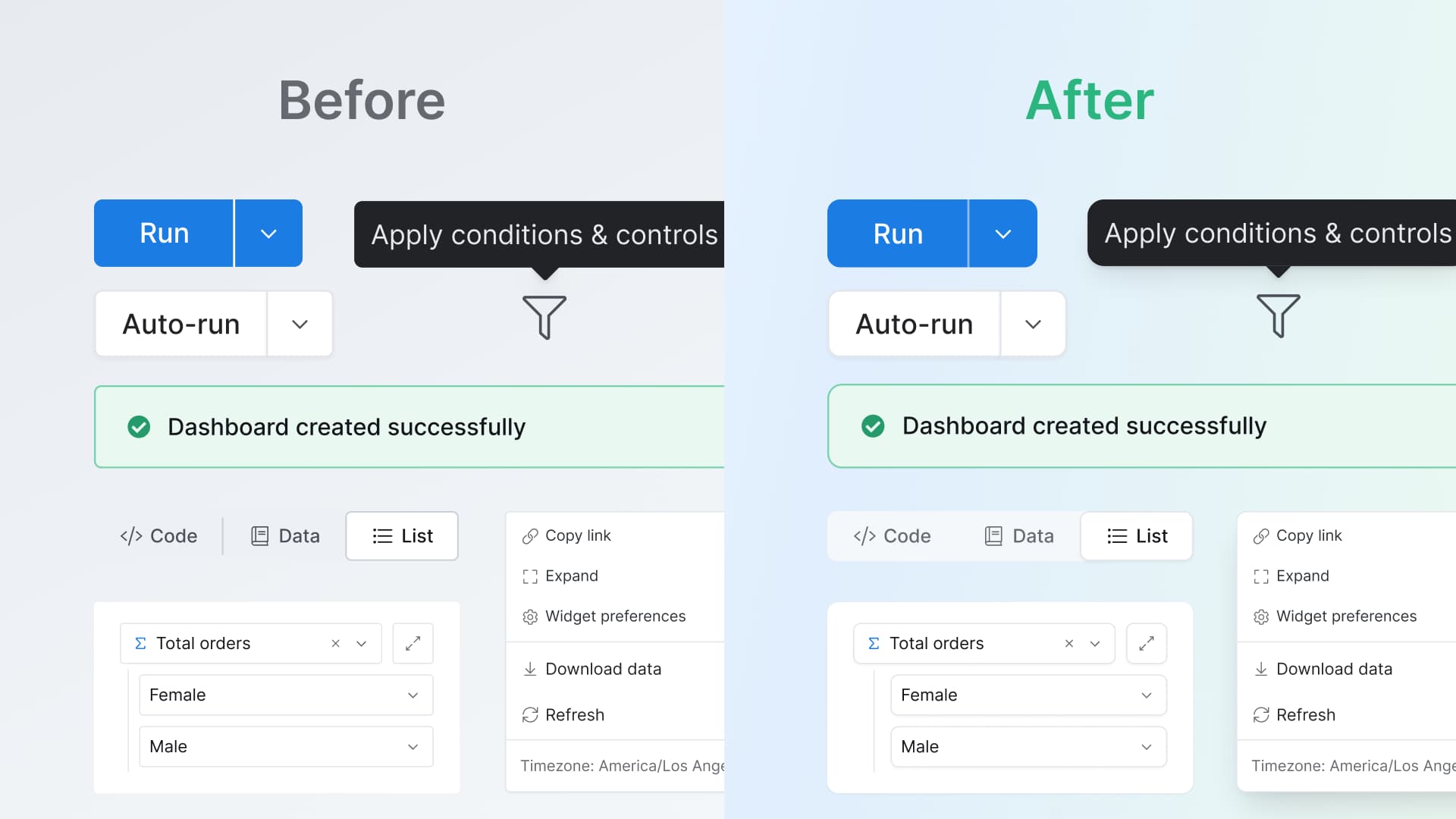
 What’s new
We’ve reviewed and reimagined every detail of the Holistics interface to be more elegant and intuitive. Here’s what changed:
You’ll soon notice:
-
Cleaner layout & spacing - Clearer page structure and spacing to help you focus on what matters.
-
Typography that breathes - Clearer, readable text to make the interface easier to scan for your eyes.
-
More refined text colors - A more neutral, balanced grays that are easier on the eyes, with improved contrast for helper text and placeholders that meet accessibility standards.
-
Icons and illustration that match our evolvement - A refreshed visual language that feels modern and clear
-
Shadows & border radius - Subtle depth and separation that makes elements feel more polished and distinct

 What to expect
The new experience starts landing over the next 2 weeks. You’ll see changes appear gradually as we roll them out.
This is just the start. You can expect more changes to other areas in the app in the future. Stay tuned!
We’d love to hear what you think as you explore the refresh. Drop your thoughts in the comments!