As part of the Holistics Glow-up initiative, we are beginning a major revamp of the Explore interface to be cleaner and easier to use. Our goal is to make data exploration not just powerful, but cleaner and more intuitive.
This is just the first step, but we wanted to share what’s landing now.
What’s changed
Weadded checkboxes to the field list. Sounds small, but it helps. You can actually see which fields are active at a glance now. And if you want to remove a field? Just uncheck it.
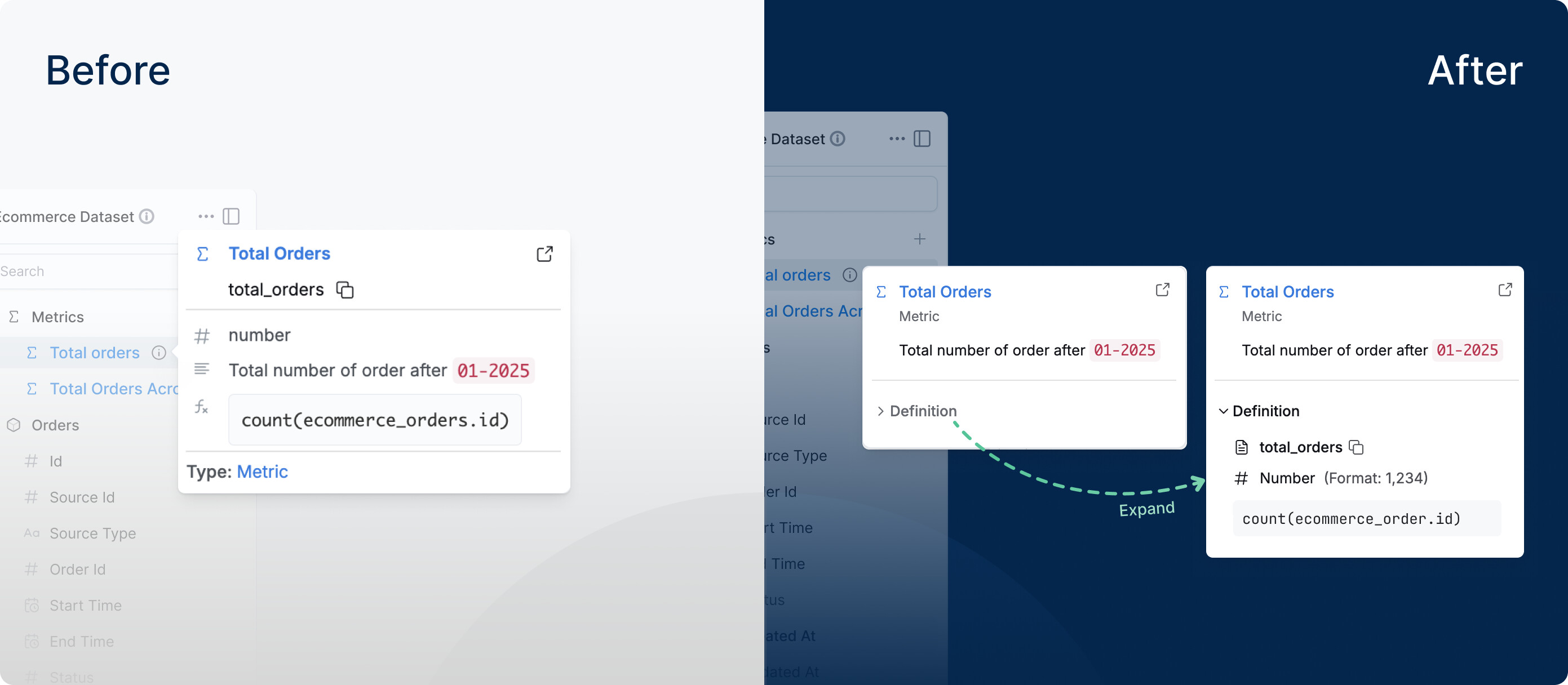
If you missed it—we recently shipped simplified field descriptions. When you hover over a field, the popover will focus on the business-friendly information instead of technical details. You can always expand to see the technical details when needed.
Coming soon We’re updating the settings panel to match our new design language. Better spacing, cleaner typography, improved contrast — the same stuff we’ve been rolling out across Holistics.
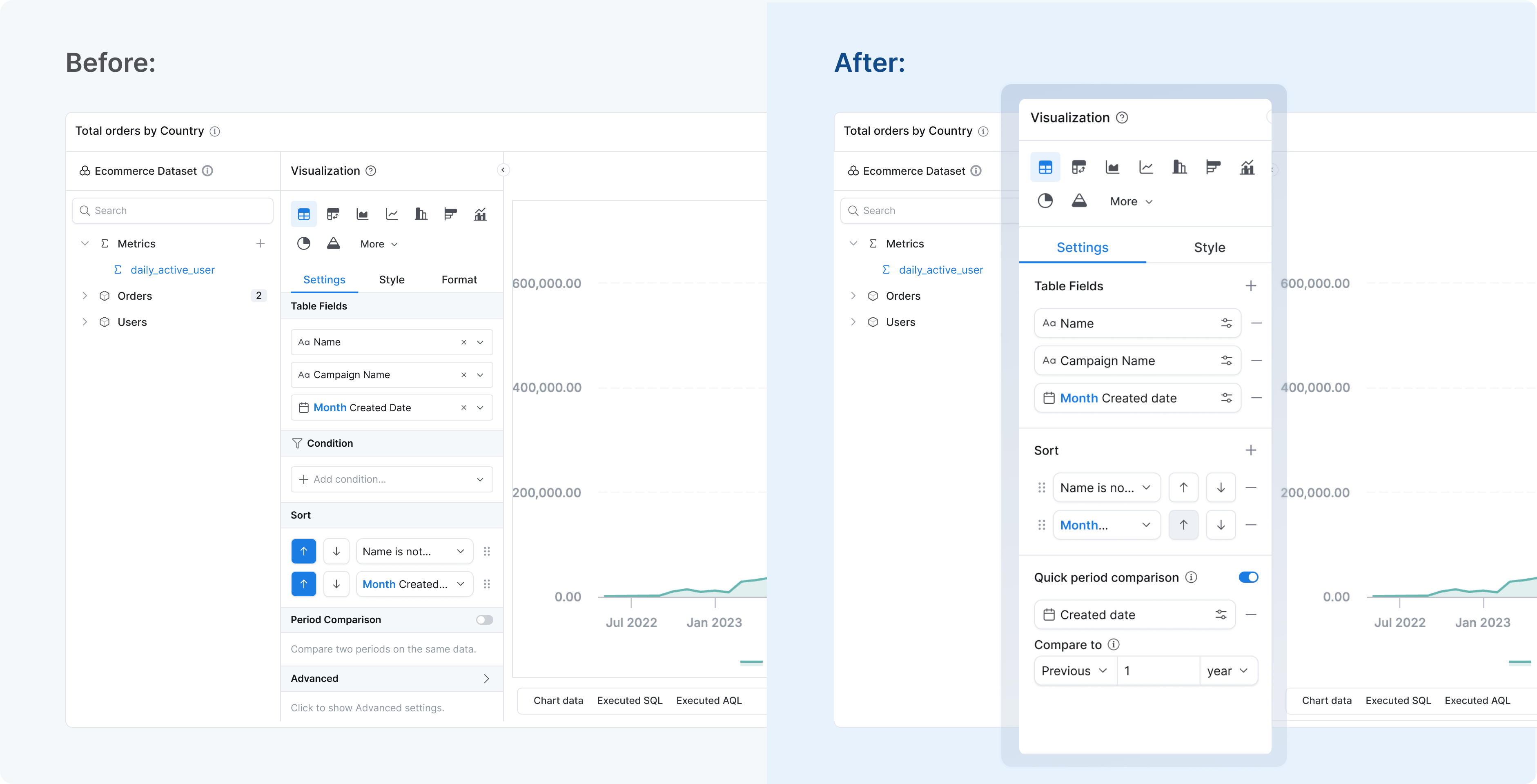
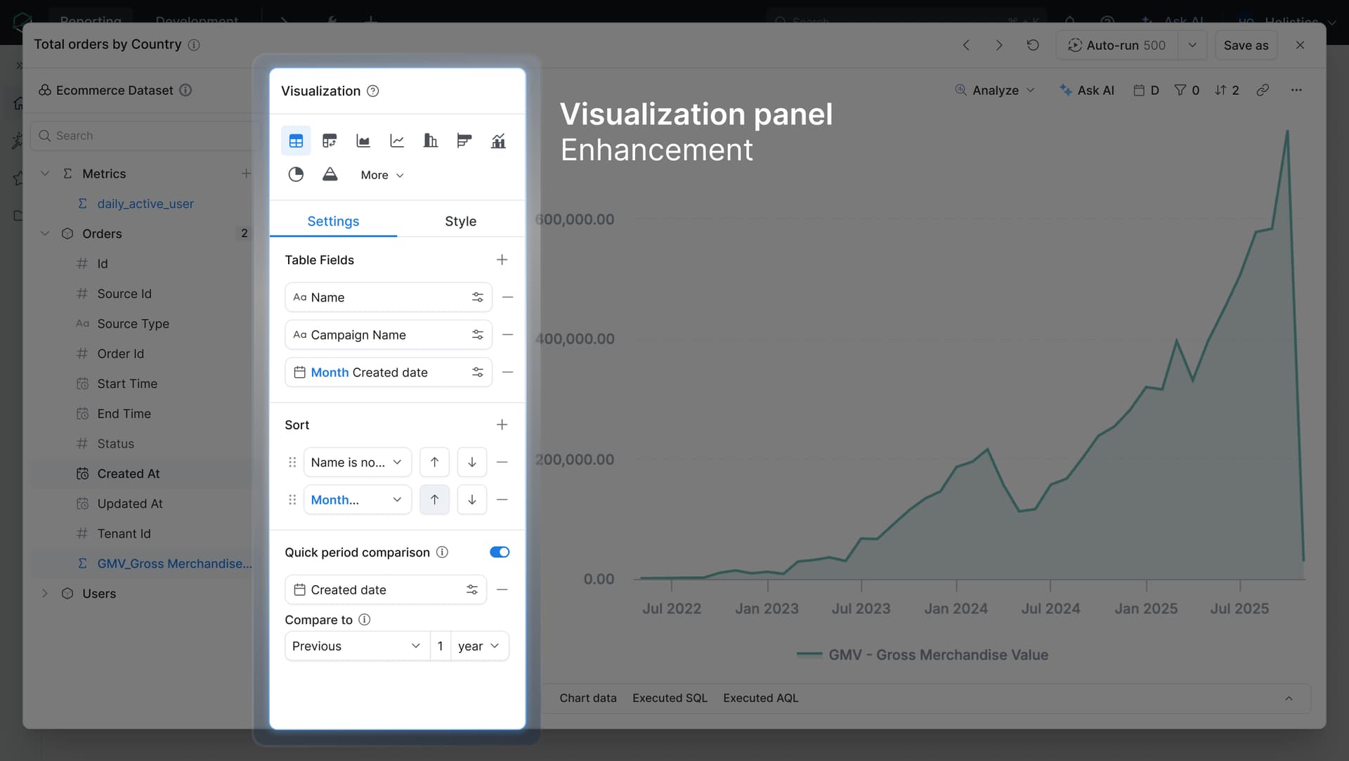
Quick update on the Explore glow-up - Phase 2 is now live!
We’ve refreshed the visualization settings panel with improved spacing, typography, and better contrast. It’s the same panel you use to configure your charts, but now it’s easier to scan and visually consistent with the rest of the Holistics UI refresh we rolled out last December.
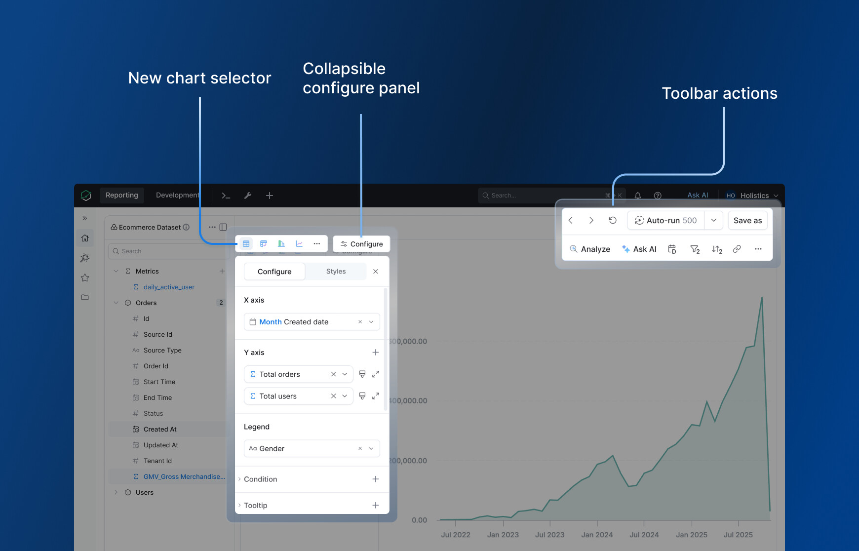
Following up with more glow-up updates - the new Explore layout is here!
Since our last update (the viz settings panel refresh in April), we have been working on the bigger layout changes we teased. Here’s what’s new:
New chart selector - Clearer icons make it easier to tell chart types apart at a glance. The most common charts are surfaced upfront; less common ones are tucked behind “more” to keep things clean.
Configure button - The viz settings panel now opens and closes via a Configure button. Click it when you need advanced settings, collapse it when you do not.
Toolbar - Most of your Explore actions are now in one place: ask AI, break down your data, drill by time, and more.
Run button - Has a new home in the top-right toolbar. This is the first step toward a workflow where the field list + toolbar + AI handles everything, without needing the viz panel open at all.
 What’s changed
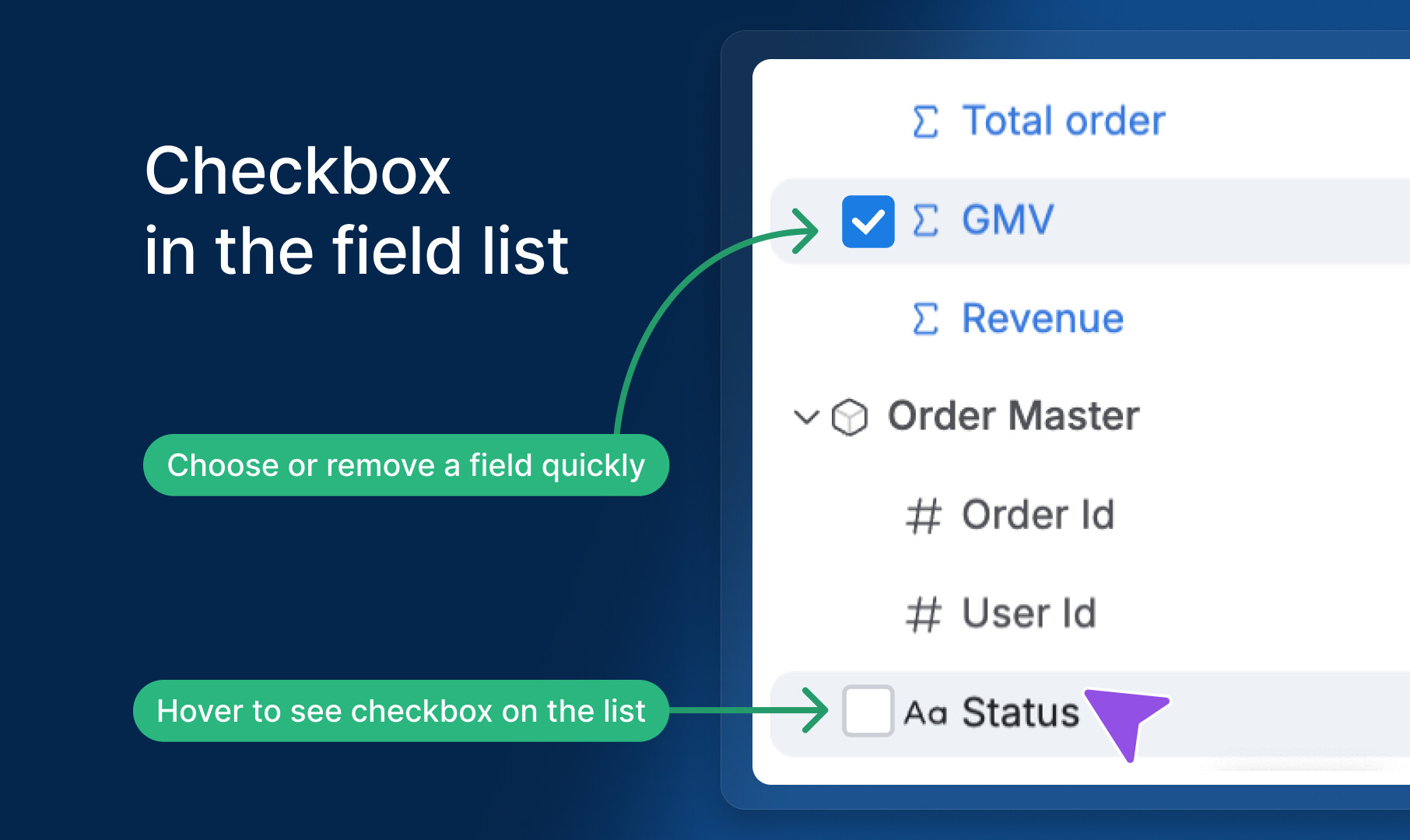
 This is just the beginning