By null title/label i mean the ability to make the title or label nothing. Right now I use custom label and just put a space in it so no text appears which is just a work around. By locks I’m referring to locking columns in a table to a certain size or locking widgets to a set size so that they don’t change with resolution changes.
I also use the workaround of putting a space in the title/labels when I do not want it to be displayed. The default labels for legends look messy - I do not want the metric name to be displayed next to each and every label.
Custom colors for tables and cohorts would also be nice. The current color palette options suffice for me, but I do see that some charts can not use them yet. It looks weird when I have a dashboard where most charts follow our default colors, but there is one cohort retention that does not.
Thank to the support team for responding to my feedback involving customising data labels and legends in our dashboards as well! Just wanted to put in this thread my thoughts on what Holistics can improve on.
Our company is currently creating some infographics using standard templates. We have placeholders where we can put in charts (e.g. pie charts). Ideally we felt it is more efficient to screenshot our charts and paste them onto our infographics template, so that we can quickly generate them on a monthly basis with new figures.
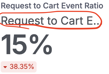
Unfortunately, what happened was that it can be quite hard to read with the default font size and colour of the data labels and legends. Consumers would need to zoom into the image to read out the descriptors.
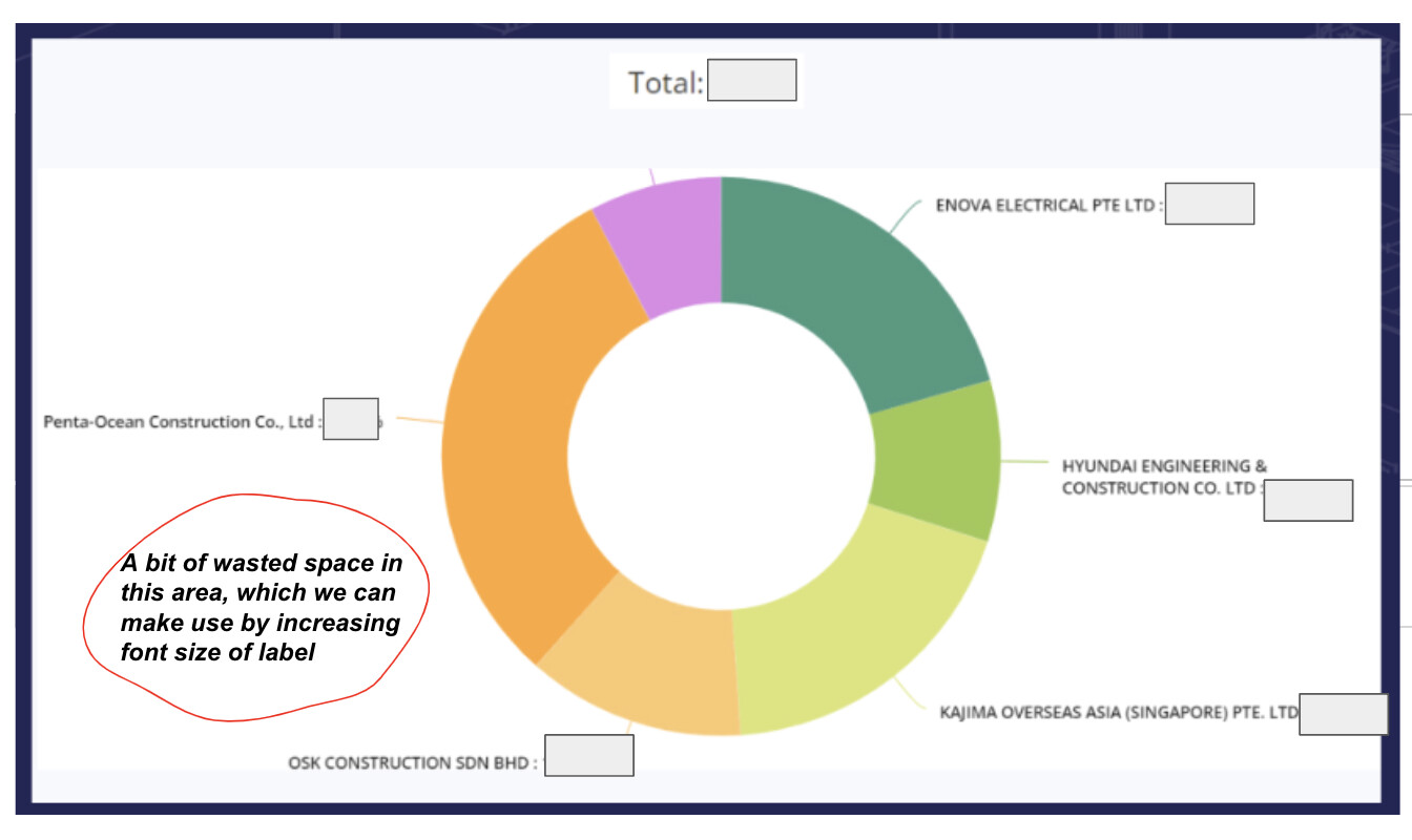
Below is an image where we attempt to explain the “wasted space” that can be sometimes generated, and how a customised label will help minimise it.
Our use case is simple, we are using holistics for embedding into our customer facing web portal. We want all fonts in holistics to match the surrounding web portal and remain on brand. Currently this is not possible.
We’re excited to let you know that we just released Page Themes, which can address majority styling customization needs. With that feature, you have the flexibility to customize a wide array of elements, including but not limited to:
Typography: change the font family, font size and color of text and data labels
Colors: customize color palettes for visualizations and other chart elements
Canvas & block styling: add borders, margins, shadows or even use custom image as background
@Theo can you adjust the value label and font using themes? I’ve been trying to but can only adjust the text or the block label, not the values themselves.