Hi there,
It’s Gus from the Growth Team at Holistics, again ![]()
We are excited to bring you up-to-date with some of the most exciting (and newest) Holistics updates - let’s unfold what we’ve shipped in the past month!
Community Highlights
Let’s take a glance at some interesting community posts we’ve handpicked for you:
- Feature Suggestion: Merge results from 02 datasets into one by @Chris
- Ask The Community: Show the last record in time rage by @Hari
For more of these, feel free to join our community. We’d love to have you there!
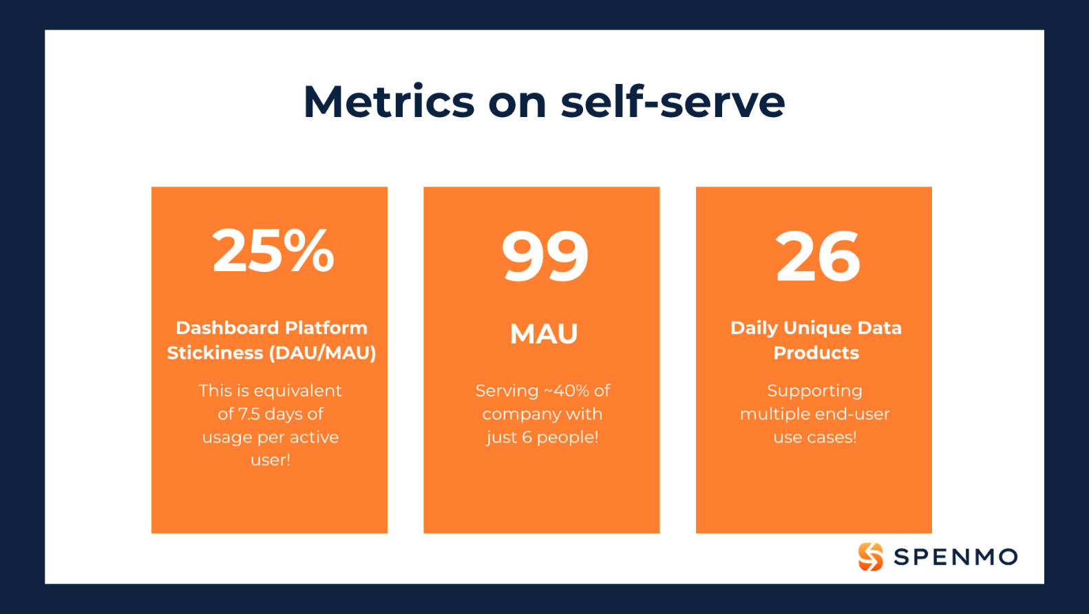
Case Study: How Spenmo Supports 200+ Users With an 08-Person Data Team
Designing your organization to be data-driven is hard, mostly because the “people, process, then tools” criterion is good and true, and universally applicable. You need to have the right people and process in place, with the right tool, in this exact order.
It’s hard. But some managed to pull it off, like one of our customers - Spenmo, a Singapore-based fintech company that has recently secured $121.4 million in funding.
By honing in on People, Process, and Tools, the 8-person data team at Spenmo was able to build a thriving self-service culture - which effectively supports the exponential volume of internal data requests that come with its rapid business growth - with some amazing results.
Here’s exactly how they did it
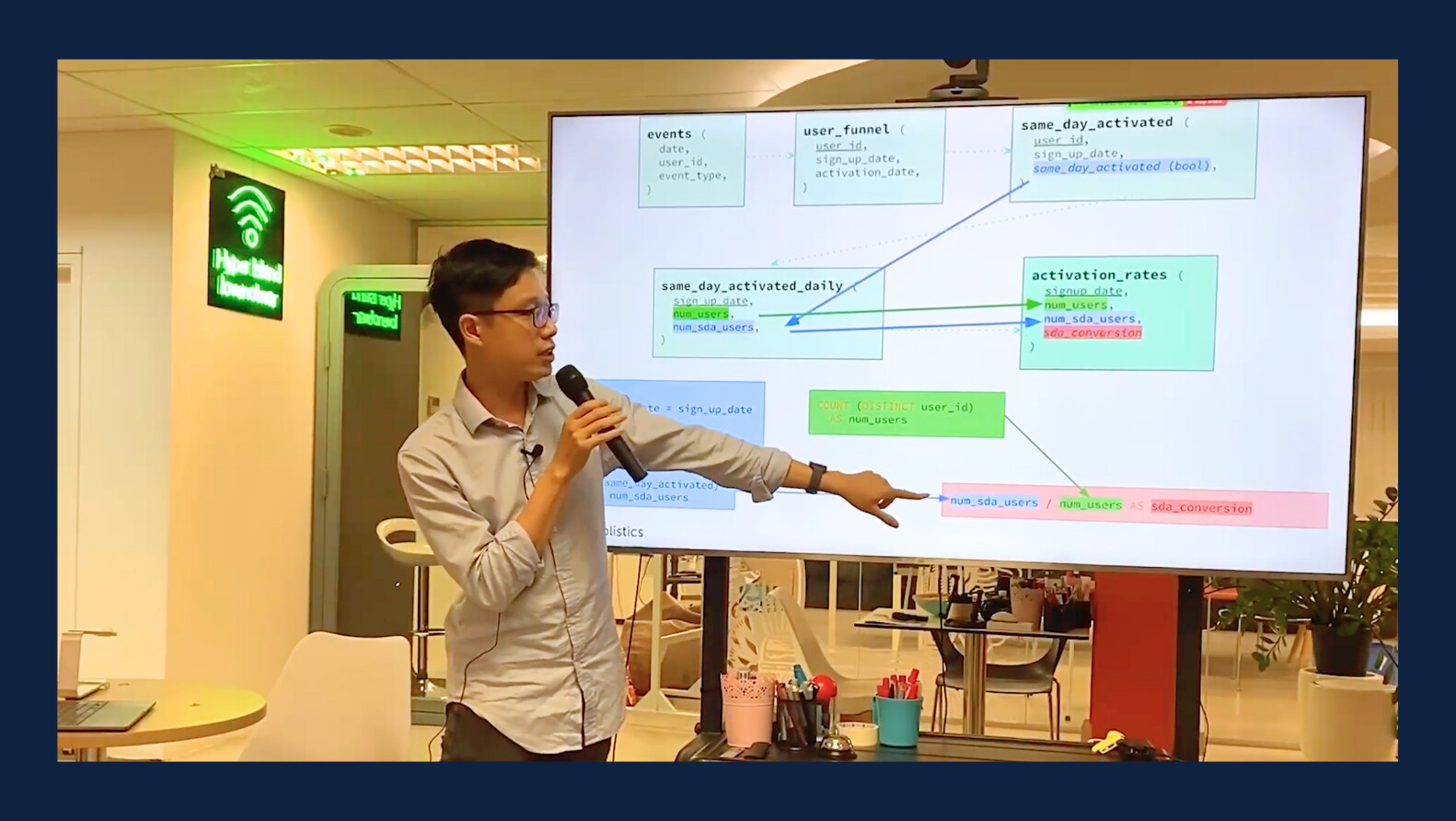
How Would An Ideal Semantic Layer Look Like?
Join Thanh from Holistics in his recent talk at dbt Singapore Meetup to explore the characteristics and benefits of the perfect semantic layer.
In this talk, we delved into
- The concept of a semantic layer.
- Why the semantic layer becomes essential in today’s analytics landscape.
- How it can improve efficiency and user experience.
We also discussed the essential features that an ideal semantic layer should have and how they can help you achieve your data analysis goals. Take a look!
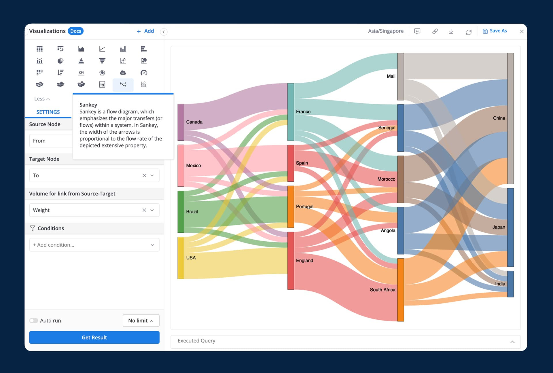
Sankey Chart Is Now Available
Sankey Chart is a type of visualization that represents the movement of data from one entity to another. Whether your marketing team wants to know how users move from one page to another and where they drop off.
Or your management team wants a visualization of how the budget is allocated across different departments or projects. Sankey Chart can get it.
And we’re proud to share that now you can create a Sankey diagram in Holistics - via our Custom Charts feature! Check our release note here for more details: Launched: Sankey diagram in Custom Charts Holistics Community.
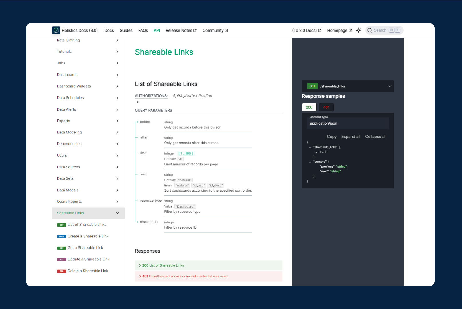
API Package to CRUD Shareable Link
Now you can automate your entire Sharable Links workflow using our API package!
Learn more here: [Launched: Shareable Links API Package | Holistics Community]
(Launched: Shareable Links API Package).
Custom Charts For Everyone
After a rewarding Beta phase, we’ve officially rolled out our Custom Charts feature! There are lots of major improvements that come with this launch, including:
- Code Templates Library
- Interactive Features Integration
- Export & Schedule
- Various UX Improvements
and so many more. Big thanks to our beta users for the amazing insights that help us tweak the feature in the right direction.
Mar UX Updates: Better Search Experience and Better Readability for Markdown Widgets
Mar UX Roundup: Improvements and Updates - Better Search Experience and Better Readability for Markdown Widgets](🎊 March UX roundup - New improvements)
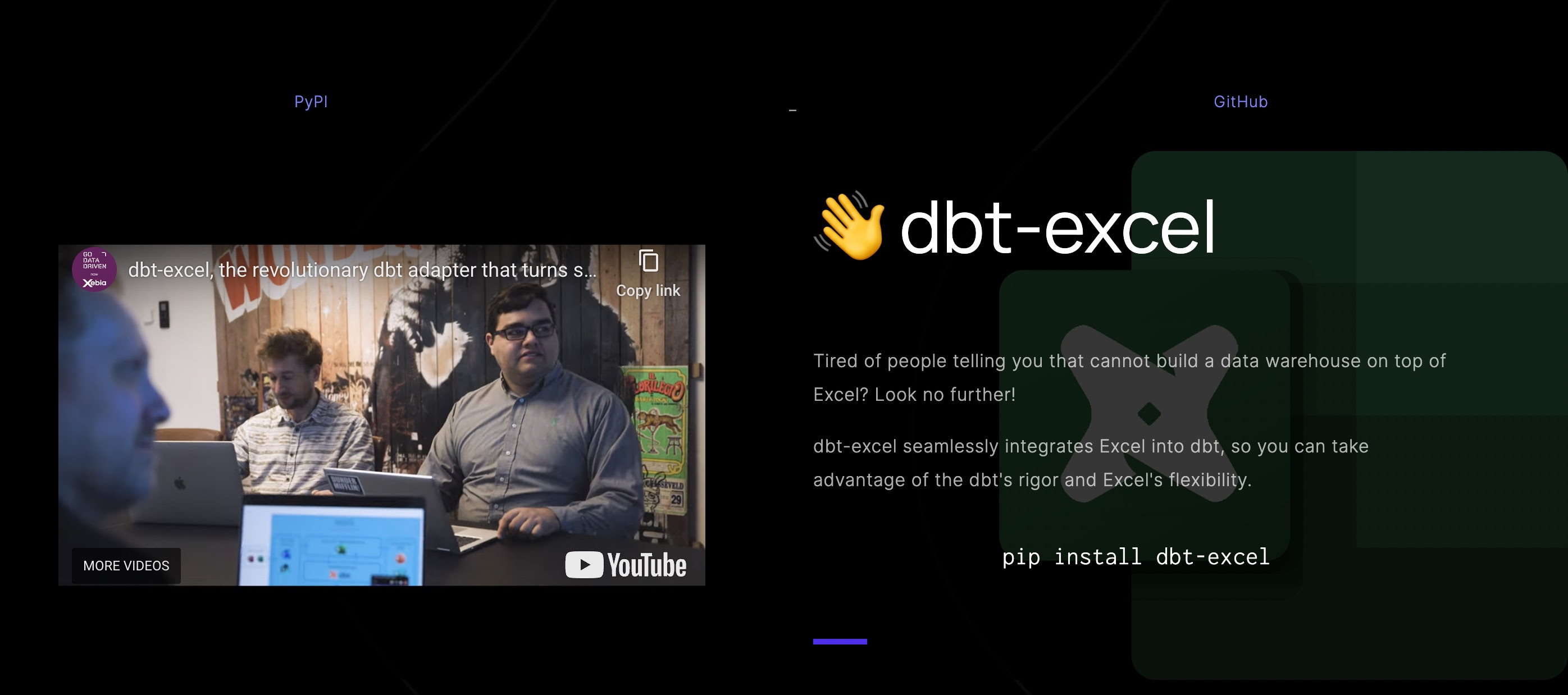
Data Joke
Now you can build a data warehouse on top of Excel, with dbt.
Is this even a joke or not? I’ll let you decide. ![]()
Here’s the website.
That’s all for this month. Stay safe and see you next month ![]()