Hi community!
We hope your weekend has been great. A few (maybe more than a few) updates going into the past month, including:
Reporting improvements
-
We fixed the bug where the Dashboard Refresh’s popover overlapped below the left navigation.
-
The separation border between the header and widget area in Dashboard went missing in the mobile view. We got it back.
-
Fixed a bug where comments using “@” for tagging would highlight the whole sentence.
-
In the Data Delivery modal, the tooltips of the “Single excel file” and "Multiple excel file” options are reversed. We switched them back

-
When creating a Data alert, the custom label of the field was not shown. We added them in so you can select the correct one easier.
-
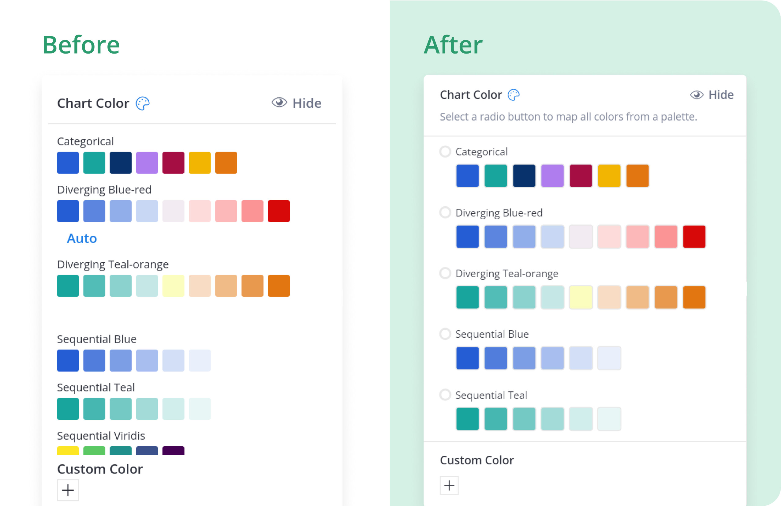
We improved the color picker’s interface for better clarity and easier to use.
-
Removed a bug where the Dataset showed saving Relationship update successfully (when it actually wasn’t).
-
Fixed a minor typo in the error message of our Condition

-
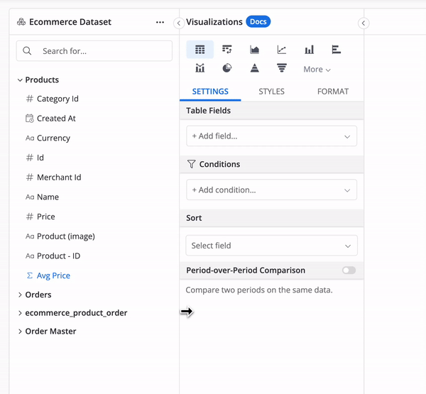
Allowed resizing the panels in the Dataset Exploration screen for Holitics version 2.0.
General app improvements
- Improved the searching mechanism of the user group when inviting new users.
- We removed a bug when clicking “Download” an exported file from the Notification display leaving tab confirmation in your browser.
- Improved the responsiveness of our Homepage & SSO sign-in page when viewing on mobile.
- Fixed a bug that prevented newly created reports from showing immediately on the left navigation.
Data Modeling
- Added a link to our docs to help you find documentation easier when refreshing a Data Model.
And a bunch of other fixes and polishes. That’s it for this month. Thanks to everyone who sent us feedback, reported bugs, and helped us improve Holistics for you ![]()