Hello December! It’s the most wonderful time of the year! ![]()
![]()
We’ve been jamming on some November UX updates and very excited to share with you. So here are 10 new UX/UI improvements that our team has been up to. Let’s dive in! ![]()
Reporting improvements
-
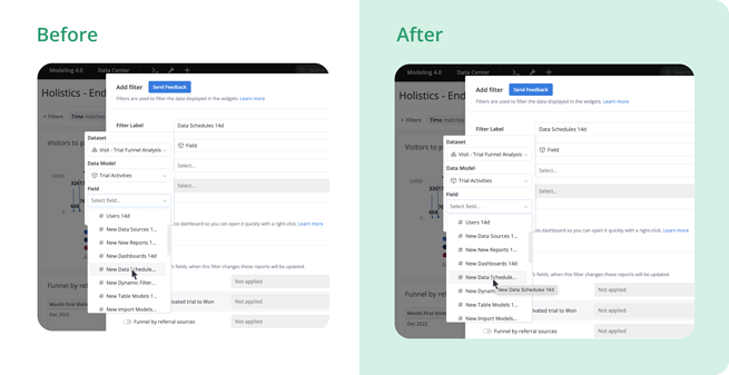
We fixed a bug in dropdown where you couldn’t see field’s truncated full name. Now you can hover on any field to see its full name

-
Funnel charts that have labels at the bottom are no longer hidden partially.
-
Fixed a small typo mistake in confirmation modal when deleting reports.
General UX & UI improvements
-
Made a tweak to correct the selected state’s color of “Save Report & New Dashboard” modal’s dropdown items.
-
Center-aligned the loading message when create new report from a Dataset.
-
Unified field input’s width in Jobs Filter segment.
-
In Settings, when using side menu to navigate between sections, section’s title got hidden. We adjusted the scrolling coordinates to fix that

AML
-
Prevented the folder tree dropdown from auto-expanding & auto-focusing when creating new item.
-
Updated branch’s name so that users can be aware that master branch is production branch.
-
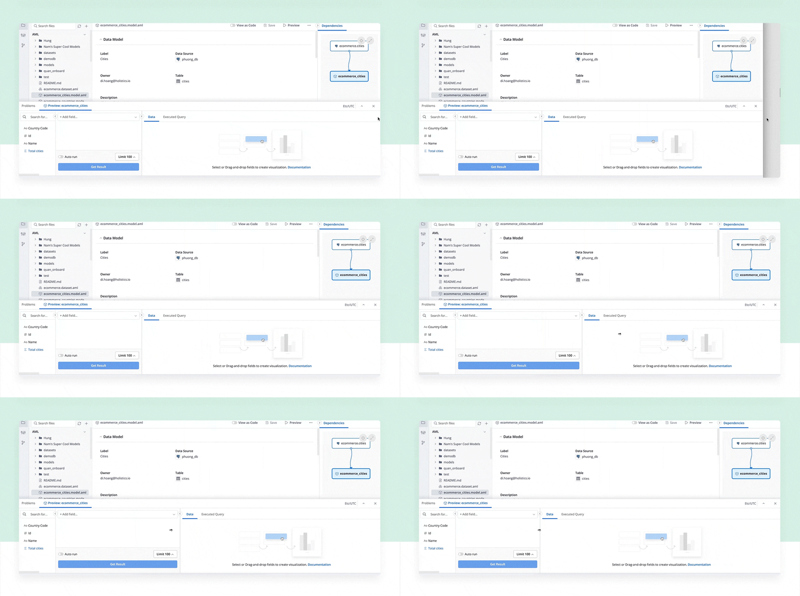
Timezone info and nearby buttons in Preview Panel are now always stick to the right edge of the screen.

That’s all for now! Stay tuned for the next update, folks ![]() . Thanks for being a part of Holistics community
. Thanks for being a part of Holistics community ![]() .
.
