Custom Charts Beta - Feedback Thread

With a few of us now beta testing Custom Charts, I thought it might be useful to have a thread to share feedback & ask questions, as I’m sure many of us will have the come across similar problems.

I need to spend a little more time with it, but some of my initial thoughts:

  • Will the ability to create custom charts be extended beyond ‘Admin’ role? I would say that anyone with Analyst permission should be able to create them. (Ideally, it might be a separate permission we can grant, but certainly shouldn’t be an ‘admin’ role)

  • A lot of the visualisations from Vega-Lite allow you to apply additional parameters (for example, for a histogram, setting the number of bins). rather than hard-coding these values, and for these custom charts to truely be re-usable, we need to be able to create a new user-input field for these parameters, and then pass that value through to the definition. (I can create a new input field, but this forces the user to select a field from the dataset which isn’t what we want here)

  • Be good if we could apply our existing colour palette to the chart rather needing to hard-code this.

  • longer term, being able to store these definitions in our github repo alongside our AML models would be preferable

4 Likes

Hey David,
Just on your second point (and maybe third) - have a look at the option definition properties (here: Custom Chart properties | Holistics Docs). I managed to set up 2 color pickers for a gradient area graph, it should be pretty simple to set up a number input to choose the number of bins. Then you would just reference the option value in the Vega Lite encoding.
For reference, it looks like this in my code:
The options block:

  options {
    option color1 {
      label: 'Color 1'
      type: 'color-picker'
      default_value: 'darkgreen'
    }}

Then to reference it in the Vega Lite JSON encoding:

 "mark": {
    "type": "area",
    "tooltip": true,
    "line": {
      "color": @{options.color1.value} 
    },
3 Likes

Thanks @Ian_McLaren , I’d completely missed that - yes this absolutely solves that problem!

1 Like

I’ve finally got a chance to start tinkering with this but can’t seem to get past the demo instructions. This is following the doc but I can’t get any further. What am I missing?

OMG it’s the comments…ok disregard :man_facepalming:

4 Likes

Absolutely agree with this! Only having admin’s creating charts is a bit of a pain.

+1 to that

Overall my feedback is that once you get a hang of the code and plugging in custom variables it works really well. I have had issues with more complex charts (confidence intervals) but for the “simpler” charts overall it works really well.

It would be great to have auto complete enabled for a lot of the definition, especially for the items in the curly brackets.

With the options section of custom charts, I’m not clear on what options are available. The one doc page says you can define things like histogram buckets but on the other doc page doesn’t mention that (i’m assuming they’re not hardcoding buckets). For example right now my chart looks horrible and I’d like to enable user to define the upper/lower boundaries which I swear I’ve seen on a regular chart. Is there a way to enable that type of option for custom?

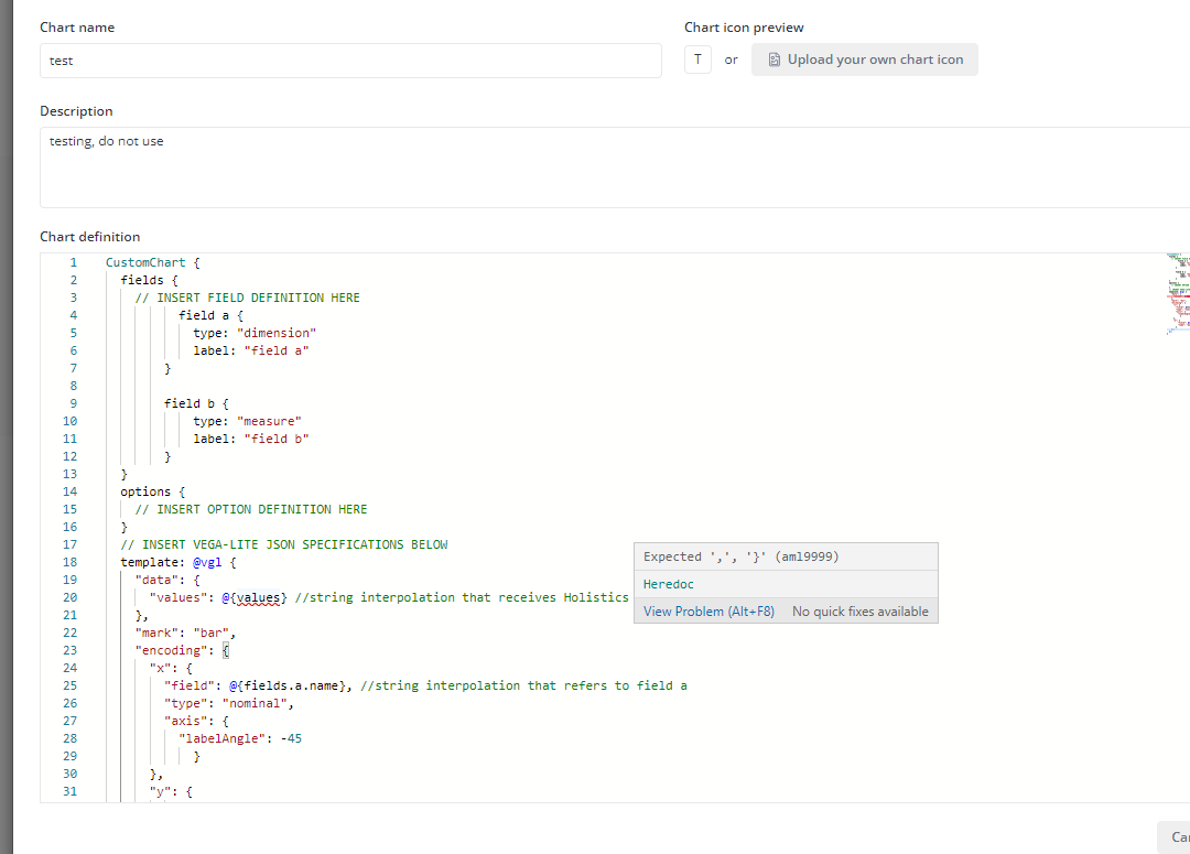
Hi @sm_mk, the options section of custom charts is where you define values to interpolate to the template.
Our document for custom chart options is outdated, we are updating it.

Meanwhile I will try to explain it here.


Currently custom charts option only support atomic values (string, boolean, number), and Holistics is supporting some pre-defined option type to render into the setting form.

The definition of an option looks like this:

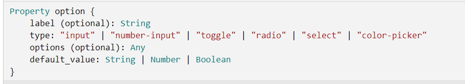
As you can see, there are currently 6 option types: input, number-input, toggle, radio, select and color-picker. I will go through each of them
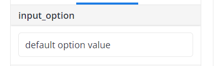
input option

This type of option renders a text input in the setting form, and will resolve whatever user put into that text input
image

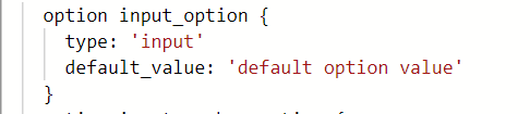
It can be defined like this:
image

After defining this option, use can use @{{ options.input_option.value }}
in your chart template to refer to the input value. Please note that input_option is just a sample name, you can define whatever name you want.
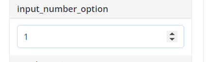
number-input option

Similar to input option, but renders a number input and resolves a number value
image

Definition:
image

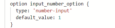
Reference in chart template: @{{ options.input_number_option.value }} (option name can be changed)
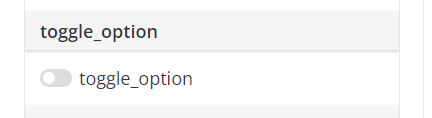
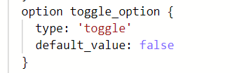
toggle option

This option type renders a toggle element, and resolves a boolean value (true/false)
image

Definition:
image

Reference: @{{ options.toggle_option.value }} (option name can be changed)
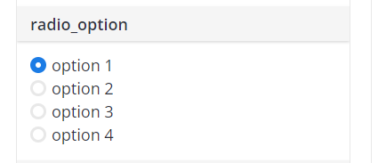
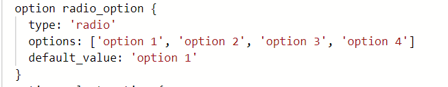
radio option

This option type renders a radio list, and resolves the selected value
image

Definition:
image
(the options property is needed to define the list of available options)

Reference: @{{ options.radio_option.value }} (option name can be changed)
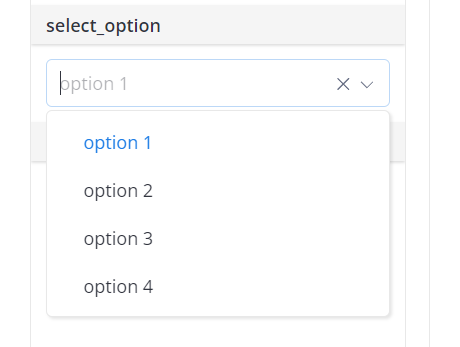
select option

Similar to radio option, but renders a select box instead
image

Definition:

Reference: @{{ options.select_option.value }} (option name can be changed)
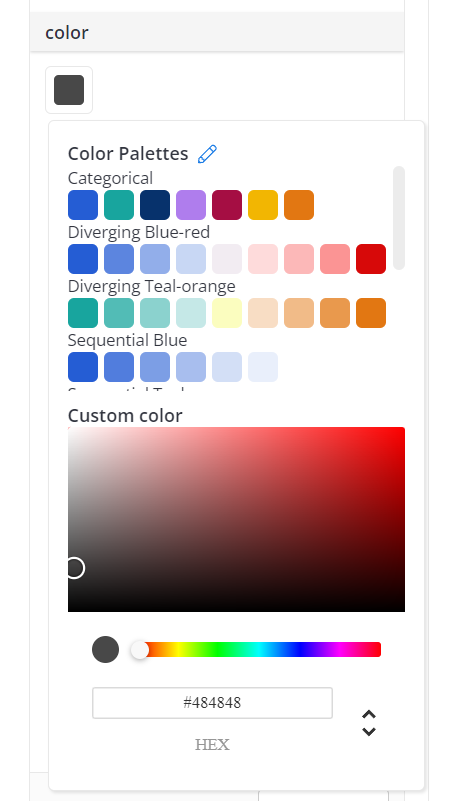
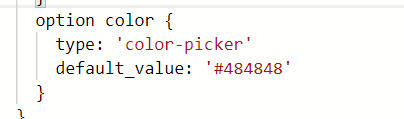
color picker option

This option type renders a color picker, and resolves the selected color hex code

Definition:
image

Reference: @{{ options.color.value }} (option name can be changed)

Notices:

  • If you define many options, their name must be unique
  • You can define label for option to let setting form render the label, instead of the raw option name
  • Each option must have default_value defined. Currently you will have to take care of default value type for each option type. For example, toggle needs a boolean value, number-input needs a number value, etc,. In the future, we will improve the editor to add auto suggestion, better validation as @DataGeekDude suggested above.

Coming back to your case, if you want to define the upper/lower boundaries of your chart, I think you can create two number-input options, assuming that you name them upper_bound and lower_bound. Then, in your chart template, use @{{ options.upper_bound.value }}
and @{{ options.lower_bound.value }} in proper places to set chart’s upper and lower boundaries.

Hope this information helps!

4 Likes

Perfect! I appreciate you taking the time to post these details, can’t wait to try it out on what I was working on.

2 Likes

Hi, when I discovered vega lite, I thought it was a great grammar that could be used to design a tableau-like UI for designing charts for end users.
Like a more user friendly version of this : Pole✭

I understand that with the custom charts feature you took a different path but is it something that could come in the near future ?

Thanks for the suggestion. Why would you prefer the tableau-like UI instead of the current visualization settings?

Hi @anthonytd,

For me, this kind of UI is a bit like a “nocode” experience of building custom charts which enables end users to be more autonomous.
The custom charts feature delivered today is more targeted to developers / data teams in my understanding.

Best regards,
Damien

1 Like

Thanks for the elaboration, @dacou. That makes sense now since it will open up more possibilities to end users rather than just data teams. Thanks for this great suggestion; we will keep it in mind for future custom chart developments.

How can we add a custom name for the X-axis and the Y-axis of the chart?
For example, instead of Count of Records or x1, x2 as below image, I can change it to difference name:

Hi Mike, we have released an update to our Custom chart parser. Now you can use comments inside the template :grin:

Hi Quang, to update those names, you can use axis labels. Please refer to vega-lite document here: Axis | Vega-Lite

1 Like

Hello @kaid, I hope you’re having a good day so far!

My organization has a use-case for the input forms that Vega-Lite generates instead of using Options, as the users of the inputs will be in the Viewer role rather than Analytics or Admin, and unable to access the options in the editor.

In this use-case, we will be tracking progress on metrics that will be gathered from the data tables we import into Holistics. However, the goal numbers are not in the data tables, and we would prefer not to hard-code them into the models.

I’ve tested the Vega-lite templates to use the generated inputs, and found that they are created just below the canvas of the visualization. However, this is hidden by the bottom panel that provides “Table Data, Chart Data, Executed Query” options. You can catch a glimpse of the generated input below the Custom Chart by selecting the maximize and minimize arrow on the right side of the panel, and flipping the bottom panel up and down. However, once the bottom panel moves, it resizes to it’s normal positioning below the Custom Chart canvas, and hides the generated input again.

Would it be possible to adjust the bottom panel to show beneath the generated inputs, if there are any? Or might we be able to capture both the visual and the input in the canvas that is presented in both the editor and report widgets?

Another Custom Chart issue I’ve encountered was with Geoshapes (Geoshape | Vega-Lite), and where or how to best define the URL for the JSON in the Holistics template. I’ve looked through the developer options in Chrome to find any errors, and found that the widget was unable to reference the URL I’ve provided, showing it was blocked from connecting to the site of the URL.

Would Geoshapes be a limitation for Holistics that is not yet supported, or would you happen to have any advice on how we could get this set up? I may be coding the template incorrectly, and welcome any suggestions on how to do so properly.

If it is supported, I believe this would help our organization address a different request of displaying Map reports with multiple layers of text, to provide location names and data counts on a custom chart to TV Screens that wont be using a Mouse to get tool-tip displays of the data.

Other than this, thank you very much for reading this through, and I hope you have a wonderful rest of your day!

3 Likes

Hi @tasha_launchcode, thanks so much for your feedback! Lets go through them one by one.

Regarding your first one, are you using vega-lite’s input parameter (Dynamic Behaviors with Parameters | Vega-Lite)? By default, custom chart will try to resize to fit to its container, which will make the inputs form hidden. You can consider this as our UI bug. I will work on a fix for this case, and will let you know once we release the fix.

About loading geojson files for Geoshapes, Holistics has a Content Security Policy (CSP) rule that block loading external resources. This behavior is to prevent our users from potential XSS attacks. I will discuss again with our team to see if we can loosen this rule to allow loading geojson files.
Meanwhile, there is a workaround. You can make use of our custom map feature (How to create a Custom Map | Holistics Docs), which is actually uploading your geojson file to Holistics’s CDN, that is not blocked by the CSP rule above. After creating a new custom map, you can get the raw uploaded URL of your geojson file and use it in your custom chart.

Hope these information help!

2 Likes

Hi @kaid, thanks for addressing these issues for us, and providing the map details! You are correct, I did use Parameters with input binding to test the use of inputs with the custom charts. For the maps, where would I find the raw uploaded URL? I’ve checked the custom map settings and looked through the docs on creating a custom map, but I may be looking in the wrong areas. Other than this, thanks again for taking a look into these issues for us, and I hope you have a great rest of your day!

1 Like

Hi @tasha_launchcode, since this workaround is very tricky and not recommended to use, I have PMed you and send the instruction there.
You can use it until we have a proper solution for your case.

1 Like