October is here! Get ready to be spooked by our app’s latest updates ![]() .
.
We’ve got some treats for you: 20+ exciting new improvements and delights to our app ![]()
![]()
![]() .
.
Let’s dive in and discover.
Reporting
-
We’ve cleaned up the “Create New Dashboard” modal with clearer error message and a required field indicator.
-
Alignment issues? No more.
- We’ve fixed misaligned items in “Job Monitoring” for a smoother experience.
- The alignment of field’s name and icons in Exploration is also readjusted for a clean and neat interface.
-
Enjoy a unified look with matching icons and text colors for selected folders in “Create new Dashboard” modal.
-
Loading indicator bug fix: Say goodbye to confusing loading message in a button
 . The loading indicator is now text-based for consistency
-
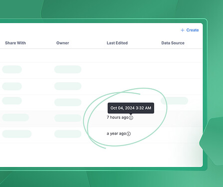
We’ve added exact timestamps to Folder View for your Dashboards. Now, you can easily identify the last updated time and find the information you need quickly✨.
-
We fixed a bug where the selected dataset wasn’t correctly reflected in the selector, happened when creating new Viz blocks.
-
The Actions icon now has a consistent width, regardless of the field label length.
-
We understand that copying and pasting table values could be cumbersome in the past. To make your experience smoother, we’ve now enhanced our table functionality. You can easily copy and paste table values by simply right-clicking on any cell or range. Plus, you have the flexibility to copy both formatted (WYSIWYG) or raw values, giving you more control over your data
 .
. -
We’ve expanded the bottom padding in Exploration for a more consistent look.
-
Notes on “Shareable Links” now display on multiple lines for better readability.
-
Notification bug fix: The progress counter in Notifications is now working as it should.
-
Color picker fix: No more accidental closures! The color picker in Viz Settings stays open when you select a palette
 .
. -
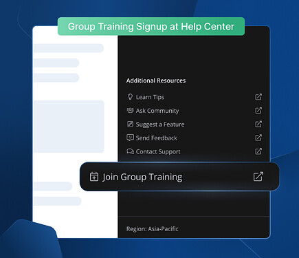
Group Training Registration Made Easy: From now on, you can find a convenient button in the Help Center panel that will take you directly to the registration page. Don’t miss out on this opportunity to get started and explore full capabilities of Holistics.
-
We’ve unified the titles of “Controls” in both dashboard and widget data alerts.
-
We fixed a UI glitch in Viz Settings where the field’s popover persists as you click on the dropdown.
-
We unified the copy of “Controls” titles in both dashboard and widget’s “Data Alert”.
-
The text and icon alignment in the fields list of “Exploration” is fine-tuned
 .
.
Modeling
-
Fixed the bug in “Data” tab where you can’t scroll down to see AQL Query.
-
We tweaked the file display color in Modeling’s left navigation to ensure consistency.
-
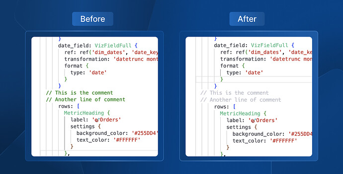
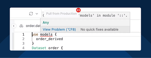
In code editor, we changed the comment color from green to light gray for easier code skimming
 .
. -
Conflict UX improvement: After resolving all conflicted files, AML will automatically commit.
-
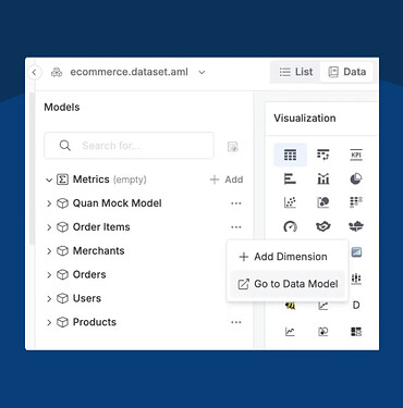
Added button “Go to Data Model” from the Dataset Data view for faster navigation

-
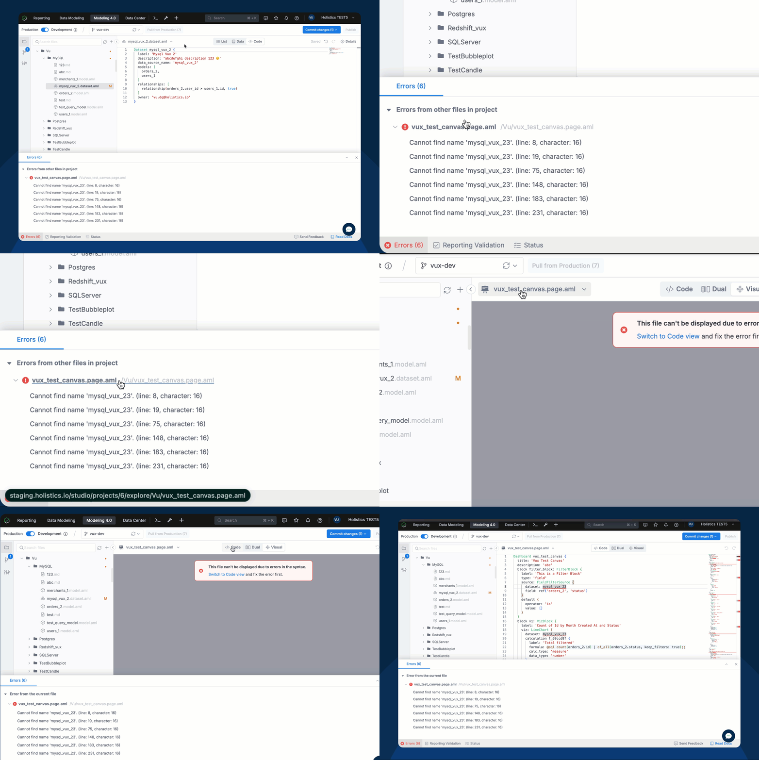
Clicking on the file name in the Errors tab now navigates the user to the file editor.
-
Bug fix: The Heredoc tooltip floats under some buttons will no longer happen.
General UX & UI enhancements
-
[Coming soon]Sidebar smarts: Our Sidebar will soon automatically scrolls to the currently selected item for a smoother navigation experience
-
The “Forgot password” page is now mobile friendly.
-
We removed the misleading icon on “Save” button in “User Attributes” modal.
-
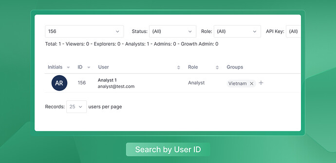
User search: you can now find users by their IDs in “Users Management.”

-
File Exporting made easy: Your exported files are now automatically downloaded instead of requiring a manual click like before

-
We’ve fixed a UI issue where the “Records” dropdown in “Data Schedules” had duplicate “100” options.
-
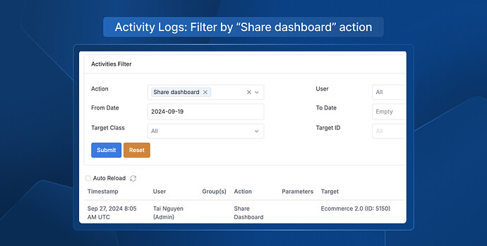
Activity Log action filtering: You can now filter “Share dashboard” action in Activity Logs

That’s it for this month. Happy haunting ![]() Enjoy these improvements and let us know what you think
Enjoy these improvements and let us know what you think ![]()
