Monday, November 18, 2024
We’d often call it The Excel Escape
You’ve got a well-curated dataset, a wealth of metrics to explore, and plenty of exploration features. Adding or tweaking visualizations is quick. Common analytical tasks (e.g.: period comparisons, running totals) take just a click or two.
It seems like enough—until tiny inconveniences creep in. A slow dashboard here, a cluttered table there, and suddenly exporting everything to Excel feels like the easier option, even if it means sacrificing BI functionality for the familiarity of spreadsheets.
At Holistics, we understand every little detail matters—down to the tiniest interaction, they make software feel seamless. That’s why we continue to roll out updates to make every interaction smoother, so you can stick with the BI tool you know and love—no Excel Escape needed! ![]()
 30x faster dashboard performance with Canal (now in Closed Beta)
Our performance team recently rewrote our query execution engine, leading to a 5-30x speed improvement when viewing dashboards, especially for large reports of up to 500k records.
For more details, check out our release post here: Introducing Holistics Canal - a fast query streaming engine, or our full demo here.
Canal now supports Postgresql, Redshift, BigQuery, and Snowflake. If you’re a Holistics customer and want to give it a try, sign up for our Closed Beta here.
 Hiding columns in Pivot Tables
Building on the positive reviews of our Hiding Columns feature in Tables, this update gives you even more control to tweak and tailor your data views when working with Pivot Table.
For more details, check out our community post here: Launched: Hiding columns in Pivot Table
 Two-factor authentication (coming soon)
Two-factor authentication (2FA) is making its way to your Holistics account, adding an extra layer of protection and security. Once enabled, Holistics will request a code from an authenticator app (e.g., Authy, Google Authenticator) on your phone, ensuring only you can access your account.
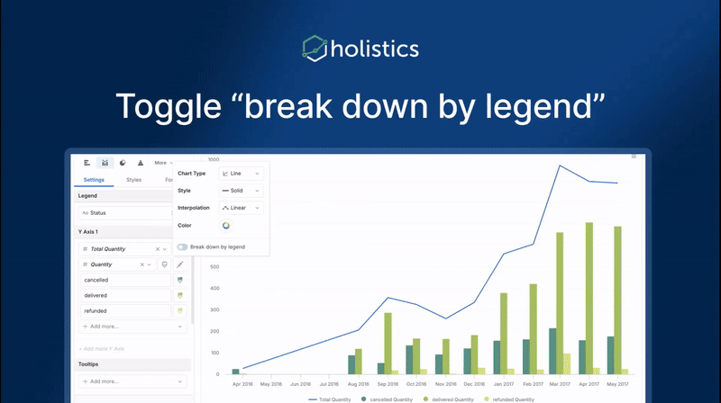
 Toggle to turn off “Break down by legend” for individual measures
Previously, every measure in your chart was always broken down by legend. But sometimes, you may want to apply legend to only certain measures, for example, visualizing a total value alongside sub-category values within a chart. Yep, we get it.
Now, with a simple toggle, you can turn off the “break down by legend” for individual measures, giving you more control over your visualizations.
Supported visualizations include line, area, column, bar, and combination charts.
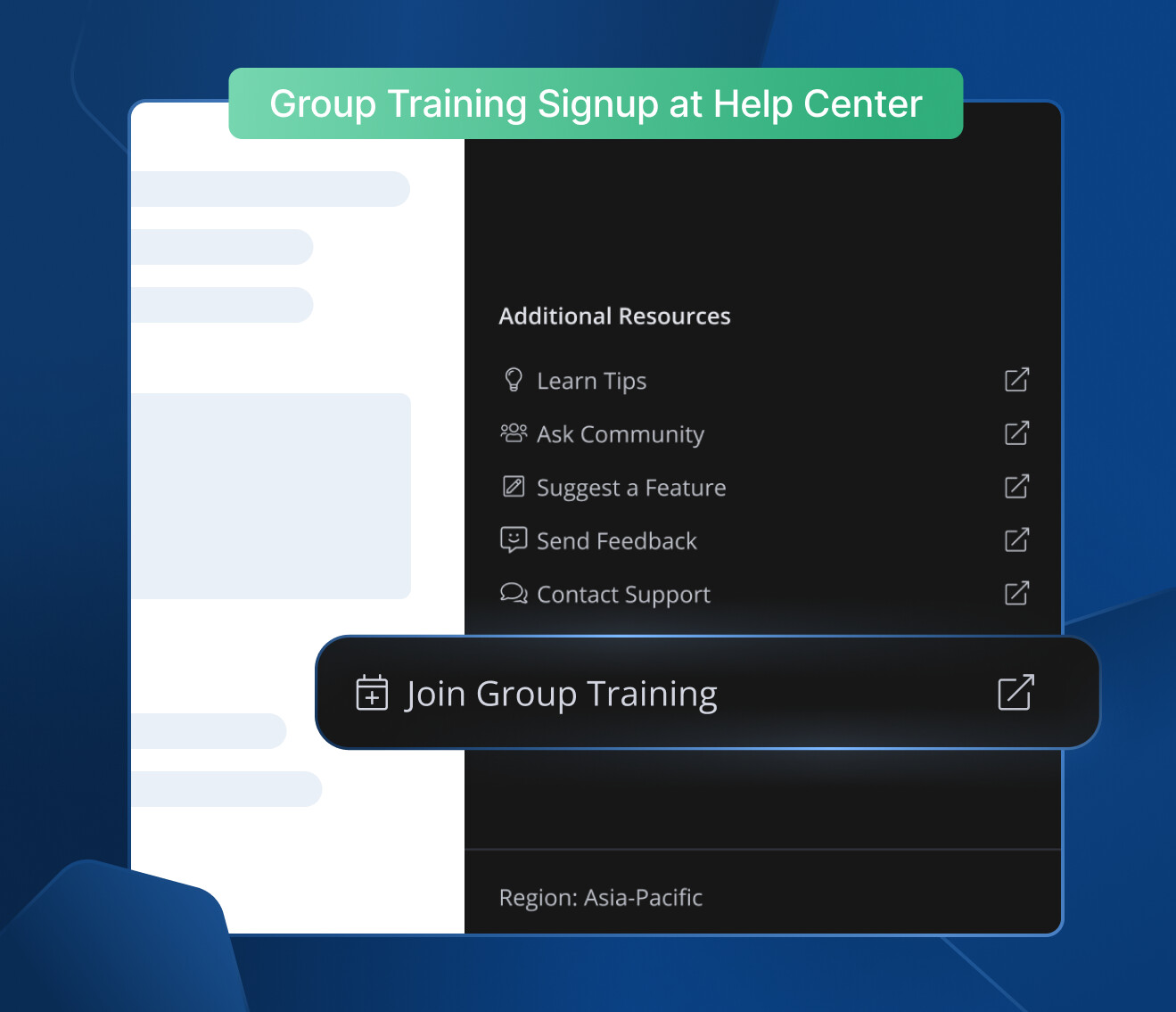
 Excited about the new features? Join our Free Training
We offer 60-minute live training sessions designed to help you get the best out of Holistics. With multiple time slots available, there’s a session that fits your schedule, no matter your time zone. And it’s completely free of charge.
Interested? Find a slot here, or sign up for Group Training through this handy button in the Help Center.
Not intrigued? Here’s what the audience has been saying! ![]()

 November UX Updates
Here’s a quick look at the highlights from our latest UX update:
- We added branch-switching confirmation when opening URLs, making it easier to track your location.
- Creating AML files is now safer – we automatically block special characters that could break navigation.
- Search panel now stays open after clicking results, making it easier to explore multiple items.


For more details, check out our community post here.