Question: How should I do to make our dashboards look cleaner and more attractive?
Tip #1: Change the display label of dimensions/measures with “Custom Label”
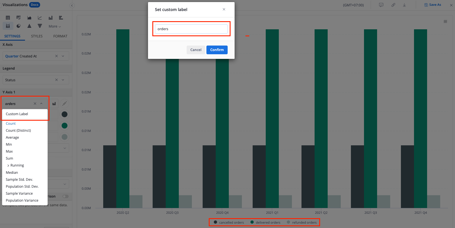
Use case 1: You want to change the display label to a more friendlier text
For example, here we change the measure “Count of Id” to “orders”:
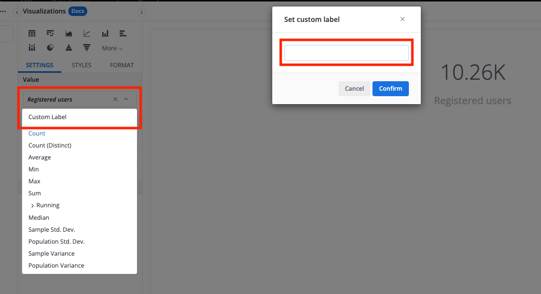
Use case 2: You want to remove/hide the label
For example, in order to hide the text below KPI Metric, we custom the label of the measure and give it blank:
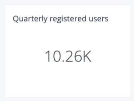
After that, our report will look as follows:
Tip #2: Change the display label of legends
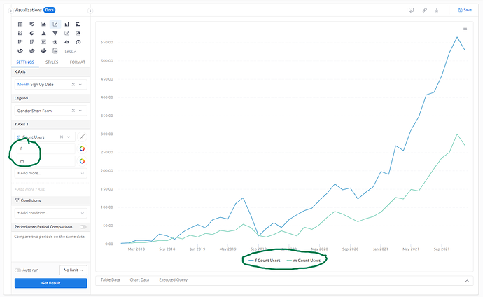
In some cases, you might want to change the legend labels to something friendlier (i.e: Female for f, and Male for m).
If so, you can read our detailed guideline here: Changing the display label of legends - Tips and Hacks - Holistics Community
Tip #3: Shorten the values with “Data Format”

Sometimes, the values are a bit long and take many spaces in your chart. In this case, you can use our Data Format to flexibly change the value display to suit your needs: Formatting Data | Holistics Docs
Tip #4: Change the chart color
Color is also one of the most significant factors that affect your dashboard look. We highly recommend you to:
-
Create some color palettes that fit your company; or
-
Custom the color to make your charts look prettier
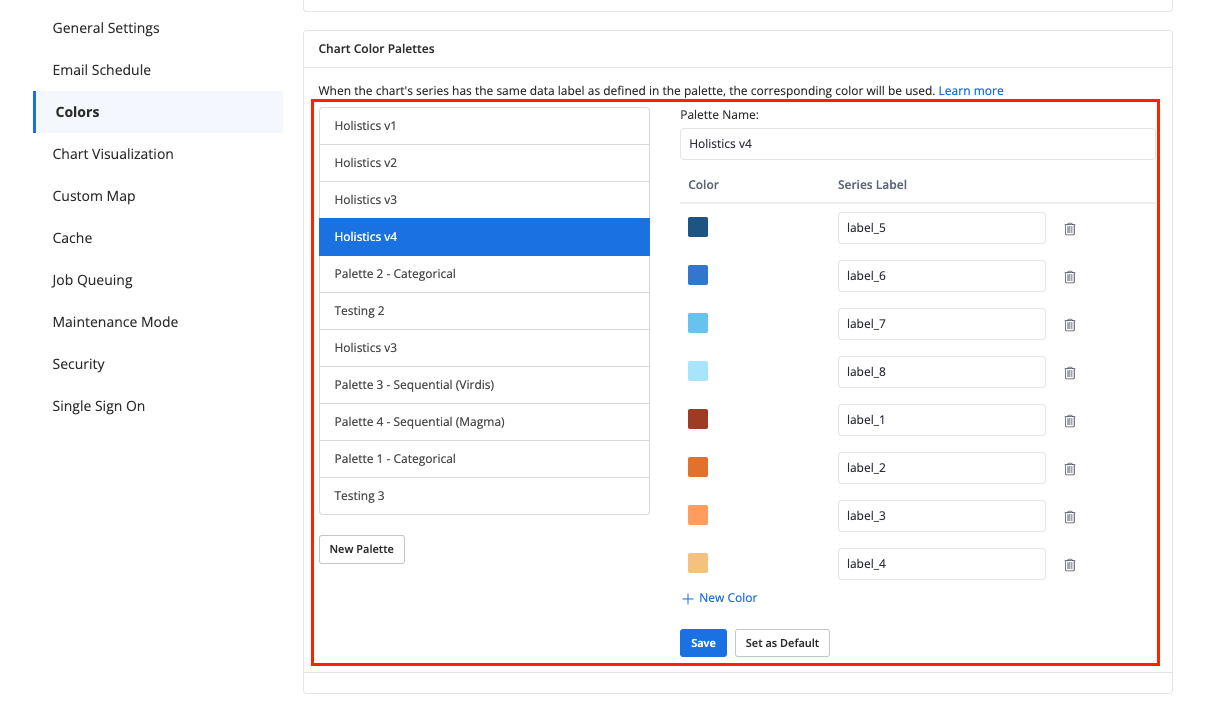
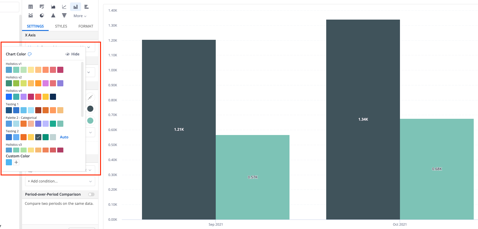
For more information on theme and color settings in Holistics, you can read our doc here: Themes and Colors | Holistics Docs
Tip #5: Add an image to your dashboard (i.e: logo)
We’ve already opened another topic to discuss on this tip, you can read it here: Embedding an image in your dashoard - Tips and Hacks - Holistics Community