Hi David,
Thank you for your reply.
However, this is not about filtering, but it is about how your data gets grouped, visualized and gets compared to previous periods.
But good that you mention the filters, I will get back on those in the end.
Example Use Case
Imagine the company you’re working in, is used to report on 30 days, then you would probably want to create a bar or timeline chart with 90 days (3 periods of 90 days) to make a timeline chart that makes sense.
In that timeline chart, you would get back 3 data points, each one representing 30 days.
This same principle applies to other charts.
Use this combined with the right filters
Now we get to the interesting point, and that is you mentioned filters, which I created another feature request for More Control on Dashboard Date Filters
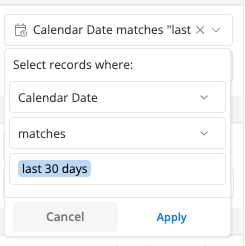
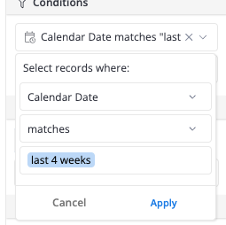
There my feature request is to let Analysts predefine date ranges, that can be used as filters in dashboards. Let’s take again the example of 30 days to explain the value when this is consistent with filters.
When you show your data grouped by 30 days, it doesnt really make sense to filter by last month, because doing so will not show the 30 days where your data is grouped by, it would for February show 28, for march 31, may 30 etc.
This is why, i think it would be very useful to be able to centrally define your custom filter ranges, and the corresponding default date drill. My default date drill would be 30 days, and I would create custom date filters such as:
- last 90 days
- last 60 days
- last 30 days
With custom date filters, I mean limiting end-users to only use those in the dashboard, as others don’t make sense to use.

