Hi
You recently wrote an excellent blog post about how Amazon measures itself. One of the things you mention is that they use a graph of change in YoY growth.
It is currently possible to get the change numbers in tables and see the change in the toolbox in graphs, but it is not possible to plot the change data itself.
Could you create an option to plot the PoP change as it would be helpful for the reasons you mention in the blogpost.
Thanks @mabr, this is indeed valid. Unfortunately, the current mechanism doesn’t support this. However, we are revamping the Holistics Expression, which will enable you to generate PoP fields under the visualization settings so that you can flexibly plot them however you like.
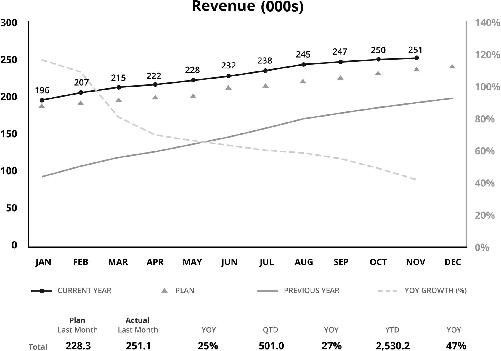
Including the post’s image here for the convenience.
That sounds good with the expression revamp! Do you have any ETA on it?
Also: I guess that would also make it possible to pass the values to custom visualizations, right?
Hmm, hard to say since this is a big change. However, the new expression is being actively researched, we will keep you informed on any further updates.