So, to keep it nice and short… I have a bunch of measures which I want to all put into one pivot table in such a way that each measure will sit on it’s own row while columns will represent a dimension splitting those rows into columns.
Currently if I drop a few measures into one pivot they will all be represented as columns instead of rows.
Would you be able to draw out what you mean for easier interpretation?
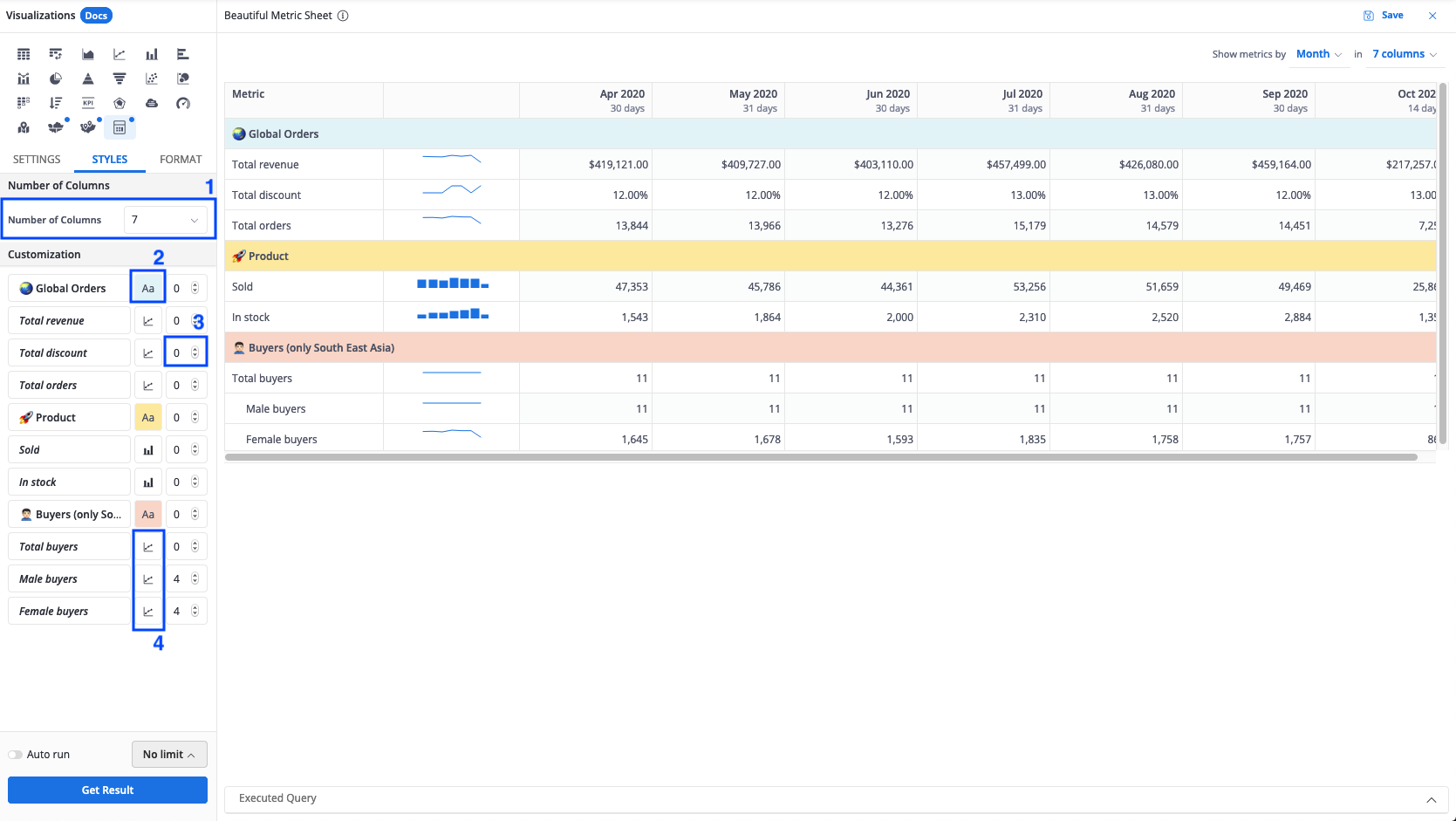
It looks like what you’re looking for is something like metrics sheets, except that instead of date/time, you want to have your own custom dimesion (country, category, etc)?
Yes, this is pretty much exactly what I mean. So, transposed pivot table (which is what your metrics sheet is in essence) but with ability to split not only by date but also by other dimension in my dataset
Unfortunately, right now the Metric Sheet and the Pivot table are the closest to your expectation.
I’m curious: is there any specific reason why you would like to transpose the pivot table instead of the same format?
I have the same request. The reason I want it is that we’re displaying accounting data by region. I would like the regions to be the columns and the revenue, cost, net revenue etc as rows as that’s much easier to read.
Hi @dmitry_sofiev and @andrea
I have the same request with u. Especially when I work with a table having 5-6 columns but just one row only, I’d like to swap its columns and row to make the table easier to read.