Tuesday, May 20, 2025
For three days in June 2023, we tried running a yogurt shop.
It was during dbt Coalesce. We took over a small yogurt store and rebranded it the Analytics Engineering Hideout, a place people can just grab a cup of yogurt, play some video games, and briefly pretend broken dashboards don’t exist.
This turned out to be (somewhat unexpectedly) harder than running a BI company. But we managed to give out 200 cups of yogurt by the end of it.
Yet, somewhere between cup #1 and cup #200+, we barely mentioned Holistics.
Instead, we talked about the everyday pains of data work, the kinds that Holistics is built to solve, through taped memes on the wall. Memes about endless stakeholder asks, about dashboards that always seem wrong, and about the mind-numbing thrill of writing the same SQL for the fifth time this week.
People loved the memes, and felt the pain.
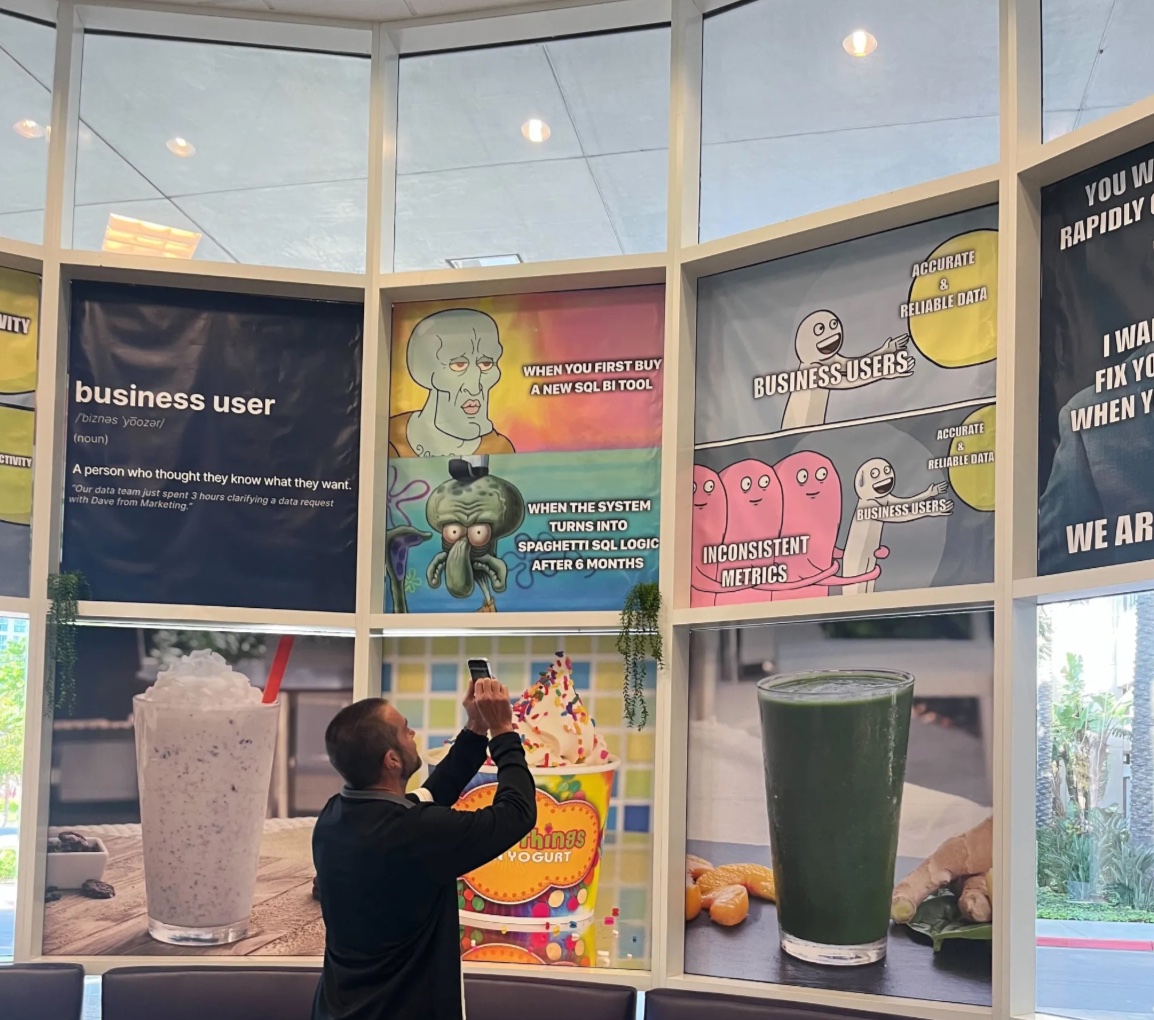
Someone said, “Wow, this is painfully accurate, I’m going to send this to my boss,” (pic), which might be the highest compliment you can receive at a data event. It gave us more confidence that we’re on the right path, that these are the real pains that deserve better solutions. So this year, we’re doing it again.
![]() Catch us at Snowflake Summit!
Catch us at Snowflake Summit!
From June 2–5, the Holistics team will be in San Francisco for Snowflake Summit 2025. We’re not setting up a yogurt shop this time, but we are showing up with the same spirit: open conversation, and hopefully a meme or two.
If you’re going, we’d love to connect, whether it’s to talk about your analytics challenges, walk you through where our product is headed, show you our cool features, or just say hello!
![]() Drop us a note if you’ll be there.
Drop us a note if you’ll be there.
 Looker to Holistics Migration Tool
“So Holistics is the cheap Looker knock-off is what you’re telling me here?”
Someone said this to us during a sales call two years ago. Reality hits you like a train sometimes. You shrug it off. You keep building. You had to.
Fast forward to today: “You’re doing the same s** as Looker, and you’re beating all of them on capabilities*,” said another customer who switched platforms.
The market is speaking. We’ve seen teams migrating from Looker to Holistics for better self-service flexibility without sacrificing governance. Just last month, we helped a team transition their entire analytics stack - 40+ dashboards and 120+ models - in only two weeks with five people.
Our Looker Migration Tool is now officially live!
This tool helps Looker users move their existing setup into Holistics with minimal friction. Our migration tool converts your Looker views to Holistics models, including dimensions and measures, so you can hit the ground running with your familiar data structure.
Ready to make the switch? Check out our comprehensive Migration Guide, or if you have questions about migrating from Looker, just drop us a note.

 Improved View Underlying Data
One customer recently told us, “We finally trust the numbers we report. When our finance team saw how metrics were calculated, they were super happy — they could verify and explain every number.”
Early feedback for this feature has been great. We love to see how our customers are using it to provide more transparency into their data. And following your feedback, we’ve now made it even better.
With our improved View Underlying Data, you can:
- Drill down into each step of your conversion funnels to understand drop-offs at a granular level.
- Generate a link to the underlying data view and share it with your teammates.
- Experience our full table capabilities in the VUD interface for better sorting, filtering, and analysis.

 Dynamic Dimension Breakdown (Coming soon)
You’re trying to understand how your Sales perform across Countries. Then by Product. Then by Customer Type. So you build chart… after chart… after chart.
50 dimensions. 50 charts. And your once-clean dashboard is now bursting with clones, one for every angle.
Well, not anymore. With our upcoming Dynamic Dimension, you can now break down dimensions in visualizations with zero setup required.
Why you’ll love it:
- End users can swap breakdown dimensions on the fly.
- One chart can now display multiple dimension breakdowns, reducing dashboard clutter.
- Dashboard builders can tailor a better exploration experience with customizable dimension lists.
- Works with line charts, pie charts, and conversion funnels
 Calculation Builder: Create Powerful Metrics Without Code! (coming soon)
AQL lets analysts build complex metrics much more easily, but learning it takes time. And we know not everyone has that luxury. That’s why we’re building Calculation Builder to let you tap into the full flexibility of AQL, through a point-and-click experience anyone can use.
Why you’ll love it:
- Zero coding required: Create, customize, compose metrics with just a few clicks.
- Powerful calculations: Build count, sum, average, running totals, and conditional metrics effortlessly.
- Progressive learning: View the generated AQL behind your GUI calculations to gradually learn the language.
- Advanced customization: Convert any GUI metric to AQL for further customization when needed.
This update includes support for all basic aggregations (count, sum, average), conditional aggregations (count if, sum if), running totals, and more—all through a simple point-and-click interface.

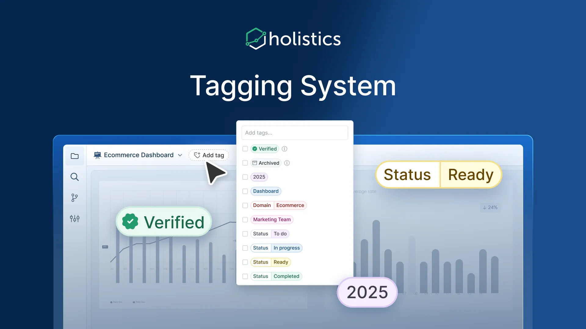
 Tagging System: Organize and Discover Analytics Content with Ease! (Coming Soon)
Managing a growing library of dashboards and reports has become increasingly challenging for data teams. Without proper tools, valuable analytics content gets buried, making it difficult for business users to find trusted information when they need it most.
We’re excited to announce that our new Tagging System is coming soon! This powerful feature will transform how you organize, discover, and understand analytics content across your organization.
Our Tagging System is coming soon to solve this.
Why you’ll love it:
- Quickly filter and find exactly what you need without navigating complex folder structures.
- Instantly understand content purpose, status, and relevance without reading lengthy descriptions.
- Systematically categorize content with consistent, meaningful tags.
- Easily identify verified, up-to-date content among similar items.
Code Search and Replace
Navigating through complex data projects often means hunting for specific code snippets across numerous files, a time-consuming process that can lead to inconsistencies and errors when making changes.
We’re excited to launch Code Search & Replace, now out of Beta! This feature allows you to quickly find and update any string across your entire data project with confidence and precision.
Why you’ll love it:
- Enhanced filtering: Use multiple filters simultaneously for more precise searches.
- Text input for filters: Type filters directly into your search field for added convenience.
- Dismiss: Easily hide specific results or entire files with the Dismiss button, ensuring they won’t be affected by replace operations.
- Significant UX improvements: Enjoy highlighted search keywords, seamless tab switching, and numerous other enhancements.
Big thanks to everyone who shared feedback during the Beta! Your input helped shape this feature into something even better.

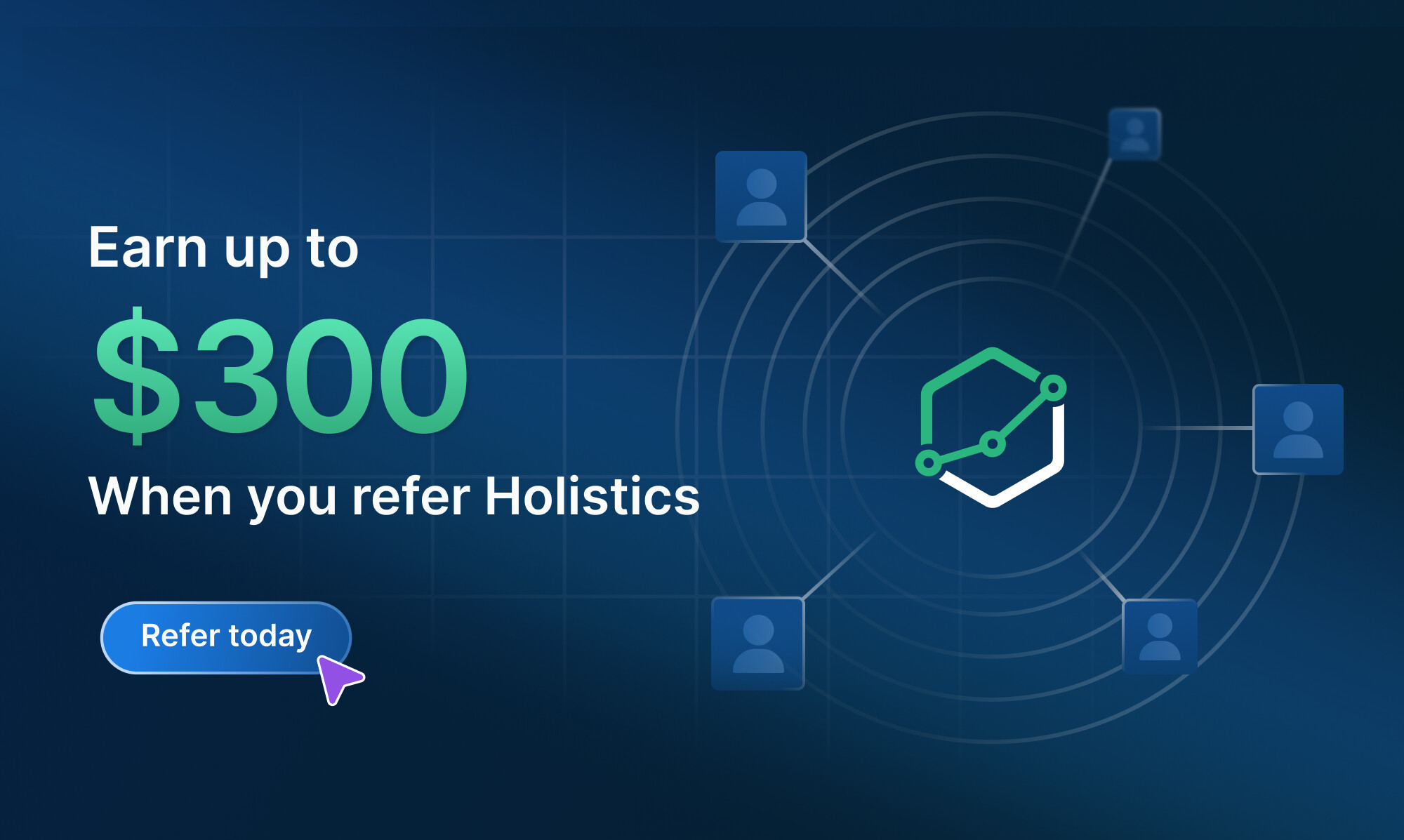
Holistics Referral Program: Share Holistics, Earn $300
Great tools are meant to be shared, and now you’ll get $300 when you do.
We’ve launched our referral program to reward customers who help spread the word about Holistics.
If you know any friends who could benefit from a more intuitive analytics platform, send them our way. We’d be grateful for your recommendation. When someone you refer subscribes to Holistics, we’ll send you $300 as a token of our appreciation. ![]()
Learn more about our referral program.
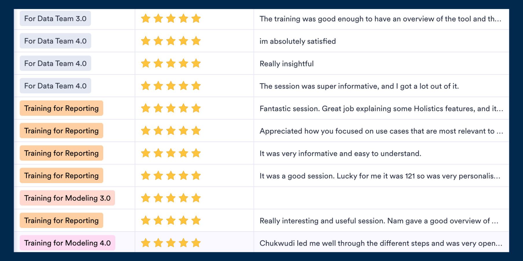
 Excited about the new features? Join our Free Training
We offer 60-minute live training sessions designed to help you get the best out of Holistics. With multiple time slots available, there’s a session that fits your schedule, no matter your time zone. And it’s completely free of charge.
Interested? Find a slot here.
Not intrigued? Here’s what the audience has been saying! ![]()
 May UX Updates
Here’s a quick look at the highlights from our latest UX update. There are A LOT of them, so make sure to check out our Community post here for more details.
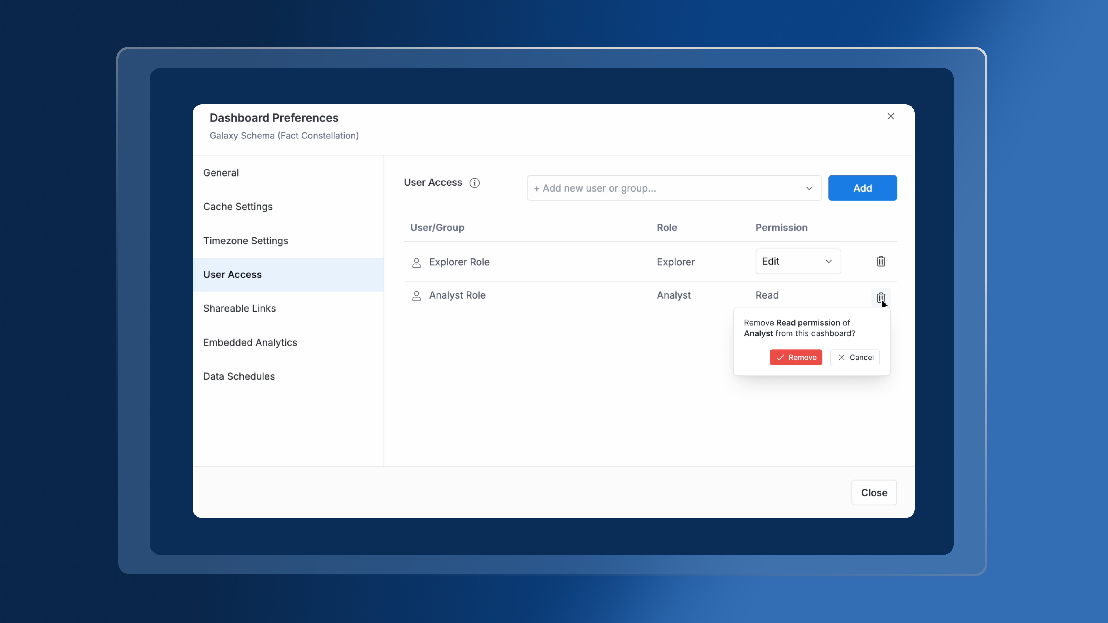
Added confirmation modal before removing dashboard access
To prevent accidental permission removal — an action that previously had no recovery path — we now prompt users to confirm before proceeding.
Stabilized date picker input behavior
Resolved an issue where the date picker behaved inconsistently when users typed values manually, improving reliability and input control.
Enhanced discoverability of “More Custom Format” option
Updated visual styling makes this option more clearly interactive and noticeable, reducing missed interactions.
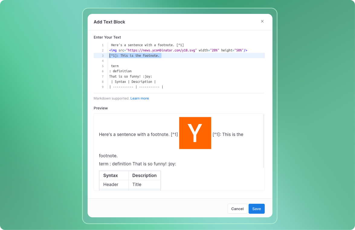
“Markdown supported” is now a contextual link
The note in applicable input areas now links directly to documentation, enabling quicker access to formatting guides and syntax reference.
Final words
That’s all for this month. If you’re curious about our upcoming direction, check out our Product Roadmap. If you’re interested in what we just released in the past few months, check out our Release Note.
Do you have any feedback for us? If you do, hit Reply and let me know. Or connect with me on LinkedIn and we can chat.
I’ll see you again real soon!