Tuesday, Mar 18, 2025
“You have built an amazing product. Canvas dashboards are f**king cool, reusable data models are brilliant…” Our customer said during a recent review call.
Then came the pause. “But…”.
For most people, the “but” is a knife that cuts through compliments. It’s a verbal guillotine we all recognize. It marks the moment you have to face your shortcomings.
As a product builder, though, I’m grateful for every “but”. I learned to love them. When you say “but,” you’re showing us exactly how we can be better, and we’re grateful for that.
“But for end-users, it needs more polish. It’s those little tiny finishing details that make or break,” our customer continued.
In that “but” was everything we needed to know.
This is why 2025, for us, has been the year of squashing the “but”. We’re hunting down rough edges, confusing interactions, and moments of frustration. We’re making everything in Holistics more polished, more intuitive, and easier to self-serve, for everyone. Our latest batch of updates continues this commitment.
So if you have any feedback for us, big or small, we’d love to hear it. Hop on a call and let us know.
 Show Metrics as Rows in Pivot Tables
This new update lets you display metrics as rows instead of columns.
Simply toggle from “Show as columns” to "Show as rows” to compare all metrics at once. No more straining to analyze metrics crammed into columns, no more eyes darting back and forth, and no more missed insights!
For more details, check out this community post.
 Custom Table Styling (coming soon)
You stare at a table that stuck out like a sore thumb on your otherwise beautiful dashboard. The visual inconsistencies start to creep under your skin. You know what your tables could be. You see it so clearly. But the tools fail you.
Not anymore. With our new Table Styling feature, you can now:
- Customize every part of your tables - headers, body, columns - exactly how you want them.
- Create a consistent visual experience that matches your Dashboard Themes.
- Override theme styles for special tables that need their unique look.
 View Underlying Data (coming soon)
Ever seen a spike in your chart and wondered “What’s really going on here?” or "Why does this number look the way it does?"
Our upcoming View Underlying Data feature makes answering these questions easier. With just a click, you can instantly see what makes up any value at its most granular level.
It requires zero setup. You can easily customize your view by adding or removing columns from the underlying table, giving you complete control over your analysis.
 Drill down (coming soon)
Besides View Underlying Data, you’ll also get Drill down to dig deeper to understand what’s driving your numbers.
Drill down allows users to easily explore a data value across specific dimensions in just a few clicks. It requires zero setups and offers a smart list of suggested dimensions for a smoother analytics experience.
 Improved AQL Error Handling System
By now, you’ve probably heard plenty about AQL capabilities. But we have to admit: writing AQL isn’t always a smooth experience.
We also know nothing kills productivity faster than AQL queries breaking at runtime with cryptic error messages.
So we built a better error handling system for AQL.
Our AQL editor now provides real-time feedback as you type:
- Immediate error detection with highlighted error locations.
- Complete stack traces to easily pinpoint errors in complex queries.
- Relationship validation that explains table connections right in the editor.
- Comprehensive AQL error reference documentation with explanations and solutions.
For a full demo and more details, check out this release note.
 File history via GitHub/GitLab
You signed up to be a BI developer, not a detective.
Yet you find yourself spending hours tracing down WHO changed your data model WHEN, and WHY. It gets worse when you’re switching between tools, digging through commits, and piecing together the story behind each change. Meanwhile, deadlines loom, and requests cry.
No more detective work. Now you can directly access your files on GitHub or GitLab with a single click, right from the Holistics interface to:
- View source code directly in GitHub/GitLab
- Access Git blame to track code changes and authorship
- Review complete file history and previous versions.
 Find Code References Faster with Project-wide Code Search
Playing “Where’s Waldo” is mostly fun, except when you’re doing it with your code references. Then it’s just annoying.
That’s why we’re excited to announce that our Code Search is now in open beta. With Code Search, you can:
- Find every file where a metric, model, or data source is referenced
- Plan your refactoring with confidence by seeing every affected file
- Search by description, label, and other criteria to find exactly what you need
- (coming soon) Replace search results with new code, filter results by object type, and more!
Since this is an early access release, you might notice some rough edges in the design and experience. If you have any feedback for us, we’d love to hear it.
 Reusable Component Library (coming soon)
You don’t need a national survey to know that most data teams rebuild the same charts again and again across different dashboards. We’ve all been there, staring at a new dashboard request and thinking “I know we’ve built something like this before…?”
Your best dashboard components deserve to live multiple lives, not buried in some report from last quarter, waiting to be rebuilt from scratch.
With Reusable Component Library, every visualization you create can become a building block for future dashboards. When you need it again, simply grab it from your library, tweak it, and you’re done.
And we’re just getting started. Soon, you’ll be able to reuse entire metrics and datasets too.
 Write AQL Without Context Switching (coming soon)
Another tool to help you write AQL without constantly switching between the editor and documentation: AQL Quick Reference, built right into your AQL editor. You’ll have access to:
- A complete function library
- Operator guides
- Real-world examples you can copy and paste
- Core concepts explained in plain English
Everything is searchable, right from your editor.
 Excited about the new features? Join our Free Training
We offer 60-minute live training sessions designed to help you get the best out of Holistics. With multiple time slots available, there’s a session that fits your schedule, no matter your time zone. And it’s completely free of charge.
Interested? Find a slot here.
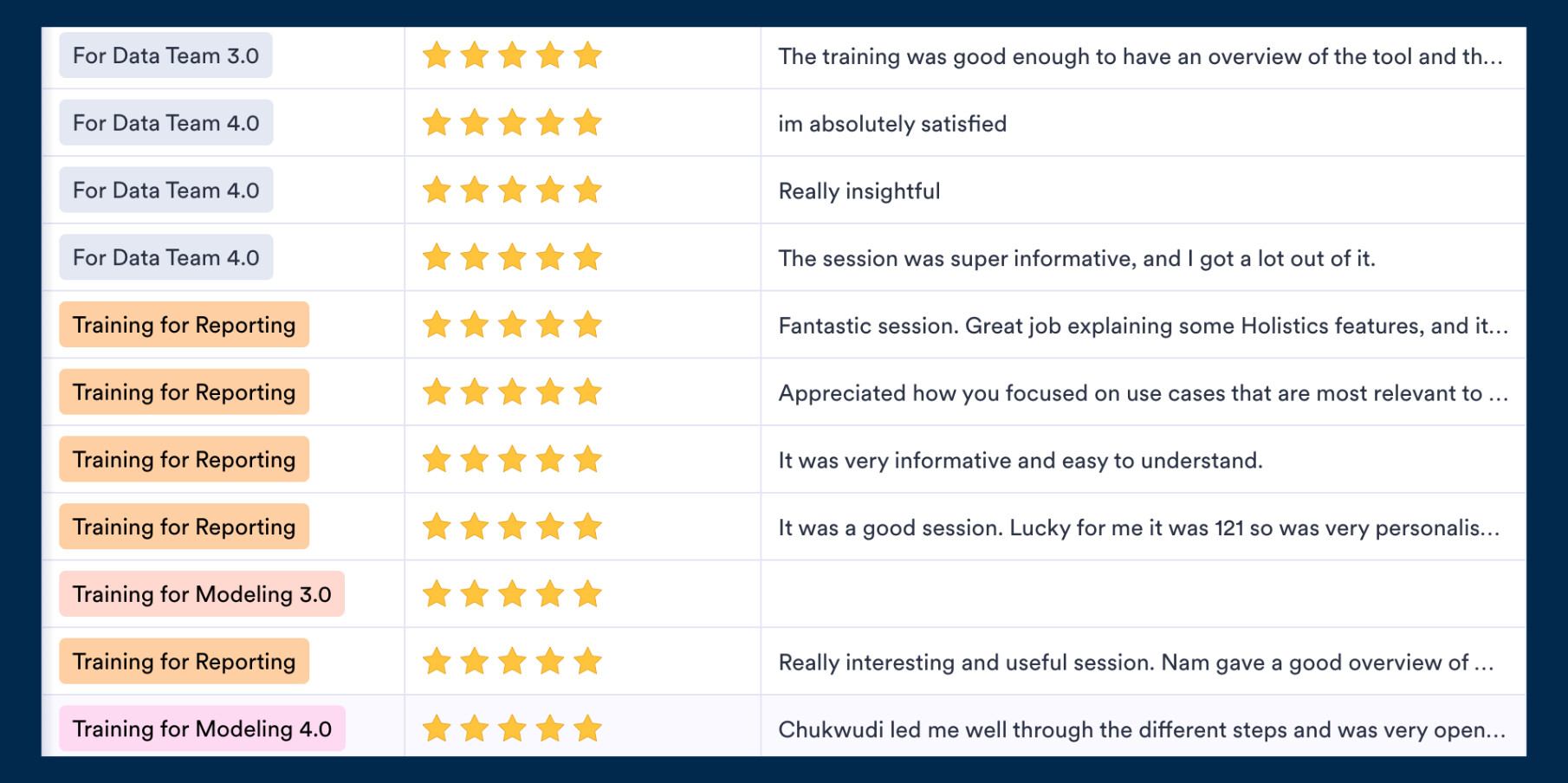
Not intrigued? Here’s what the audience has been saying! ![]()
 March UX Roundup
When I say we’ll be hunting down rough edges, I mean it. This month, our design team delivered almost 20 improvements and updates to make everything a bit more polished, a bit smoother, and a lot more enjoyable.
Here are some highlights:
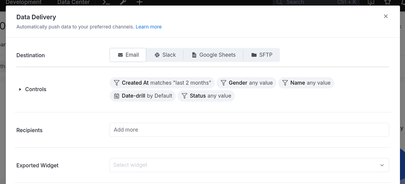
We’ve updated the Schedule destination selection UI to improve consistency and usability.
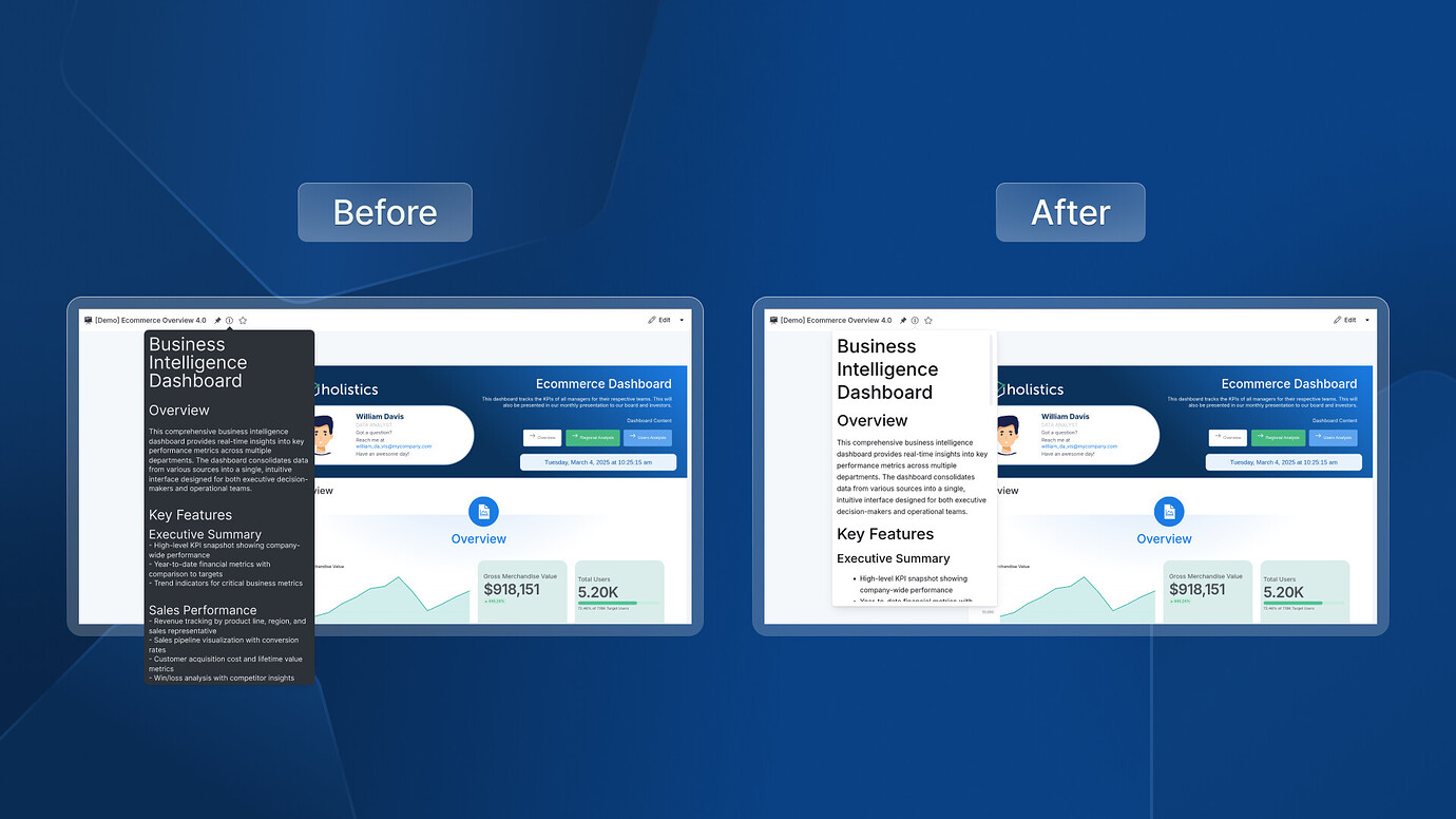
We’ve fixed the issue causing dashboard descriptions to overflow when dashboard metadata is disabled.
