Monday, June 16, 2025
Just got back from Snowflake Summit. What did we learn?
This.

Juggling is fun, until it starts looking like your job.
In data work, it often does: juggling endless requests, dashboards that won’t stay fixed, and the occasional emergency ping at 4:59 PM. And unlike real juggling, dropping these doesn’t get you any laughs. You’d just get Slack-ed harder.
So you either keep juggling, hoping nothing falls. Or, you teach others to catch the balls themselves.
This month’s updates help with the latter*:* fewer things for data teams to juggle, and more ways for everyone else to self-serve without dropping anything important. From tabs that tame dashboard sprawl to 1-click calculations that make complex analytical functions simple (and fun), we’re building tools that make juggling optional.
By the way, did I mention we love hearing from you? If you’ve got feedback, ideas, or even just want to yell at us, book a review call with our team here.
 Just Released
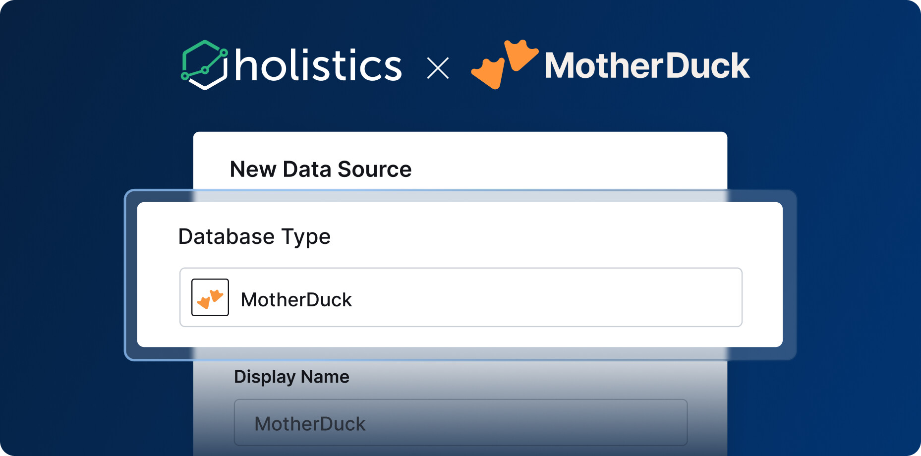
 MotherDuck Connector
We’re excited to announce that our integration with MotherDuck is now available, allowing you to combine the robust, scalable data processing power of MotherDuck with Holistics’ governed self-service platform. For more information, check out our docs here.
 Even More Powerful Tabs in Canvas Dashboard
Dashboard navigation shouldn’t be a maze. When analysts create complex reporting solutions, end users often struggle with lengthy, scrolling dashboards that bury critical insights. That’s exactly why we built Tabs for Canvas Dashboard—and why we’re making them even more powerful this months:
- Tabs Switch Cache: No more loading delays. Switch between tabs instantly with intelligent caching that keeps your workflow flowing.
- Tabs Export: Export exactly what you need—current tab, all tabs, or selective tabs—with complete control over your data sharing.
- Tabs Filter Mapping: New Filters modal provides crystal-clear visibility into which filters apply to each tab, eliminating guesswork and boosting confidence.
 Calculation Builder: Create Powerful Metrics Without Code (Now in Beta)!
AQL lets analysts build complex metrics much more easily, but learning it takes time. And we know not everyone has that luxury. That’s why we’re building Calculation Builder to let you tap into the full flexibility of AQL, through a point-and-click experience anyone can use.
Why you’ll love it:
- Zero coding required: Create, customize, compose metrics with just a few clicks.
- Common calculations made easy: Build count, sum, average, running totals, and conditional metrics effortlessly.
- Progressive learning: View the generated AQL behind your GUI calculations to gradually learn the language.
- Advanced customization: Convert any GUI metric to AQL for further customization when needed.
This update includes support for all basic aggregations (count, sum, average), conditional aggregations (count if, sum if), running totals, and more—all through a simple point-and-click interface.

 Field Promotion: Turns Ad-Hoc Fields into Reusable Assets (Beta)
You create the perfect calculated field during analysis, and suddenly everyone wants to use it. But instead of easy reuse, you’re stuck recreating the same logic across multiple dashboards, copying formulas, and watching inconsistent variations multiply across your organization.
Field Promotion eliminates this friction by transforming your proven ad-hoc calculations into permanent, reusable dataset fields that live in your Semantic Layer.
With this feature, you can:
- Transform proven ad-hoc calculations into permanent Dataset Metrics or Dataset Dimensions
- Eliminate duplicate work by turning one-time calculations into reusable assets
- Stop copy-paste chaos with centralized fields that ensure consistent definitions
- Reduce maintenance burden by updating once and applying everywhere

 Embed Portal: Bring Self-Service Analytics To Your Customers
Your users want more than static charts: they expect to explore, filter, and build. But embedding full BI into your app means weeks of work: auth flows, permissions, versioning, dashboard builders, and visualization plumbing.
Basic embedding doesn’t cut it either. The moment users try to filter, customize, or dig deeper, they hit a wall.
That’s why we built Embed Portal, which allows developers to add a full-featured BI experience directly into their product. Y
ou can finally give customers their own space to explore data, create dashboards, and self-serve, all without ever leaving your app.
- Embed a full BI app: Users get a personalized, on-brand environment for exploration, authoring, and dashboard management.
- Self-service UI for end-users: Let users create and edit dashboards with row-level access control.
- Plan-based access: Control data and feature access by subscription tier.
- Build and deploy as code: Manage embed portals in Git, just like the rest of your infrastructure, with versioning and preview support.
Learn more about this feature here: Embed Portal Bring Self-Service Analytics to Your Customers.

 Coming Soon
Content Endorsement & Archive (Coming Soon)
Your analytics library is growing, but so is the chaos. Business users waste time guessing which reports are trustworthy, and valuable insights get buried because users can’t quickly identify what’s official versus experimental.
That’s why we are building Content Endorsement & Archive—to systematically organize analytics content, ensure data quality, and provide clear trust signals that make reliable insights more accessible.
With this feature, you can:
- Identify verified, data team-approved reports with instant trust signals
- Find content faster with tag-based filtering
- Organize, endorse, and archive content using consistent labels
 Dynamic Dimension Breakdown (Coming Soon)
You’re trying to understand how your Sales perform across Countries. Then by Product. Then by Customer Type. So you build chart… after chart… after chart.
50 dimensions. 50 charts. And your once-clean dashboard is now bursting with clones, one for every angle.
Well, not anymore. With our upcoming Dynamic Dimension, you can now break down dimensions in visualizations with zero setup required.
With this feature, you can:
- Swap breakdown dimensions on the fly without rebuilding charts
- Reduce dashboard clutter with one chart handling multiple breakdowns
- Explore data freely with zero setup from the data team
 Reusable Block Library (Coming Soon)
You don’t need a national survey to know that most data teams rebuild the same charts again and again across different dashboards. We’ve all been there, staring at a new dashboard request and thinking “I know we’ve built something like this before…?”
Your best dashboard components deserve to live multiple lives, not buried in some report from last quarter, waiting to be rebuilt from scratch.
With Reusable Component Library, every visualization you create can become a building block for future dashboards. When you need it again, simply grab it from your library, tweak it, and you’re done.
See the full demo here.

 Excited about the new features? Join our Free Training
We offer 60-minute live training sessions designed to help you get the best out of Holistics. With multiple time slots available, there’s a session that fits your schedule, no matter your time zone. And it’s completely free of charge.
Interested? Find a slot here.
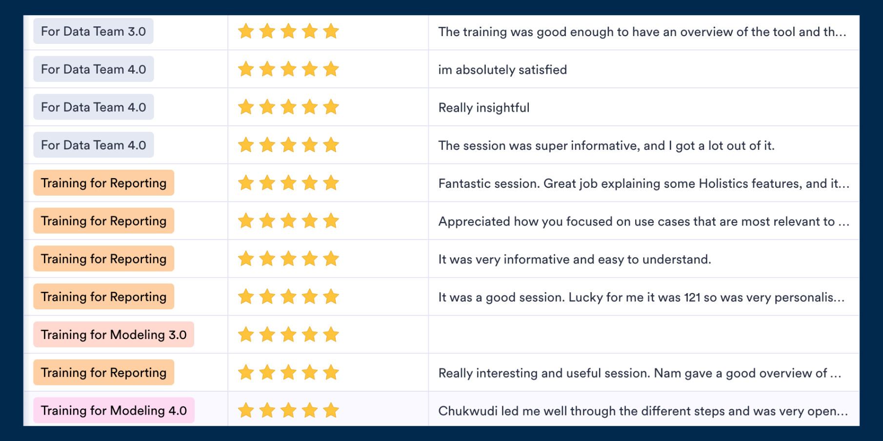
Not intrigued? Here’s what the audience has been saying! ![]()
 June UX Updates
Here’s a quick look at the highlights from our latest UX update. There are A LOT of them, so make sure to check out our Community post here for more details.
Our design and engineering teams have been hunting down those workflow friction points that slow you down. Here are the highlights:
![]() Dataset Discovery Made Easier When editing reports, your currently used dataset now appears at the top and is highlighted—no more hunting through long lists to find what you’re already working with.
Dataset Discovery Made Easier When editing reports, your currently used dataset now appears at the top and is highlighted—no more hunting through long lists to find what you’re already working with.
![]() Sidebar Memory (Coming Soon) Your expand/collapse preferences will finally be remembered across sessions. No more re-collapsing those long sections every time you log in.
Sidebar Memory (Coming Soon) Your expand/collapse preferences will finally be remembered across sessions. No more re-collapsing those long sections every time you log in.
![]() Enhanced Data Schedules We’ve upgraded the entire schedules experience with new “Title” and “Status” columns for better monitoring, plus a smoother Pause/Resume flow with clearer messaging.
Enhanced Data Schedules We’ve upgraded the entire schedules experience with new “Title” and “Status” columns for better monitoring, plus a smoother Pause/Resume flow with clearer messaging.
Final words
That’s all for this month. If you’re curious about our upcoming direction, check out our Product Roadmap. If you’re interested in what we just released in the past few months, check out our Release Note.
Do you have any feedback for us? If you do, hit Reply and let me know.
Or connect with me on LinkedIn (to see more juggling tricks), and we can chat.
I’ll see you again real soon!