Hey Holistics community! ![]()
Our design and engineering teams have been busy hunting down those pesky UIUX quirks and giving your workflows some much-needed love! ![]()
![]()
We’ve packed this update with exciting improvements that’ll make your daily Holistics experience just a bit more delightful. Let’s dive in:
Reporting
- Currently used Dataset highlighting - When editing reports, your currently used dataset now appears at the top and is highlighted for easier discovery
- Holistics Playground banner fix - Resolved text overflow in info banners for cleaner display.
- Field selection clarity - Selected fields now show a clear tick icon for better visual distinction from metrics.
- Sharable Links alignment - Text and icons in the modal (Version 3.0) are now perfectly aligned.
- Consistent button labels - Changed “Documentation” to “Learn more” in visualization empty states.
- Table chart visibility - “Copy to clipboard” button is now more visible when hovering over data cells.
- Date picker stability - Resolved erratic behavior when typing in Exploration date inputs.
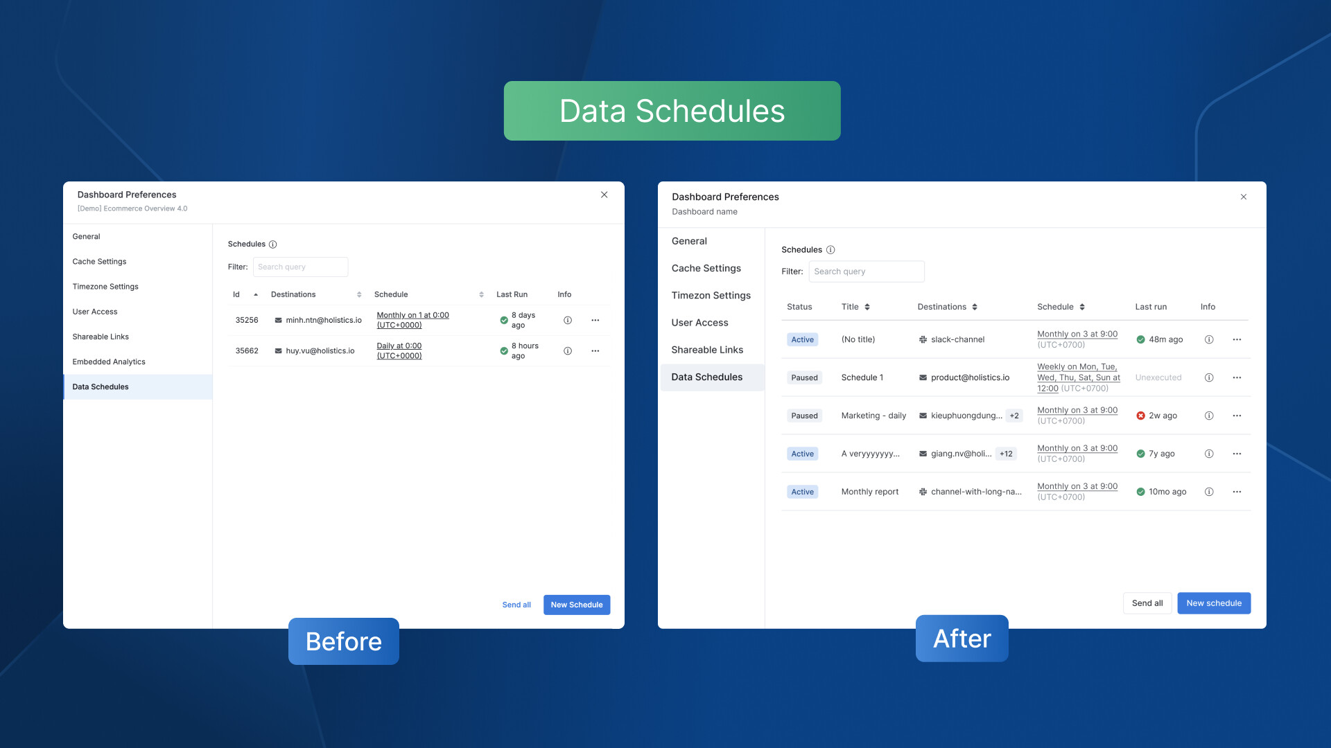
Coming soonLeft Sidebar - Your expand/collapse preferences will be remembered, so no more re-collapsing long sections.Coming soonEnhanced Data Schedules with upgraded UX:- New “Title” and “Status” columns in the Schedules table for better monitoring
- Smoother Pause/Resume flow with improved UI and clearer copy
Development
- Syntax error visibility - Syntax errors are no longer hidden behind the top navigation
- Better button hierarchy - Enhanced prominence of “Add…” buttons in Dataset files for clearer visual structure
- Send Feedback placement - Relocated the feedback button to its proper position when creating new Models
- Relationship diagram display - Resolved overflow issues in “View relationship” modal for better diagram viewing
And there you have it!![]()
While these tweaks may seem small, the magic is in the details — every click should feel just right! Your feedback motivates us to refine Holistics, so keep sharing your thoughts. More goodies coming soon! ![]()