Tuesday, July 22, 2025
How do you really know a hot dog is a hot dog?
You could just eyeball it. After all, everyone knows a hot dog when they see one. It’s mystery meat stuffed in a casing, tucked neatly between two buns.
But let’s say that’s not enough. You want ironclad, unassailable certainty. You want to end the “is-a-hot-dog-a-sandwich” debate once and for all. So you secure $2M in funding to build an app called “SeaFood”, which uses computer vision to scan any plate and give you a definitive answer: “Hot dog” or “Not hot dog.”
(A pizza is, of course, not a hot dog)
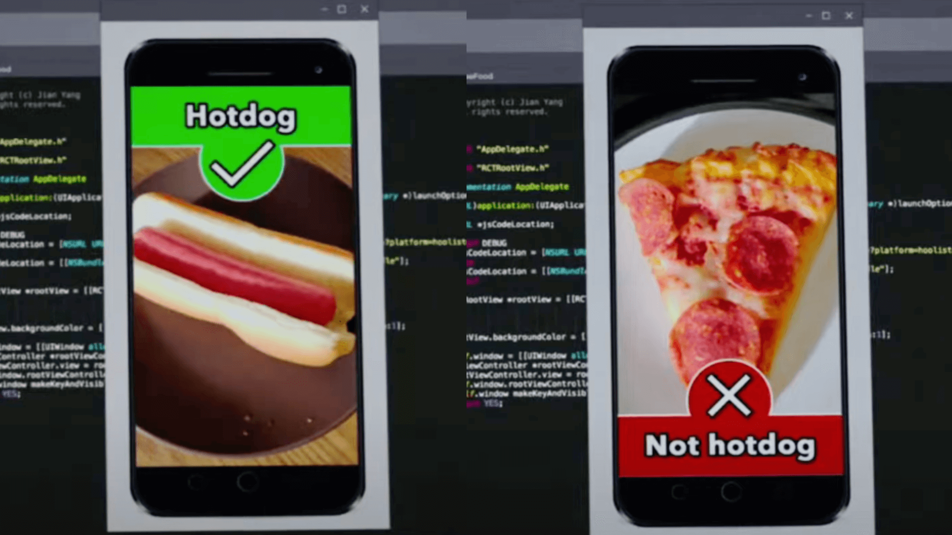
But then what?
(If you’re lucky, your algorithm turns out to be freakishly good at detecting explicit content, and you get acquired by Periscope for an ungodly sum. At least that’s how it goes in that one episode of Silicon Valley.)
Most of the time, though, nothing happens.
BI tools made it incredibly easy to know what something is, but that’s not the same as knowing what to do with it. Information without purpose is just a yawning void of distractions. Too much of a good thing can distract you from actually making decisions.
This batch of updates helps you cut through that noise.
Tags quickly surface dashboards your team trusts and actually uses. Breakdown lets you dissect key metrics without rummaging through thousands of reports, and AI Assistant gets you exactly the answers you need (and sometimes the ones you didn’t know you needed).
 Just Released
 Tagging System: Organize and Discover Analytics Content with Ease
You’ve probably seen this Slack message: “Hey, does anyone know which report is the RIGHT one to use?”
Tags solve that. Now available in Holistics, tags let you label dashboards and reports by topic, project, or business function. It’s a small improvement, but it makes a noticeable difference when you’re trying to find things without resorting to detective work.
For more information, visit our public doc here.
 Content Endorsement
Now in Holistics, you can mark dashboards and reports as officially endorsed by the data team. Add trust labels, organize content, and help your org quickly tell what’s vetted, and what’s not.
For more information, visit our public doc here.
 Break Down: Instantly Dissect Any Metric (Beta)
You’re analyzing sales across countries, then by product, then by customer type. So you build chart after chart after chart. Your once-clean dashboard is now bursting with clones for every angle you need to explore.
That’s why we built Break Down, to let you instantly dissect metrics and switch between dimensions directly on your dashboard with zero setup required.
With this feature, you can…
- Swap breakdown dimensions on the fly without rebuilding charts
- Reduce dashboard clutter with one chart handling multiple breakdowns
- Explore data freely with zero setup from the data team
Supported visualizations: Line, column, bar, area, combination, pie, donut, pyramid, funnel, pivot table, and conversion funnel charts.
For more information, visit our public doc here.
For the full demo, check out this video
 Table Styling: Flexible Text Wrapping
Long headers and cell values in tables often force you into an all-or-nothing choice: wrap everything and create messy layouts, or truncate content and lose important information.
That’s why we built Flexible Text Wrapping to give you independent control over header and cell text wrapping for the perfect table layout.
With this feature, you can:
- Wrap header text and cell text independently in table visualizations
- Choose selective wrapping: just headers, just cell values, or both.
- Control table appearance with precise formatting that fits your dashboard needs
Supported visualizations: Data Table and Pivot Table

 New AQL Functions: Supercharge Your Data Manipulation
Building complex analytics often means wrestling with limited function libraries, forcing you to write verbose workarounds or export data for processing elsewhere. Simple tasks like finding correlations, extracting text patterns, or getting values from related rows become unnecessarily complex.
Not anymore. We expanded our AQL (Analytical Query Language) with 30+ new functions across aggregation, text manipulation, time intelligence, and window operations, giving you the tools to handle sophisticated data transformations natively.
With these functions, you can:
- Calculate correlations instantly with
corr(table, field1, field2)for statistical analysis - Get related values efficiently using
min_byandmax_byto fetch data from rows with extreme values - Concatenate grouped data with
string_agg(expression, separator)for clean text aggregation - Extract text patterns using
regexp_extract,regexp_replace, and other regex functions - Create statistical buckets with
ntile(n)andpercent_rank()for advanced analytics
Function categories include: Aggregation, Time Intelligence, Text Manipulation, Window Functions, and AI Functions (Snowflake & Databricks)
See all new functions and examples in our community post.
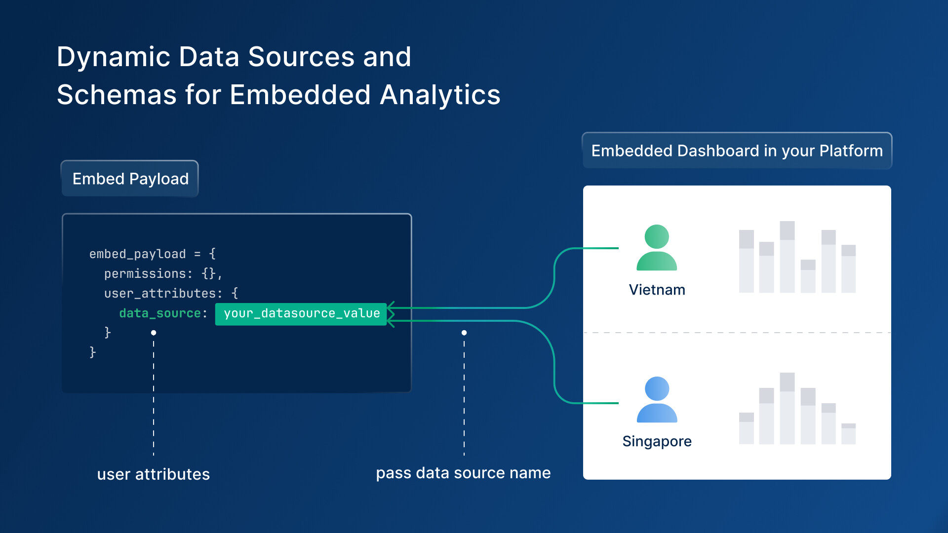
 Dynamic Schema & Data Sources: Multi-Tenant Embedded Analytics (Beta)
If you’re building embedded analytics, this question shows up fast:
“How do we show the same dashboard to all our customers, without spinning up a hundred versions?”
Dynamic Schema & Data Sources solves that. Now in Holistics, your embedded dashboards can automatically connect to the right database or schema based on who’s viewing them.
Here’s what you can do with it:
- Serve different customers from a single dashboard using dynamic schema switching.
- Swap data sources on the fly using user-specific variables
- Simplify multi-tenant architecture with automatic data source switching based on embedded payload
- Test everything safely with the Embed Sandbox to validate your dynamic setup
How it works: Define variables like H.current_user.data_source and H.current_user.schema in your AML code, then pass the appropriate values through your embedded payload—the system automatically routes each user to their designated data source.
Now available in Open Beta with full testing support in Embed Sandbox.
For more information, visit our public doc here.
 Coming Soon
 Holistics AI (Alpha)
We’re introducing a simpler, faster way to explore data in Holistics, without the need to write code, tap an analyst on the shoulder, or even build charts by dragging and dropping.
You just need to chat with Holistics AI.
Built on top of our governed semantic layer and metric-first query language, Holistics AI is designed to help teams explore data and build charts through natural language, all while staying grounded in trusted, curated datasets.
Holistics AI thinks step-by-step like an analyst, using our composable AQL to build transparent, reliable answers. You can follow up with questions, drill down into details, and even promote useful metrics back to your semantic layer for future reuse.
Currently in Alpha development. If you’d like early access and want to help shape how it evolves, you can join the waitlist here.
For more details, read our doc here, or check out this video:
 CSV & Google Sheets Import
You’ve got a CSV from a customer survey and a question you need answered fast. But not so fast, you’ll need to wait on ETL, engineering, and access requests. All that for something you’ll only use once.
Soon you won’t have to. With this upcoming feature, you’ll be able to import CSVs and Google Sheets straight into your warehouse, mapped to existing models, ready to explore.
With this, you can:
- Drag and drop CSV files directly into ready-to-explore data models
- Skip the engineering queue and analyze survey data, spreadsheets, and ad-hoc datasets immediately.
- Integrate seamlessly with existing data without context-switching—import while exploring datasets
- Validate smartly with built-in data validation and configuration options for accurate modeling
How it works: Simply drag and drop your CSV file, and within seconds, you’ll have a new data model ready for exploration in your warehouse.
 Excited about the new features? Join our Free Training
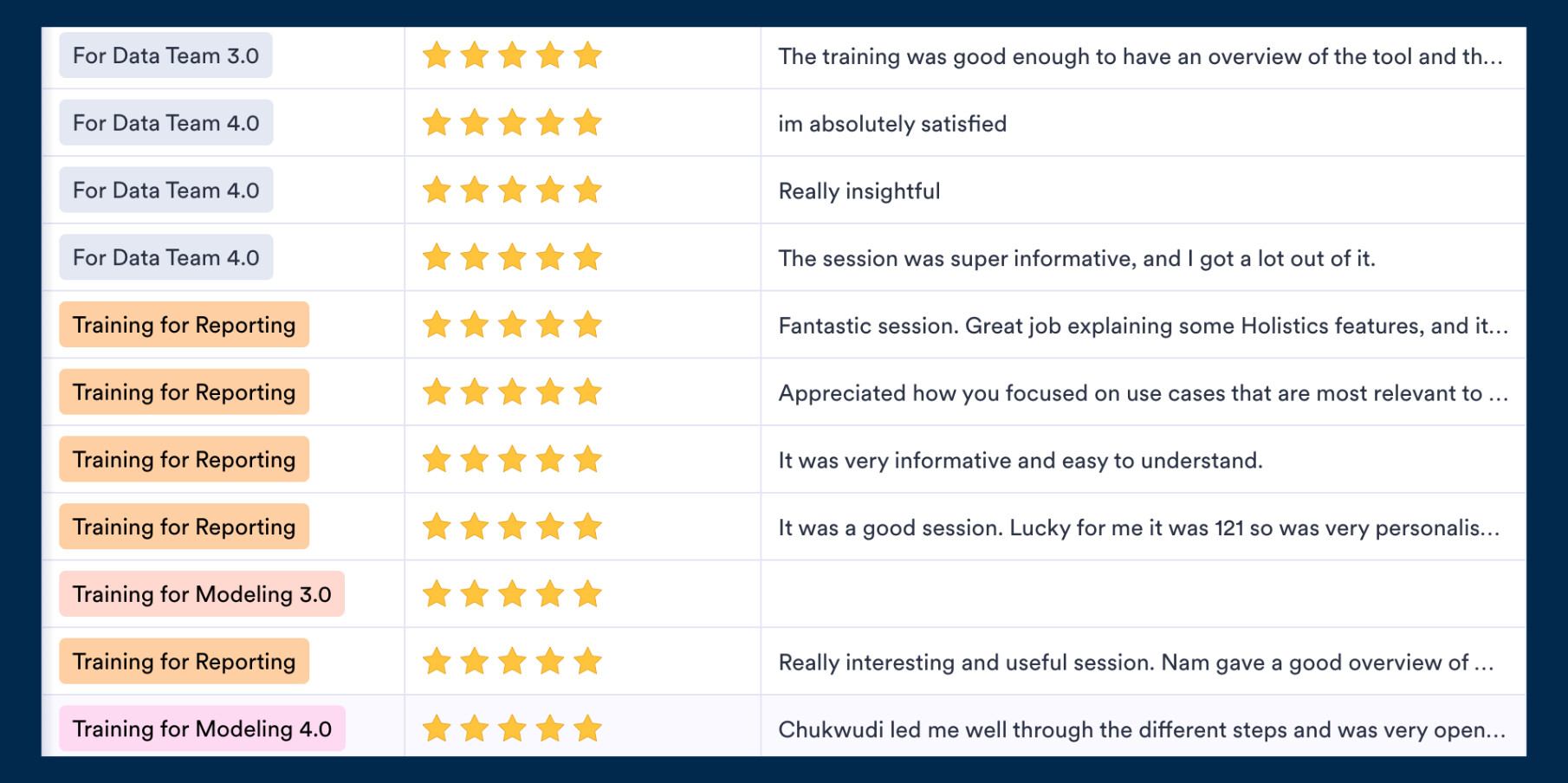
We offer 60-minute live training sessions designed to help you get the best out of Holistics. With multiple time slots available, there’s a session that fits your schedule, no matter your time zone. And it’s completely free of charge.
Interested? Find a slot here.
Not intrigued? Here’s what the audience has been saying! ![]()
 July UX Updates
While we’ve been shipping major features, we haven’t forgotten about the small details that make your daily workflow smoother. This month’s collection of UX refinements continues our relentless focus on removing friction wherever we find it.
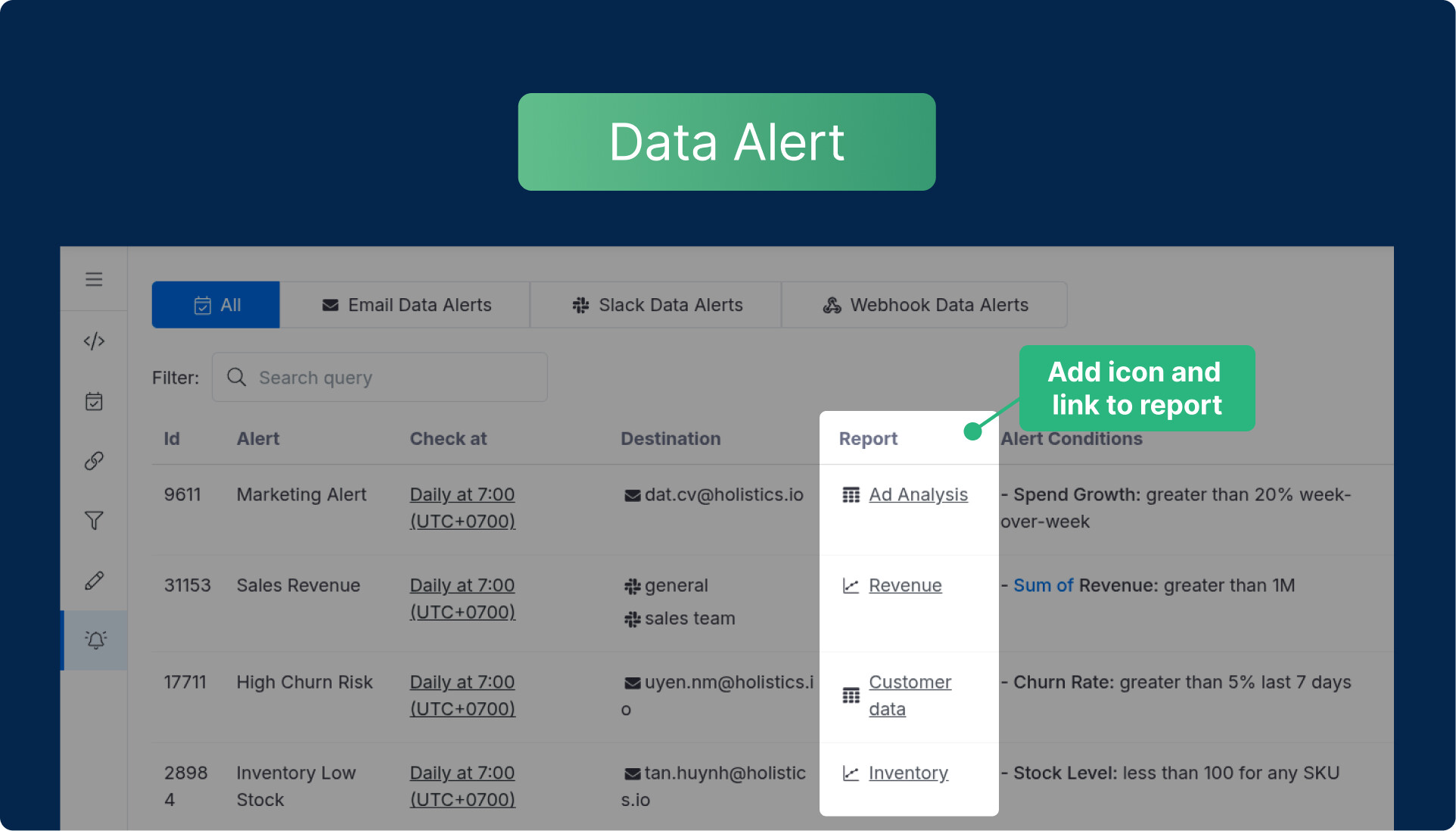
Enhanced Data Alerts - Report and Dashboard objects in the Data Alert page now include proper icons and navigation functionality, matching the consistent experience you expect across the platform.
Seamless Navigation - New breadcrumb navigation lets you move through your work history without accidentally collapsing sidebars or losing your place.
General UX & UI enhancements:
- Markdown Consistency - Unified the Markdown component design for consistent styling across all implementations
- Git Connection - Updated button components in Git provider connection settings
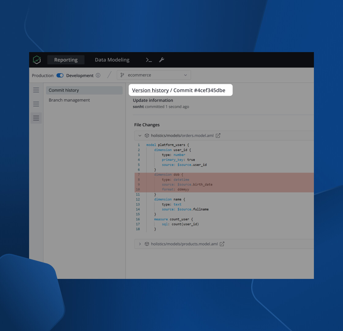
- Color Picker Fix - Resolved functionality issues with buttons in the color picker interface
Final words
That’s all for this month. If you’re curious about our upcoming direction, check out our Product Roadmap. If you’re interested in what we just released in the past few months, check out our Release Note.
Do you have any feedback for us? If you do, hit Reply and let me know.
Or connect with me on LinkedIn (to see more juggling tricks), and we can chat.
I’ll see you again real soon!