I can’t talk about this month’s updates without talking about AQL.
And to talk about AQL is to talk about composition and SQL. (Bear with me for a moment here).
Composition is fundamental to good software design.
Composition lets you extract common logic for reuse, keep related logic together, and reason about code without understanding the entire system. And it’s what SQL, for all its strengths, has always struggled with. The smallest unit in SQL is a query. To modify even a tiny part, you often need to rewrite entire queries or wrestle with complex CTEs. This makes building and maintaining metrics unnecessarily complex.
We write more about SQL and its Composition problem here, where we explain why we built AQL. AQL isn’t meant to replace SQL, but to complement it. While SQL remains the lingua franca of data analysis and excels at data transformation, AQL treats metrics as building blocks, ready to be composed, reused, and reimagined.
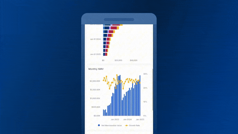
With AQL’s composability, we’re building features that were once pipe dreams. Functions like Percent of Total, Period-over-Period, and Moving Average are now achievable with a single click. This also enables us to build advanced period-over-period comparisons, allowing you to do all sorts of powerful analyses, which we’ll get into next. All with fewer lines of code, fewer clicks, and cleaner logic.
 Advanced Period-over-Period (PoP) Comparison
Our Period Comparison feature was good, already a customer favorite, but ‘good’ wasn’t good enough. You couldn’t compare multiple periods. You couldn’t apply conditional formatting or customize styling. You couldn’t set data alerts on PoP fields.
So we decided to rebuild it. From the ground up.
Thanks to AQL, the new Period Comparison introduces powerful capabilities beyond the current Period Comparison toggle. For example, you can:
- Apply comparisons to individual measures of your choice, rather than to all measures in a visualization.
- Compare multiple periods simultaneously.
- Applying conditional formatting and custom styling.
- Set data alerts on PoP measures.
You can learn more about the new feature here: Public Docs Analytic Functions Period-over-Period Comparison
Check out the full demo here.
 Mobile-friendly layout for Canvas Dashboard
You’ve just built the perfect dashboard. Then someone opens it on their phone. Suddenly, your beautiful data story becomes a pinch-and-zoom nightmare. Charts shrink to microscopic size. Tables spill off the screen. Filters play hide-and-seek with your users.
We knew there had to be a better way.
That’s why we’ve built the Mobile-friendly Layout for the Canvas Dashboard, which can intelligently adapt to any screen size across desktop and mobile devices.
Choose how your dashboard adapts:
- Auto mode (Default): Your dashboard flows naturally from desktop to mobile, left to right, top to bottom. Changes in the desktop layout automatically reflect on mobile.
- Manual mode: Customize your mobile view without affecting your desktop view. Move things around. Hide what you don’t need. Perfect every detail.
- Classic mode: The desktop layout remains unchanged on all devices.
It’s on by default for new dashboards. No setup is needed. For more details, check out our documentation: Responsive Design in Canvas Dashboard Holistics Docs (4.0).
For the full demo, check out our Youtube video.
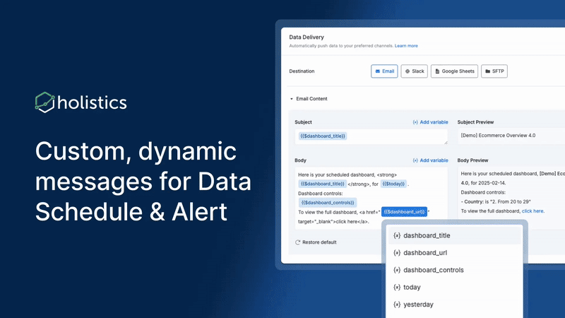
 Customizable Messages in Data Alerts and Schedules
When your inventory drops below safety levels, would you rather get:
- “Dashboard XYZ updated at 9:00 AM EST”
- or "URGENT: 3 product lines below reorder point. Action needed in next 48 hours to avoid stockout.”
Important business updates shouldn’t hide behind generic alerts. We’ve launched Custom Alert/Schedule to solve this exact problem.
This update gives you full control over your message, ensuring critical updates are loud and clear. Save time with reusable smart variables ({{metric}}, {{threshold}}, {{trend}}), and use the live preview to fine-tune your alerts before sending them out.
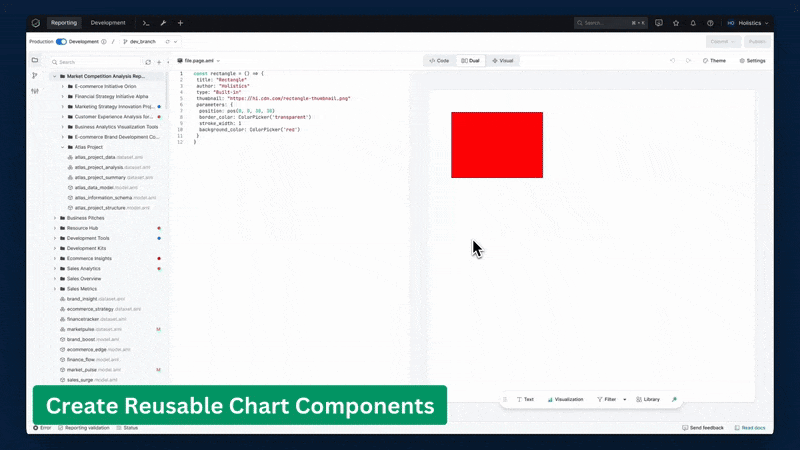
 Reusable Component Library (coming soon)
You don’t need a national survey to know that most data teams rebuild the same charts again and again across different dashboards. We’ve all been there, staring at a new dashboard request and thinking “I know we’ve built something like this before…?”
Your best dashboard components deserve to live multiple lives, not buried in some report from last quarter, waiting to be rebuilt from scratch.
With Reusable Component Library, every visualization you create can become a building block for future dashboards. When you need it again, simply grab it from your library, tweak it, and you’re done.
And we’re just getting started. Soon, you’ll be able to reuse entire metrics and datasets too. See the full demo here.
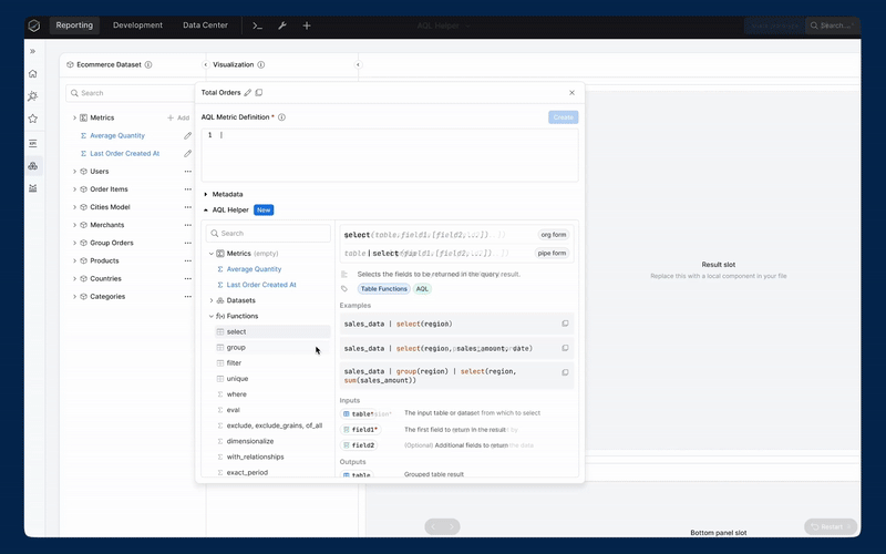
 AQL Copilot for Query Writing (coming soon)
By now, you’ve probably heard plenty about AQL capabilities. But we have to admit: it comes with a learning curve.
Learning AQL shouldn’t feel like a scavenger hunt through documentation, so that’s why we’re building AQL Helper—your new copilot for query writing. Right inside your AQL Editor, you’ll get:
- A complete function library
- Operator guides
- Real-world examples you can copy and paste
- Core concepts explained in plain English
Everything is searchable, right from your editor.
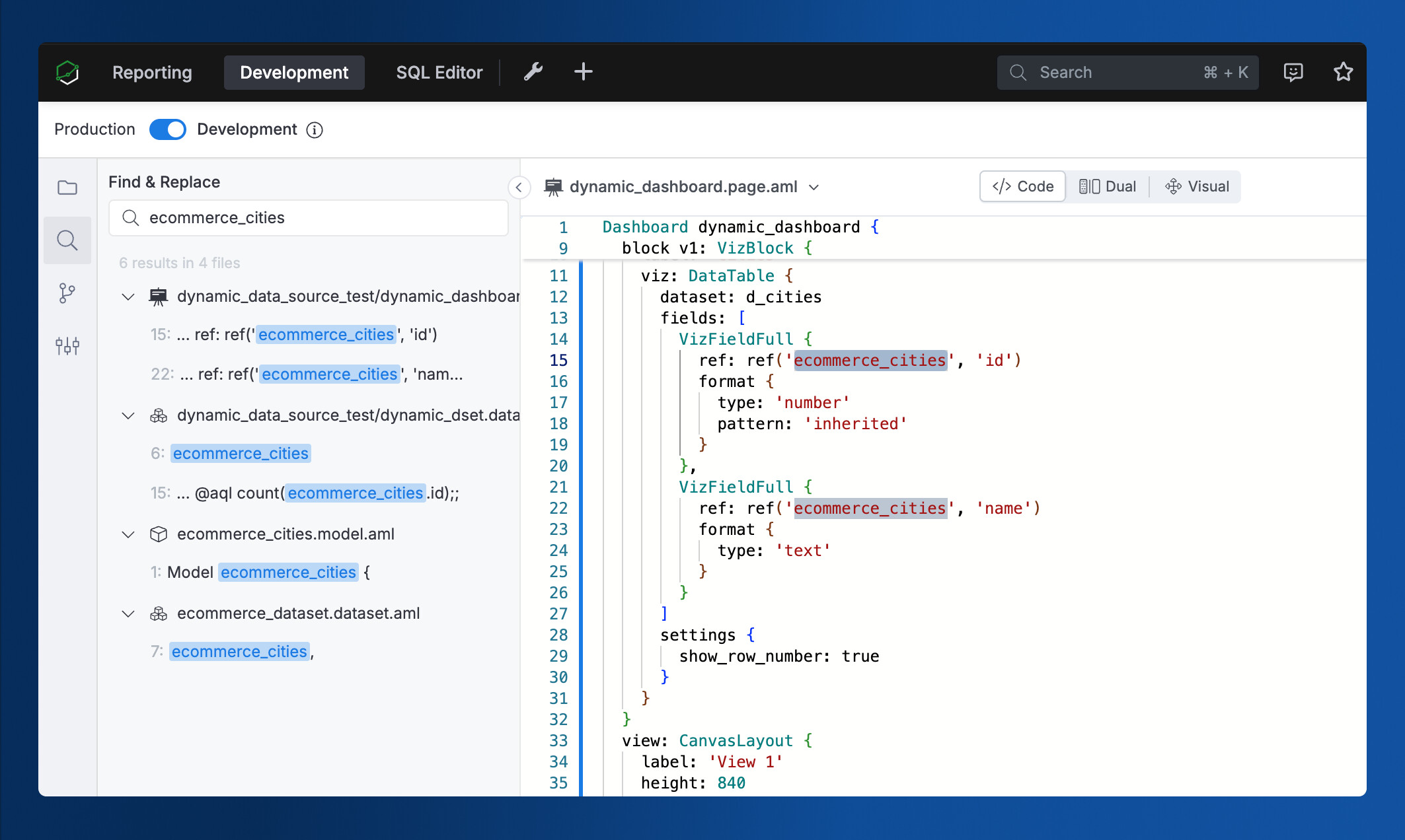
 Smarter Search for Development Workspace
“Just search for it,” they said. “It’s in the development workspace somewhere,” they said.
But we all know the pain of hunting for that one file, that one metric, that one dashboard connection. That’ll soon be a thing of the past.
With our new String Search update, you can find anything within your Holistics Development Workspace, instantly:
- Search by labels, descriptions, and metadata (not just filenames!)
- Trace object connections (like finding every dashboard using your dataset)
- Find and replace strings across files (coming soon!)
 Excited about the new features? Join our Free Training
We offer 60-minute live training sessions designed to help you get the best out of Holistics. With multiple time slots available, there’s a session that fits your schedule, no matter your time zone. And it’s completely free of charge.
Interested? Find a slot here.
Not intrigued? Here’s what the audience has been saying! ![]()

 February UX Roundup
Our team is on fire again! ![]() Here’s a sneak peek at our latest UX upgrades. There are tons, so be sure to check out our Community post for the full updates.
Here’s a sneak peek at our latest UX upgrades. There are tons, so be sure to check out our Community post for the full updates.
-
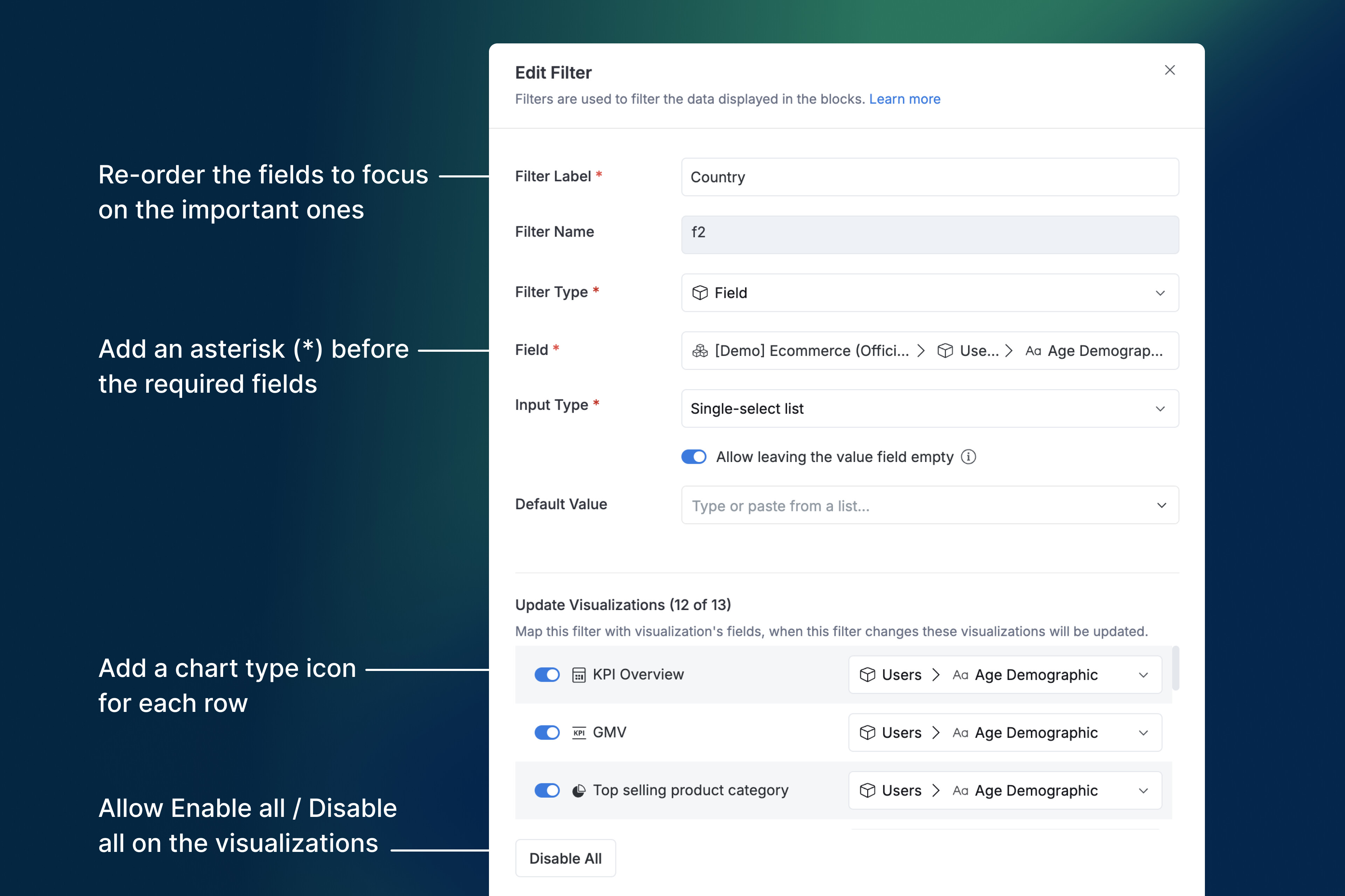
10+ UX improvements to our interactive controls (Filter, Date Drill, Period Comparison), including better-required field validation, an Enable/Disable All option, and clearer UI labels.
-
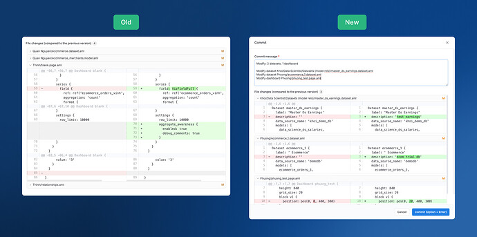
The Commit Details modal now has better spacing (because breathing room matters).
-
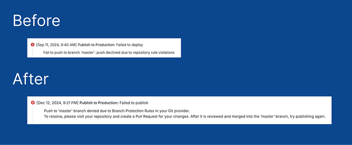
Improved error messages when your master branch is protected.
-
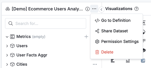
A shiny new “Go to Definition” button in the context menu for quicker navigation.
For more details, check out our community post here.
Final words
That’s all for this month. If you’re curious about our upcoming direction, check out our Product Roadmap. If you’re interested in what we just released in the past few months, check out our Release Note.
Do you have any feedback for us? If you do, hit Reply and let me know. Or connect with me on LinkedIn and we can chat.
I’ll see you again real soon!