Awesome, we haven’s had the chance to dig into this, but it would be great to have a shortcut. Great work!
1 Like
This would be amazing!
1 Like
Would love the native functionality for adding reference lines a la Looker https://cloud.google.com/looker/docs/best-practices/how-to-create-reference-lines-with-visualization-editor
1 Like
Hi @olammas ![]() ,
,
Noted and added in our backlog. We’ll surely consider this in our future visualization improvements ![]()
For a temporary workaround: You can create a custom chart (line chart, bar chart, etc. as per your use), and then add another layer of Rule mark to demonstrate the Reference line.
Here is the Vega-lite doc for Rule mark: <Rule | Vega-Lite>. Hope it’s useful!
Thanks! And I’ll let you know of any update on the native functionality.
1 Like
Hey everyone,
I wanted to take a moment to loop you in on the progress we’ve made regarding the various requests that have been brought up:
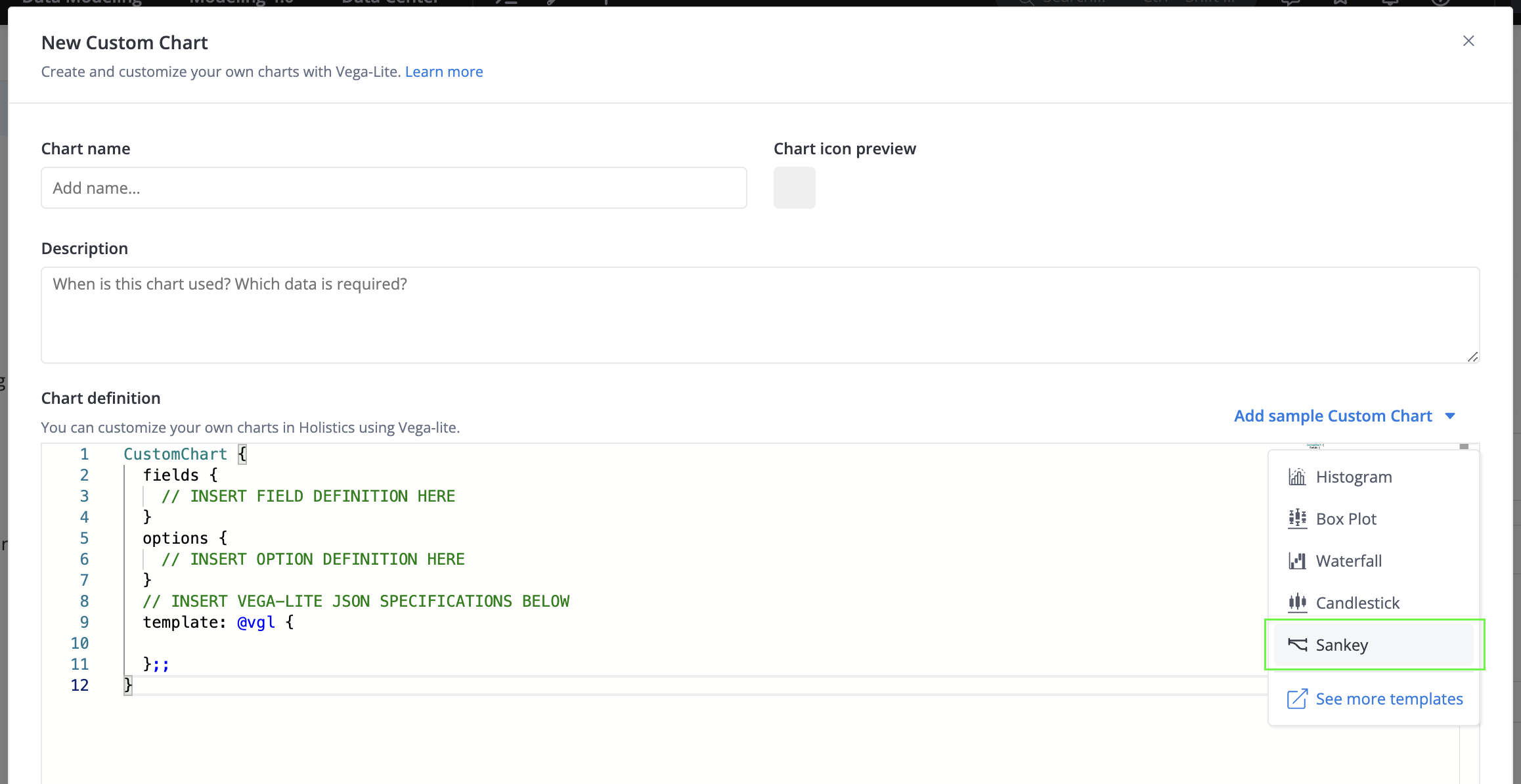
 1. Histogram, Box Plot, Sankey chart, and more
Great news! As our colleagues, Tuan and Vu, shared above, you’re now able to create all sorts of charts beyond our native options using our Custom Chart feature.
Plus, we’ve made it even easier with some handy chart templates: Launched: Sankey diagram in Custom Charts
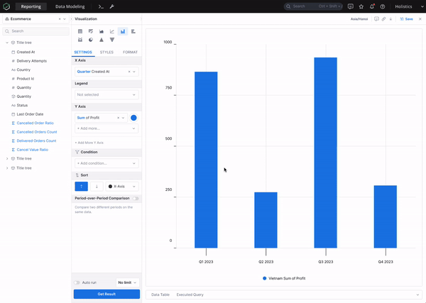
2. [WIP] Trend line, Reference line, and more analytics features
We’re actively working on the Trend Line feature and aiming for a release by the end of Q1 2024. Reference Line and other cool analytics features like % Total, Error Bar, etc. will be released gradually then.
Here is a sneak peek of these functions:
3. Running Total (Cumulative Sum, Avg, Min, Max)
In case you missed it, we’ve actually had the Running Total functionalities up and running for a while now. You can catch up on all the details in our launch note here.
4. [WIP] Customizable font sizes, font styles, and colors of Charts and Dashboards
We’ve got our thinking caps on and are actively exploring ways to make your charts and dashboards even more customizable ![]() Keep an eye out for updates as we delve into this further with our new Canvas Dashboard.
Keep an eye out for updates as we delve into this further with our new Canvas Dashboard.
5. Customizable chart tooltip (adding more fields to the tooltip)
In order to add extra fields to the Chart tooltips, simply drag a field into the Tooltip area or create a new field there. Once a field is added to the tooltip, hovering over a data point on the visualization will show the values for those fields.
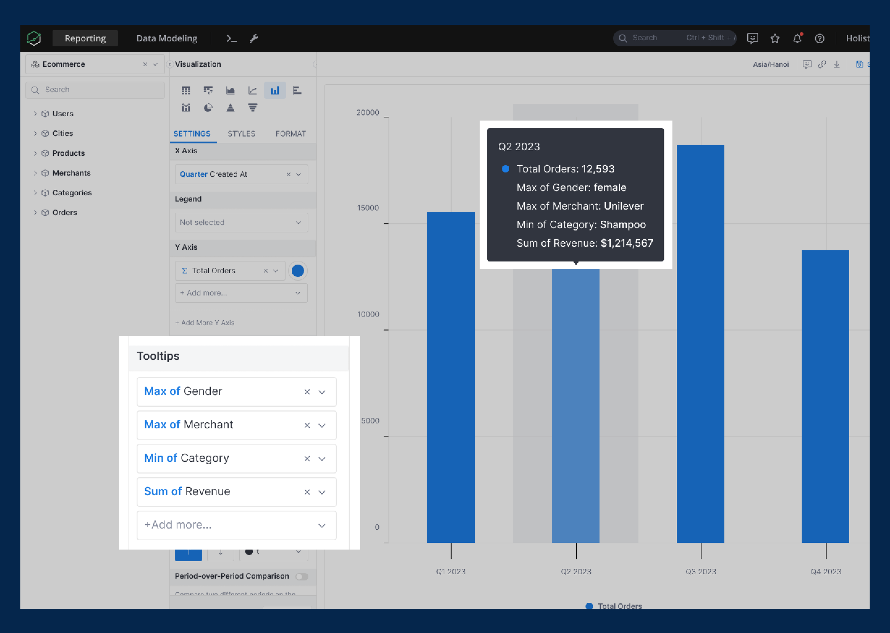
For more details, please visit our public doc here: Customizable Tooltips
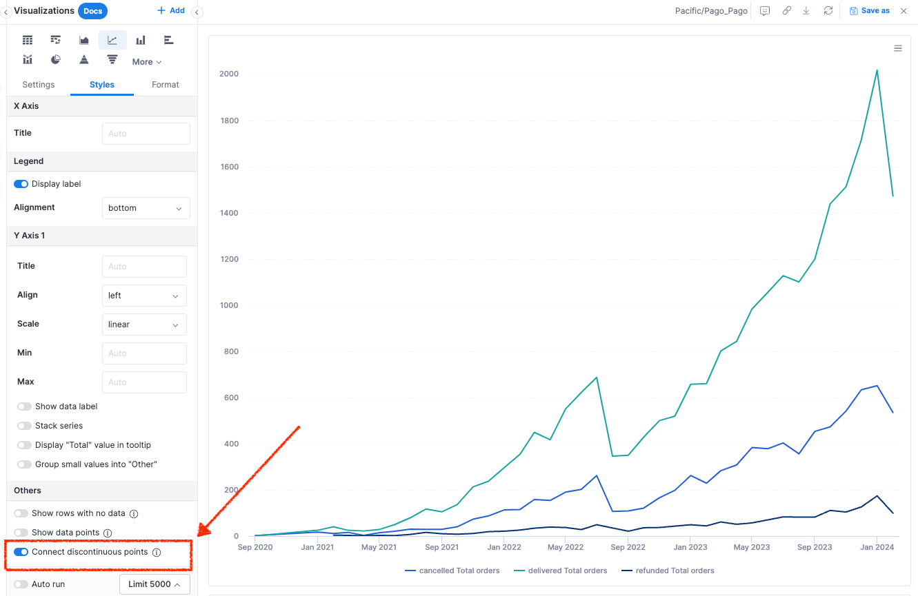
6. Able to disable connecting lines between data points in Line/Combination Chart
Just a heads up - you’ve actually been able to disable those connecting lines between data points for a while. Simply go to the Styles > Others section to toggle this option, as shown below:
7. Having Dual Chart
We believe the functionality you’re looking for can be achieved through our Canvas Dashboard. It lets you play around with visualizations, stacking them next to or on top of each other for that perfect layout. Check out more details about the Canvas Dashboard here.
Again, we’ll keep you updated once there is any further updates on chart customization functions ![]()
2 Likes
Hi @Monika_Kubek,
I see you’re interested in adding additional metrics to the tooltip.
I’m excited to share with you that our team is actively working on the Customizable Tooltip feature, and expect to release it in the next 2 weeks ![]()

This function will allow you to add extra fields to tooltips, enhancing the information available to viewers.
Could you help check if it can address your use case? ![]()