Custom charts and chart customizations

Hi Sophie, welcome to the community! I’ve noted your request for our Product team to improve the experience. Thanks!

Thanks Craig for the inputs. Any idea which “key missing charts” we should be looking at?

Noted on the trend line, will let my team know about this!

Hi Tuan,

The charts I feel would be great additions are (and similar to @david-ri list):

  • Box plot
  • Histogram
  • Waterfall
  • Error Bars (like line chart but provides a box plot at each section)
  • A more generic sounding Heatmap (not all heat maps are used for customer retention)

I think that would probably cover most use cases I can see being required.

4 Likes

Sorry @tuan.nguyen missed this originally.

I agree with a lot of the points other posters made here - some additional core visualisations would be fantastic - particularly the histogram.

I’d also add that a Sankey diagram would be very welcome.

5 Likes

Great to see you are working on charts. When it comes to my use case, the current set of available charts is enough for me. But I would love to see more customization options, such as additional metrics shown on the tooltip, retention chart color, showing percentage values rounded to 2 digits, additional currencies (not only $), and other things mentioned by the people in this thread :slight_smile:

2 Likes

There is one simple improvement i’d like to suggest - for readers who read left to right, the expectation is that the legend order from left to right will be reflected in the legend stacking order from bottom to top (e.g. 1, 2,3,4,5 would stack from the bottom 1,2,3,4,5). Currently stacking goes from 5 at the bottom to 1 at top. There seems to be no way to order the legend.

1 Like

Thanks Monika!

Well noted on the additional metrics shown on the tooltip & retention chart color.

Regarding these two:

  • showing percentage values rounded to 2 digits
  • additional currencies

Actually, we have already supported them. You can check out our documentation: Data Formats | Holistics Docs

Thanks mate for noticing this! Lemme add “change order of legend in the stacked bar chart to ascending from bottom to top” to our backlog!

1 Like

Another small improvement would be to disable connecting lines between data points in the combination chart type.

1 Like

Hi!

Another chart I really appreciate is a cumulative growth chart. So we can see total of a metric on a given day. E.g. if we were interested in seeing total sales so far each month, where the x axis would be date and the y axis would be the total sales on that date.

To echo Craig above - error bars would be super useful!

Thanks!

2 Likes

Hi Sophie, I believe you are referring to this feature (which we have released) right? :point_right: Launched: Running Total (Cumulative Sum, Avg, Min, Max)

Hi!

I’d love to have the possibility of having a dual chart, where only one of the axis is impacted by the legend.
i.e. Revenue by department and total revenue in the same chart.

And also to echo Craig and Sophie above - error bars would be super useful!

5 Likes

Hello!

At Infraspeak we would like a Sankey or a Sunburst charts. The use case is visualisation of node strength inside a network of agents.

Happy to give more information :slight_smile: Have a nice day!

1 Like

Thanks for sharing about this, @Luis_Pereira! :raised_hands:t2:
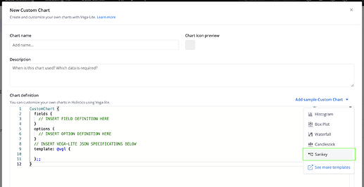
Recently, our team has discussed with you over how to create a Sankey diagram with Custom charts / Vega-lite template, right? Just wanted to repost it here, in case it’s helpful for others.

About the Sunburst chart, we haven’t been able to support this with Custom chart, though. But let me note it down to see if we can try & create it.

P.S. We are working on gathering some Vega-lite templates for highly requested charts by you guys, so that you can copy & modify them for your use. Feel free to let me know any other charts types you need. Cheers :beers:

1 Like

Awesome, we haven’s had the chance to dig into this, but it would be great to have a shortcut. Great work!

1 Like

This would be amazing!

1 Like

Would love the native functionality for adding reference lines a la Looker https://cloud.google.com/looker/docs/best-practices/how-to-create-reference-lines-with-visualization-editor

1 Like

Hi @olammas :raising_hand_man:t2:,
Noted and added in our backlog. We’ll surely consider this in our future visualization improvements :+1:

For a temporary workaround: You can create a custom chart (line chart, bar chart, etc. as per your use), and then add another layer of Rule mark to demonstrate the Reference line.
Here is the Vega-lite doc for Rule mark: <Rule | Vega-Lite>. Hope it’s useful!

Thanks! And I’ll let you know of any update on the native functionality.

1 Like

Hey everyone,

I wanted to take a moment to loop you in on the progress we’ve made regarding the various requests that have been brought up:

:ballot_box_with_check: 1. Histogram, Box Plot, Sankey chart, and more

Great news! As our colleagues, Tuan and Vu, shared above, you’re now able to create all sorts of charts beyond our native options using our Custom Chart feature.

Plus, we’ve made it even easier with some handy chart templates: Launched: Sankey diagram in Custom Charts

2. [WIP] Trend line, Reference line, and more analytics features

We’re actively working on the Trend Line feature and aiming for a release by the end of Q1 2024. Reference Line and other cool analytics features like % Total, Error Bar, etc. will be released gradually then.

Here is a sneak peek of these functions:
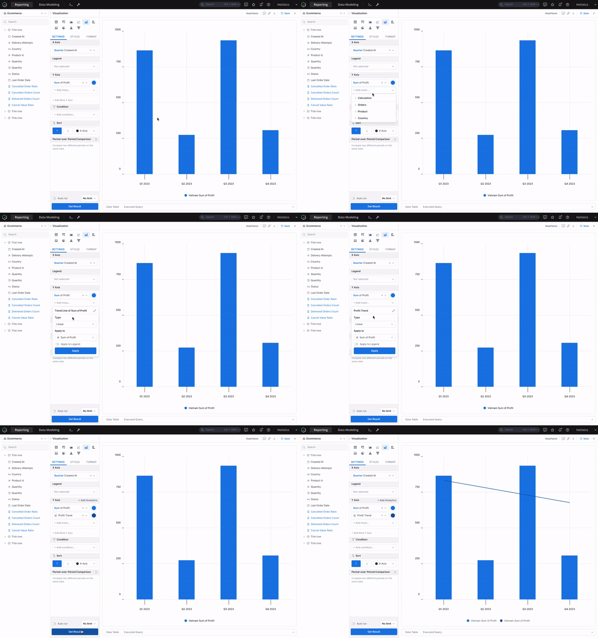
trend-line

:ballot_box_with_check: 3. Running Total (Cumulative Sum, Avg, Min, Max)

In case you missed it, we’ve actually had the Running Total functionalities up and running for a while now. You can catch up on all the details in our launch note here.

4. [WIP] Customizable font sizes, font styles, and colors of Charts and Dashboards

We’ve got our thinking caps on and are actively exploring ways to make your charts and dashboards even more customizable :blush: Keep an eye out for updates as we delve into this further with our new Canvas Dashboard.

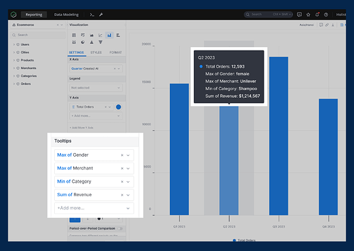
:ballot_box_with_check: 5. Customizable chart tooltip (adding more fields to the tooltip)

In order to add extra fields to the Chart tooltips, simply drag a field into the Tooltip area or create a new field there. Once a field is added to the tooltip, hovering over a data point on the visualization will show the values for those fields.

For more details, please visit our public doc here: Customizable Tooltips

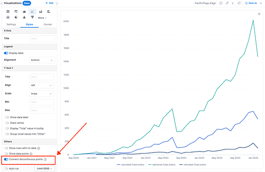
:ballot_box_with_check: 6. Able to disable connecting lines between data points in Line/Combination Chart

Just a heads up - you’ve actually been able to disable those connecting lines between data points for a while. Simply go to the Styles > Others section to toggle this option, as shown below:

:ballot_box_with_check: 7. Having Dual Chart

We believe the functionality you’re looking for can be achieved through our Canvas Dashboard. It lets you play around with visualizations, stacking them next to or on top of each other for that perfect layout. Check out more details about the Canvas Dashboard here.

Again, we’ll keep you updated once there is any further updates on chart customization functions :blush:

2 Likes

Hi @Monika_Kubek,

I see you’re interested in adding additional metrics to the tooltip.
I’m excited to share with you that our team is actively working on the Customizable Tooltip feature, and expect to release it in the next 2 weeks :blush:

This function will allow you to add extra fields to tooltips, enhancing the information available to viewers.
Could you help check if it can address your use case? :blush: