The problem
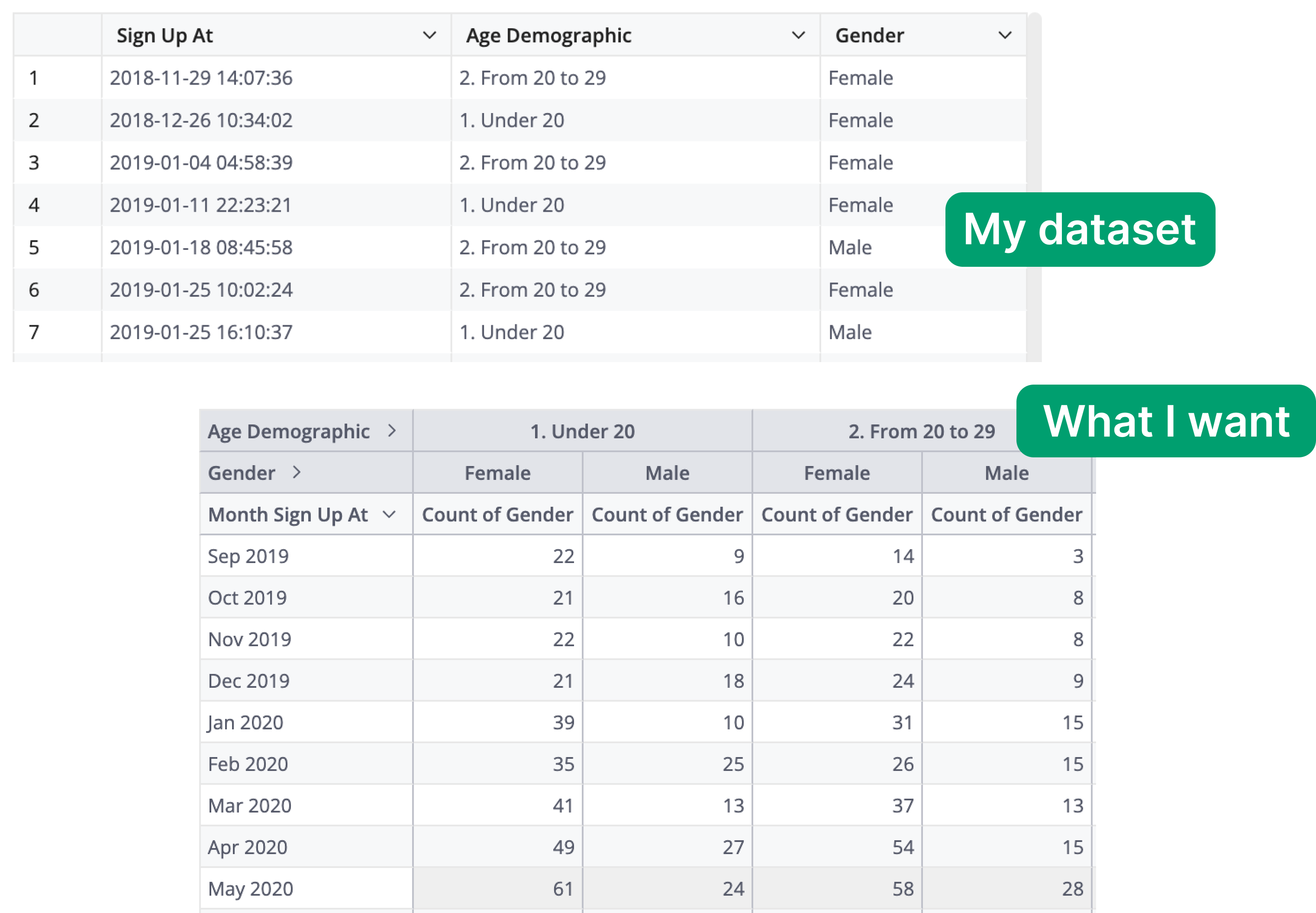
My dataset contains the signup information of users, including the timestamp of their registration, age demographic (which is a measure created from the age column), and their gender.
How can I create a view that lists out the number of users, aggregated by age demographic and gender, that signed up on a particular date?
Solution
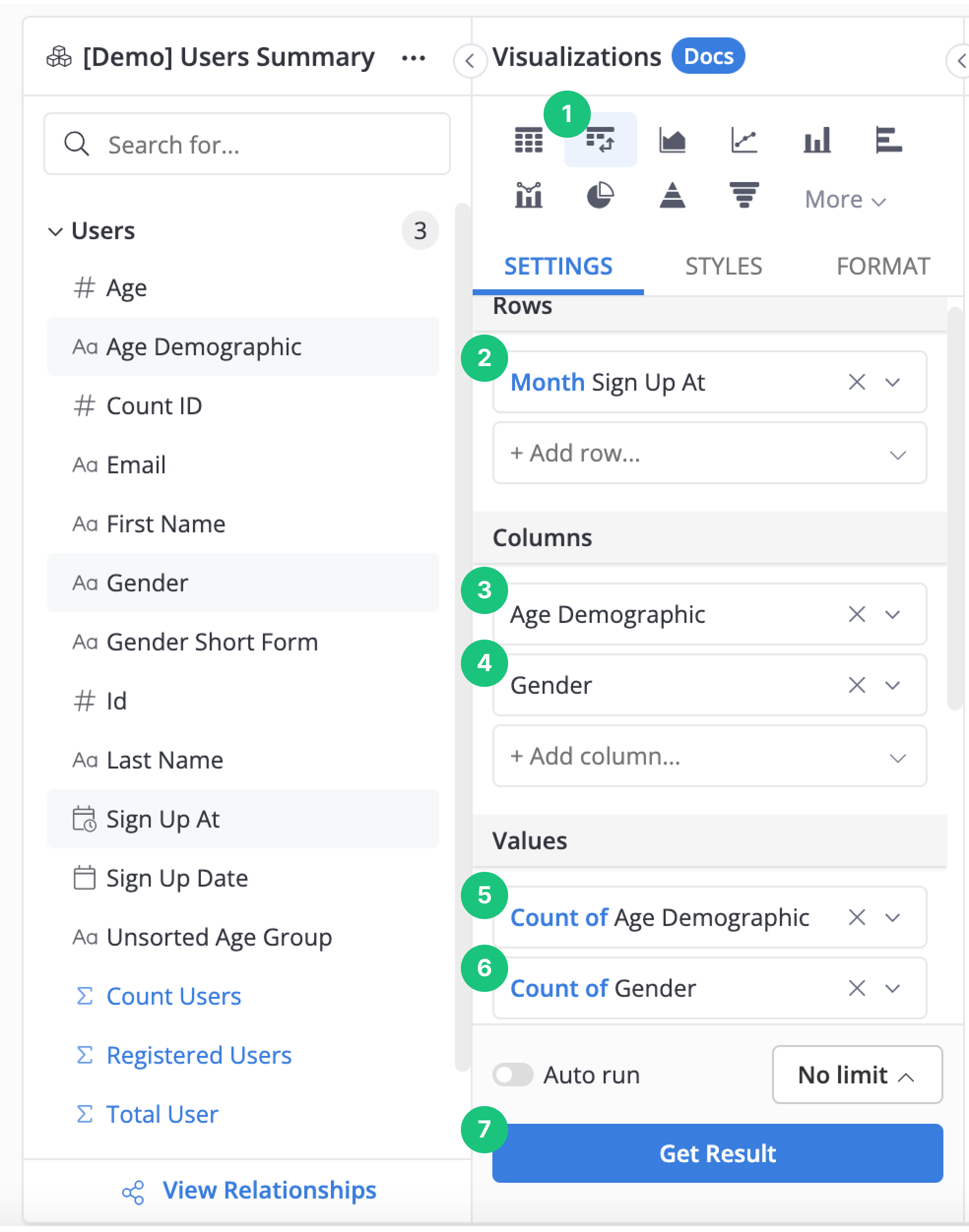
It sounds like you are describing a summary table. Pivot Table is an excellent candidate for this use case. Here is the step-by-step guide on how to build a summary table using this chart type.
Step 1: In your Data Exploration view, select the Pivot Table chart type.
Step 2: In the Rows section, select the Sign Up At column. This is our first level of “row level” aggregation. Of course, you can have an extra level of aggregation, say week level, for this column. To achieve this, simply select the Sign Up At column again, and set the aggregation to weeks.
(Optional) Step 3 and 4: In the Columns section, select the Age Demographic and Gender. These would serve as additional aggregates within the same row value.
Step 5 and 6: In the Values section, select Count of Gender. This is the value that would be aggregated by the Rows and Columns values.
Note: Note that we should only choose one aggregate value for this field to make the chart easier to read at first glance. For example, adding an extra value of Count of Age Demographic would create another column with the same value as our existing Count of Gender, which provides little information and should be omitted for brevity.
Step 7: Click Get result to build the report.
Here is the visualization of all the configurations for your reference: