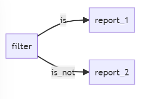
Say in our dataset we have 20 groupings. In the dashboard, we want one chart to show only 2 of the groupings (“is” filter) for clarify. The other chart would show the remaining 18 groupings (“is not” on the same filter values) for comparison. The user should only need to put in the filter once and the two reports will be filtered in the opposite way.
This is a rare yet interesting use case.
In Holistics 2.0 (SQL-to-charts reporting), the solution is pretty straightforward because it’s just SQL variables interpolation. One can simply create a chart in the dashboard with the added negation:
where country NOT IN ({{countries}})
But for modeling-based reporting like Holistics 3.0, this is trickier since the filter linking logic is done automatically:
Could you perhaps help share a real-world example?
That is exactly what we need. Is it possible to downgrade to 2.0 now?
Unfortunately, 2.0 is no longer supported. However, this could be achieved once we release Query Parameters for Dynamic Dimensions, Measures, and more for the current version.