Hi community, welcome to another UX roundup. Let’s take a look at what we’ve improved last month in Holistics ![]()
Reporting
-
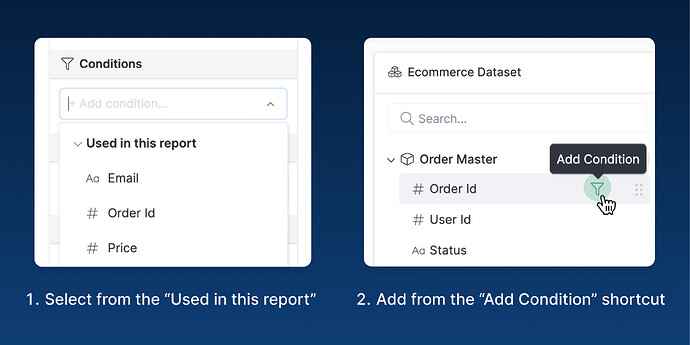
Adding a Condition when exploring is much easier thanks to:
- A new “Used in this report” section, containing selected fields for quicker selection.
- Or you can just click this shortcut & add directly from the field list.
-
The Relationship diagram in the Exploration page should display normally now.
-
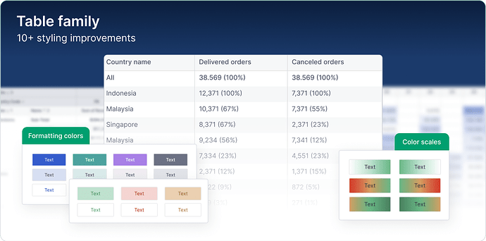
New styling options are available for Table-like visualizations, including Conditional Formatting, Metric Sheets Header, etc.
-
We’ve also made various enhancements to our Exploration interface:
- The Viz Settings’ now can show the icon to indicate the field’s data type.
- We simplify the big, blue Docs pill to a more subtle question icon to leave the spotlight for more important things.
- Some minor UI enhancements for our Chart picker: we move the KPI & Metrics sheet to be more prominent, & update the More/Less button spacing.
Modeling
- We fixed the Branch Select’s option to scale correctly.
- Fixed a broken dropdown when Explore Data from the created Datasets.
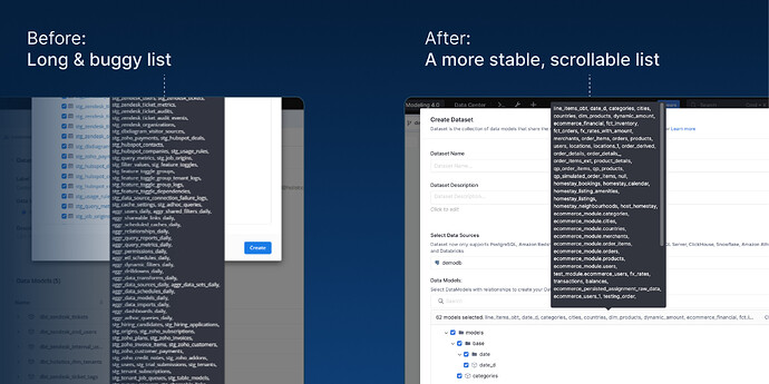
- We improved this tooltip that shows selected Data Models when creating a new Dataset.
Other UX & UI enhancements
- Various updates to our Admin & Settings page:
- Fixed a button misalignment in the User Profile Section
- Removed a bug that made importing Custom maps with invalid data get bypassed by pressing Enter
- Fixed the issue where the loading message displays at the wrong position in our expanded widget view.
- The Dashboard SFTP schedule modal has odd spacing. We fixed it.
- Correct the misaligned text in the Custom Format modal.
That’s it for this month. As usual, a big thank you to everyone who sent us feedback and helped us improve Holistics for you!


