Boost your June workflow! ![]()
![]() We’ve packed in 10+ exciting UX/UI improvements.
We’ve packed in 10+ exciting UX/UI improvements.
Let’s explore them together! ![]()
Reporting
- Say goodbye to grayed-out titles
 . Your dashboard title now looks sharp, even when shared or embedded.
 - Custom formatting: No more missing padding at the bottom.
- The Dataset View button and search bar are now properly center-aligned
 .
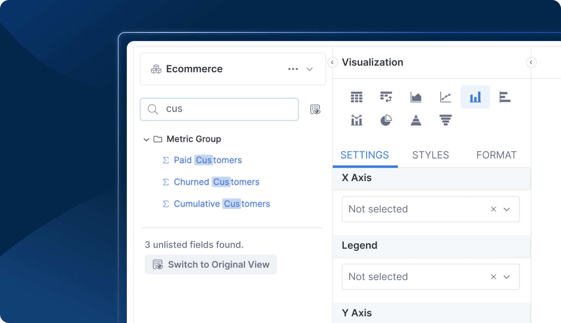
. - Ever struggled to find your fields
 , only to realize that they’re already there in the Original View?
  We want to help with that by providing more information about hidden fields in the Dataset View list, so that your confusion is eliminated
- Visualization settings got a spring clean

 . The “Add” button has moved in with the charts, making room for a cleaner workspace.
 - Data Schedules are in alignment: control pills are now perfectly lined up for a smoother interface.
- The “Send Test” button now sits beside recipients, ensuring you target the right audience. Test smarter, not harder

- One-click canvas creation
 : Skip the unnecessary info filling, and create your canvas dashboard with a single click.
 - We’ve fine-tuned the alignment and padding of 3.0 Dashboard header for a sleek and organized look

Modeling
 [coming soon] Discard like a boss: Discard all changes with a single click
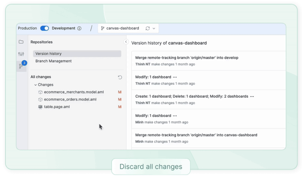
- Tired of moving your mouse to confirm “Discard Change”? Press
Enterfor a keyboard shortcut superpower
- Rename on the go: Change file names directly from the top navigation, no need for navigation detours
 .
.
Holistics keeps getting better ![]()
![]() Huge thanks to your feedback
Huge thanks to your feedback ![]()
![]()
![]() . Stay tuned for next month’s exciting updates!
. Stay tuned for next month’s exciting updates! ![]()