![]() Hey there, amazing community!
Hey there, amazing community!
It’s time for our monthly UX roundup! We’re excited to share the latest updates and fixes with you in the last month. Let’s jump right in!
Reporting
-
We fixed the Save button being cut off on small screens.
-
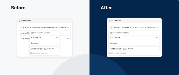
The resizing issue of the Conditions popover in the Settings panel has been resolved.
-
Our team corrected the custom label issue that cut off the last letter.
-
The metadata popover in the Exploration modal is now properly aligned.
-
We removed duplicate fields in the Used in the reports section of the Conditions popover
-
The + Create Dataset button has been repositioned to align correctly.
-
We fixed a bug that you could scroll the Visualizations (Viz) panel from top to bottom, which was supposed to be scrolled inside the Viz Content section (excluding Chart Selector and Get Result section).
Modeling
- You can now click outside the field to save a new file name from the left sidebar.
- We added spacing between action buttons (+ and … ) on the left sidebar.
General UX & UI Enhancements
-
The redundant divider line in the widget dropdown for business users has been removed.
-
Aligned the icon and text in the Embedded Analytics confirmation modal.
-
Also related to the Embedded Analytics, in the Preview Sandbox, we fixed the issue that the empty state image broke its frame in the small screens.
-
Clicking the Holistics logo on the navigation bar now correctly directs you to the homepage.
-
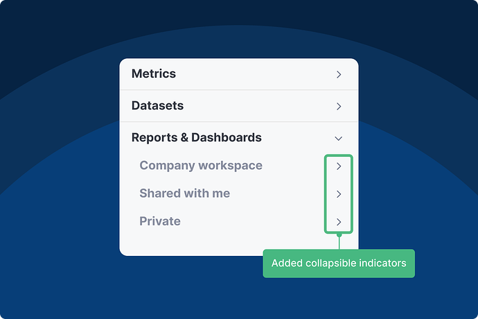
The left sidebar on the homepage now has an arrow on each subsection (e.g., Shared with me, Private, etc) to indicate that they are collapsible).
-
The Add button in the User Access modal is no longer stretched to match the height of the input field when inviting multiple users.
That’s a wrap for this month! We hope these updates make your experience smoother and more enjoyable. Thanks for being part of our community – your feedback keeps us going strong!

