Happy April Fool’s! As we come together for our monthly UX duty roundup, let’s take a look at the improvements we’ve made to enhance user experience in our app over the past month.
Reporting
-
Say goodbye to widget wobbles!
 We noticed some widgets shifting slightly when you hovered over them with the Hide title option on. This happened because the popover menu popped in, adding extra space. We’ve ironed out that inconsistency!
  Now, hovering over your widgets, whether titles are hidden or shown, will be a smooth and seamless experience.
-
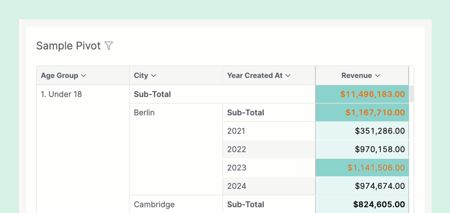
We’ve some new improvements to our Pivot table:
- You can now resize column in Pivot table, by dragging the header’s right border
- To fit the column with its content, double-click on that border
- Note that your resizing doesn’t persist (reload = gone)
General UX & UI enhancements
- The (i) icon and buttons’ behavior were inconsistent across our app, some showed a tooltip on hover but some required a click. We’ve unified them to show a tooltip on hover.
- In the Users Management page, there was no space between the API Key dropdown and the
Invite Userbutton. We fixed that. - We fixed the misalignment between some radio buttons in KPI Metric setting.
- The left sidebar in the Create Query modal is no longer cut off.
- The Color Picker from the Chart Color Palette on the Setting page was broken with the wrong font family. We fixed that.
- We fixed the bug that caused the text and rating scores to overlap with each other in our Feedback form.
That’s it for this month. More enhancements are coming up, so stay tuned. Thank you for sending us feedback, reporting bugs, and helping us build a better product. See you next month!