Hi everyone, welcome back to our monthly UX roundup update!
From your valuable feedback, we have made improvements to bring you the best experience with Holistics. Let’s see what we get this month:
Reporting
-
Field value now shows the correct options when you change a field in Data Alert Condition
-
The Single-select List filter can now be left empty. No more forced to choose a default value

-
We added more date formats to support you better in data presentation

General UX & UI improvements
-
Markdown styling across the Holistics app is unified.
-
The bug where empty tooltips show up when you hover over the Date-drill is fixed.
-
There was an extra space when showing the execution time. We fixed it.
-
In the Data Modeling 3.0 version, the error banner is now removed correctly when you disable ambiguous indirect relationships.
-
We removed the styling from browsers that made the modals border dark and thick in the focused state when users navigate with their keyboards.
-
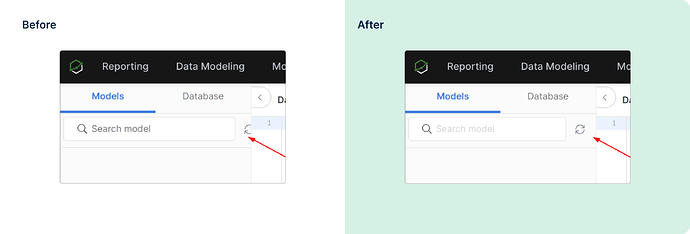
The refresh button in SQL Editor is no longer cut off when the left panel reaches minimum width.
There are more things that we’ve been working on (like an updated Error Handling system ![]() ) but that’s all for this month. Feel free to share your feedback and suggestions to help us make Holistics better. See you next month!
) but that’s all for this month. Feel free to share your feedback and suggestions to help us make Holistics better. See you next month!
