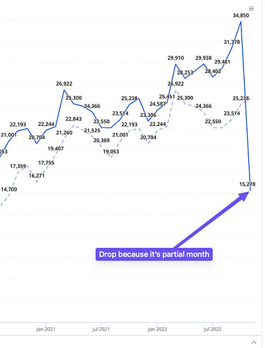
When charting out monthly/weekly metrics up to today, there usually is a drop if it’s not the end of the month yet. If not careful, readers might confuse this with an actual drop in metrics.
Ideally there should be some cue (dotted lines, etc) to signal this.
