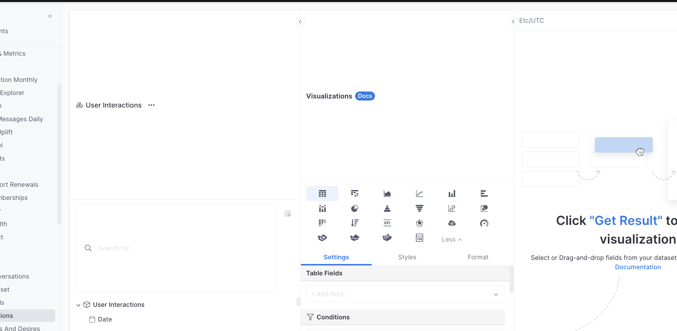
Hey data gurus! myself and my data team are experiencing view setting issues with creating a new explores or opening a data widget. There seems to be bigger white space areas now. Its makes to hard to navigate the page and we cant seem to correct it.
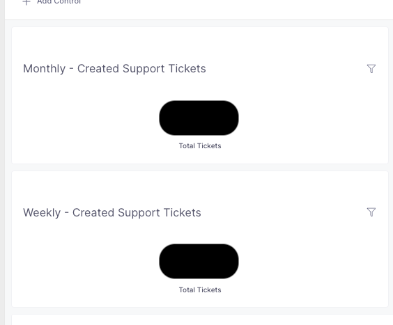
Also, on our dashboards the widgets are also looking drowned out by the additional white space now around our KPIs, graphs etc.
We appreciate your report regarding the issue. Would you kindly attempt to refresh your browser to check if the problem with the view has been resolved? Our working theory is that you encountered this issue during the release of a new version of Holistics, and it should now be rectified.
UPDATE: all of my data team are still having the same issue. Even our dashboards are looking messy. KPIS aren’t in line and have lot of white space still, graphs are flattened and tables cant read properly. We have sent a company wide update to all data users.
We’ve pinpointed the issue: it seems that the Workstream Concierge extension (you can find it here: Workstream Concierge - Chrome Web Store) is somehow conflicting with Holistics, causing some hiccups in our website’s UI.
In the meantime, it would be super helpful if you could let your colleagues know to temporarily disable that extension when they’re working with Holistics. It should tide us over until we get this issue sorted.
P/s: I have already sent you an email regarding this issue, but I re-post it here in case there’s other people face the same one.