I’m a big fan of the metric sheet visualization, but I don’t understand why there is a hard column limit.
I would welcome it being removed or made configurable to avoid having users filter on a timeframe manually to expand the desired view.
Thanks for reaching out about this, @Gabriel!
To confirm, is it the “Number of columns” options in Viz Styles that you were referring to?
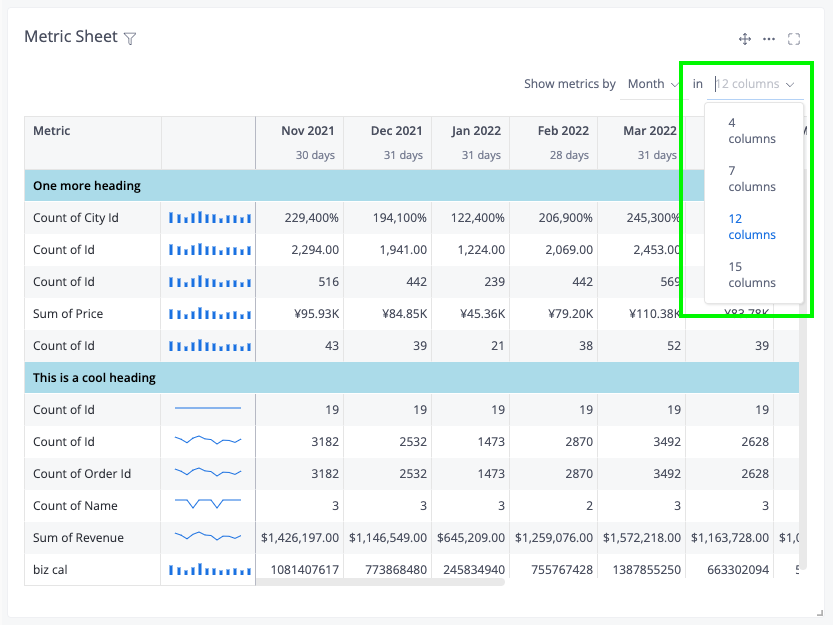
This is indeed our original intention for the “Number of columns” option in Metric Sheet visualization.
Due to the viz being a combinations of several metrics, we wanted to limit the number of columns here, but only focus on some of the most-used ones (for example, 4 columns for “Quarter” granularity, 7 columns for “Day”, with the aim of improving in-app performance & experience.
However, we’d love to have the opportunities to support more use-cases also.
Could you share more about the context, as well as what your users’ desired view of the metric sheet would look like, @Gabriel?
I understand a column limit to have better control over the performance, but a pre-defined and mandatory limit is restrictive. As I understand, query results are limited already for performance reasons so it could be redundant. Plus this viz is pretty much a nicely styled pivot table and pivot tables do not have this limit, although you could make the same argument there.
We use the metric sheet for reporting purposes, which we in a lot of cases do on a monthly basis.
We currently have to build a business case, where we need +2 years of sales data per month.
If we did not have the 15-column limit, this would be very easy. Instead, we either have to download the results, use a filter to select another period, and then merge it in excel or use another report type like a table.