The UX with single-select filter boxes is kind of painful to use.
For me, the use case for this feature is to quickly switch between all-data views and one specific person, area, or store.
In other words, basically drill-down, but driver by a filter rather than having to waste dashboard space with a table listing the filterable values.
So being able to do this without a lot of clicks or a lot of space is key.
First, it seems like a bug to me that you have to have a value for single-select boxes, rather that “any value” being one of the options as for multi-select filter boxes.
Secondly, compare the sequence to select from this type of filter in most BI products, which show the drop-down box directly when you create this type of control:
Click on the filter box to bring up the filtering panel
Click on the drop-down for the filter that you just clicked on (redundant)
2a. Wonder why there’s radio-button circles; ignore that
Click the value you want
3a. Wonder why the drop-down hasn’t closed up; see that the color has changed and the radio-button selected, so decide it’s probably OK
Wonder why nothing is happening
Realise that the filter hasn’t actually been applied, because the filter panel hasn’t been submitted. But where’s the submit button?
Click away from the drop-down to close it up, revealing the Submit button that was hiding underneath. (nb. Multi-select boxes don’t have this problem because it happens that the nested drop-down for the choice type - the one that says “is” by default - is wide enough that the actual value drop-down does not cover the Submit button).
Click Submit.
So 5 clicks vs. 2 with most products, and not very discoverable, first-time users will get frustrated.
Next thing wrong, you can’t Submit a filter unless you’ve changed something - you must Cancel. Even if you changed a filter then changed it back! That seems totally unnecessary, and it makes it feel like you have something actually wrong with your selections. It’s not obvious to a user what cancel will do here (actually it’s fine in the end). This one applies to multi-select filters too.
While I’m on the subject, it’s kind of nice having Date drill as a normal, quick-to-use drop-down there by default on the right. But why not one for Date itself? It’s very, very common to want to filter a dashboard by date, in fact I would go so far as to say you want to do that on most dashboards.
For the 1st question:
I just wanted to confirm a bit that such a behavior of the Single-select filter is by design. We wanted to provide a filter option in which only one specific value is required. This is to help solve use-cases where more than 1 value will render the dashboard meaningless or broken.
Regarding your use case, to quickly switch between all-data views and one specific person, area, or store: I think our Drill-through feature may come in handy in such a case (Drill-through | Holistics Docs). Could you try it and let me know if it helps?
We surely will validate use-cases where you need to include all data, with a single-select filter presented in a dashboard. I’ll let you know if there’s any update on this!
For your 2nd question: These are great suggestions to the current user flow of the dashboard filters.
Currently, we’ve been planning on revamping the filters for 3.0 dashboard, and these are great inputs to note down. Let me keep you posted on any updates!
Drill through - yeah, I’m using cross-filtering and drill-through as a workaround. But IMHO this is a pretty natural case for filters.
Date drop-down - yeah, something like that. The date range filter input is not bad, just want it to be really quick to use. I guess the catch is that we need to define which field to filter on though right? So probably easier to just improve the filter UX.
We’ve just released some updates to the Single-select List filter, which should address several problems that you raised above:
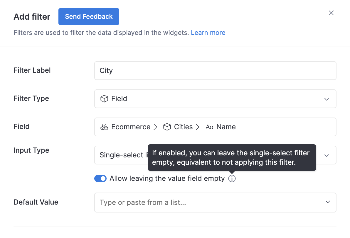
(1) The ability to allow empty value field for Single-select List:
Thanks to your invaluable feedback, we’ve acknowledged the opportunity, and been working on supporting this use-case with Single-select.
I’m glad to let you know that you can now configure your Single-select filter to accept leaving the value field empty.
When left empty, this filter will not be applied, just similar to the behavior of Multi-operator filter.
(2) Improvement to the flow of using Single-select List
We have also made an improvement, where the drop-down list will close right after you have chosen a value
Your inputs on the Filter experience are duly noted. And we are actually working to further improve it at the moment. I’m excited to let you know more soon
Let me know if you have any further feedback.
Once again, thank you @will.b for the insightful and thorough feedback! It’s definitely the fuel for us to keep improving.
Cheers!