This is Thinh from the Product team. Thank you so much for your suggestion.
We are currently not supporting the option to change the format of data labels in percentage stacked column charts. But I could definitely see how we could improve on this base on your feedback. I will add this use case to our backlog on your behalf for future improvement.
It’s Theo here from Product team. First off, massive thanks for being so patient with us.
At present, we don’t have immediate plans to address this within the next two months. Our current focus lies in delivering the Canvas Dashboard and other items outlined in our roadmap. You can find our Public Roadmap here: Public Product Roadmap — Holistics. However, we do aim to tackle issues with Stacked Charts by the end of Q2-2024, once our backlog has cleared up.
I’ve made sure to give your request a personal nudge within the Product team. In addition to that, if you’re still grappling with readability issues with Stacked Charts, would you mind snap a screenshot and give us some more details about your report? You can send it over to us via [email protected] or fill out this form. We’ll do our best to find a workaround for your situation.
Thank you for being patient with us all this time.
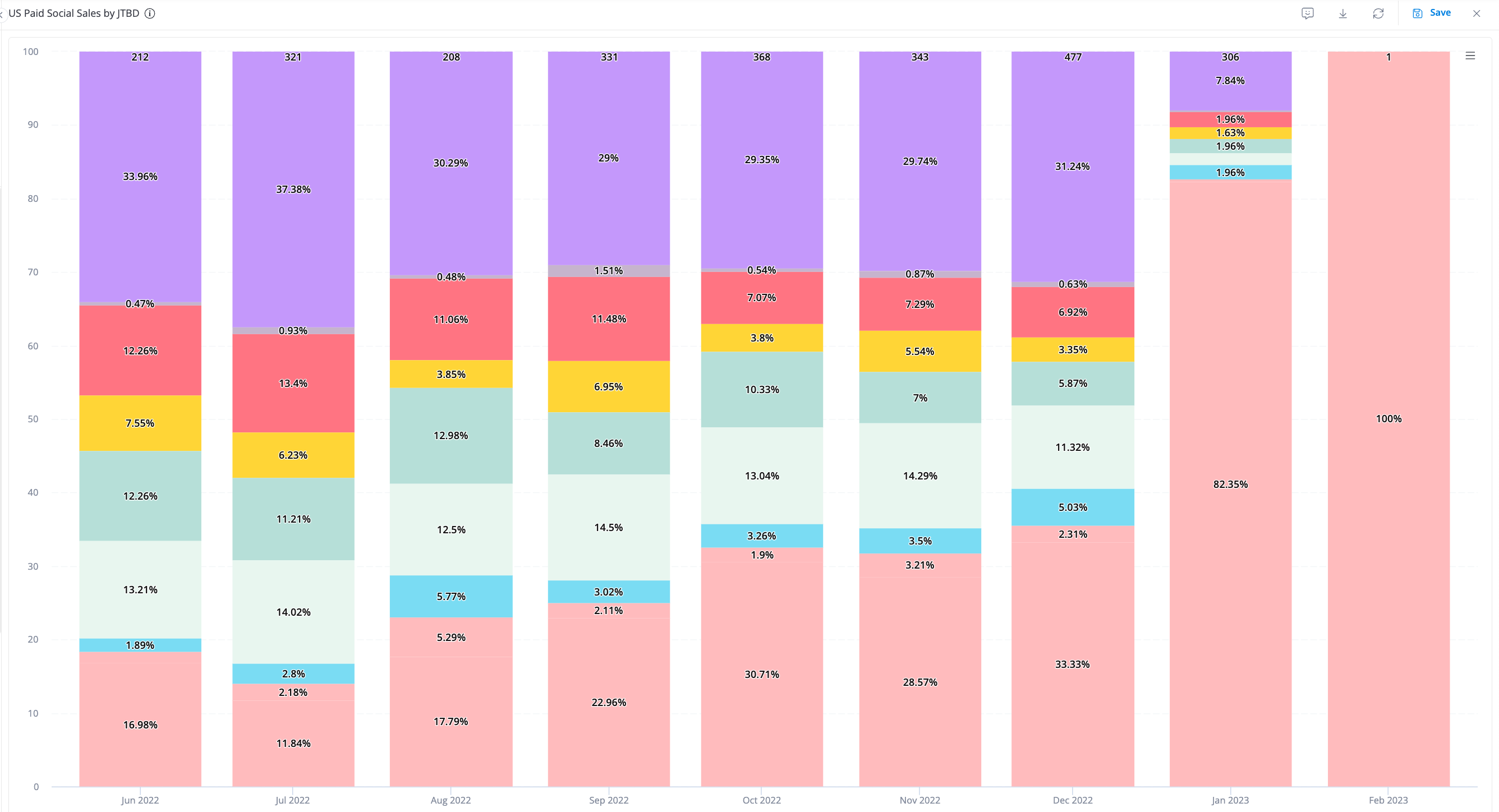
Whilst we haven’t made any improvements on the percentage format of stacked bar charts, our Percent of Total (released in August, 2024) can help you with this use case.
Please follow these steps:
In Y-axis:
Click “Add Percent of Total”
Input a measure
Choose “Legend Total”
In tab Styles:
Turn on “Stack series” toggle
Choose “Normal” for “Stacking type”
Your PoT behaves like any measures in the chart, so you can format them however you like it (e.g. with decimal points, or no decimal points at all).