Manually group y-axis legend items or manually group values in a dimension into a new custom dimension

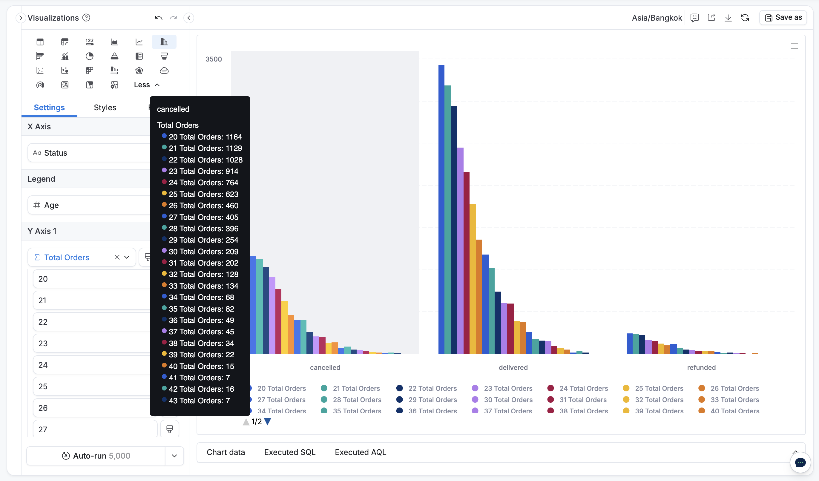
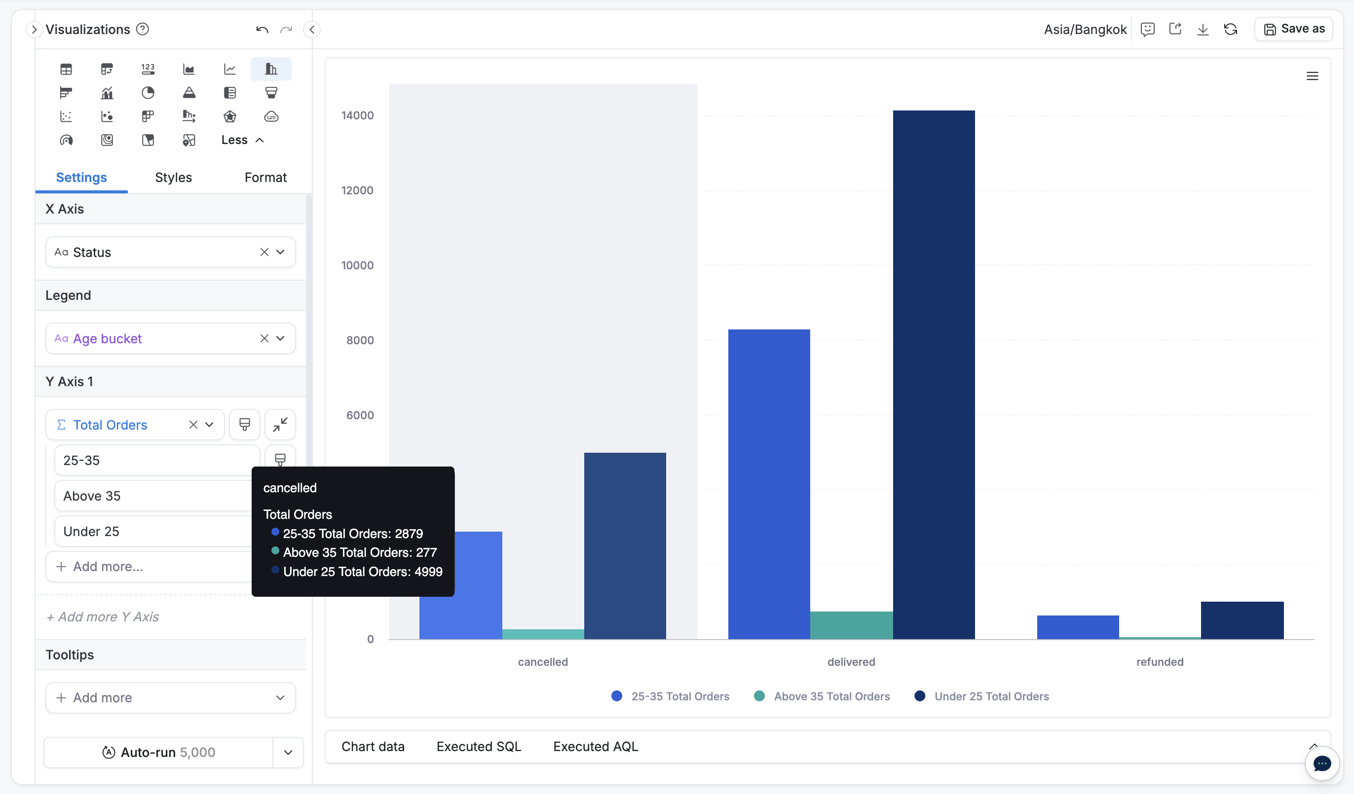
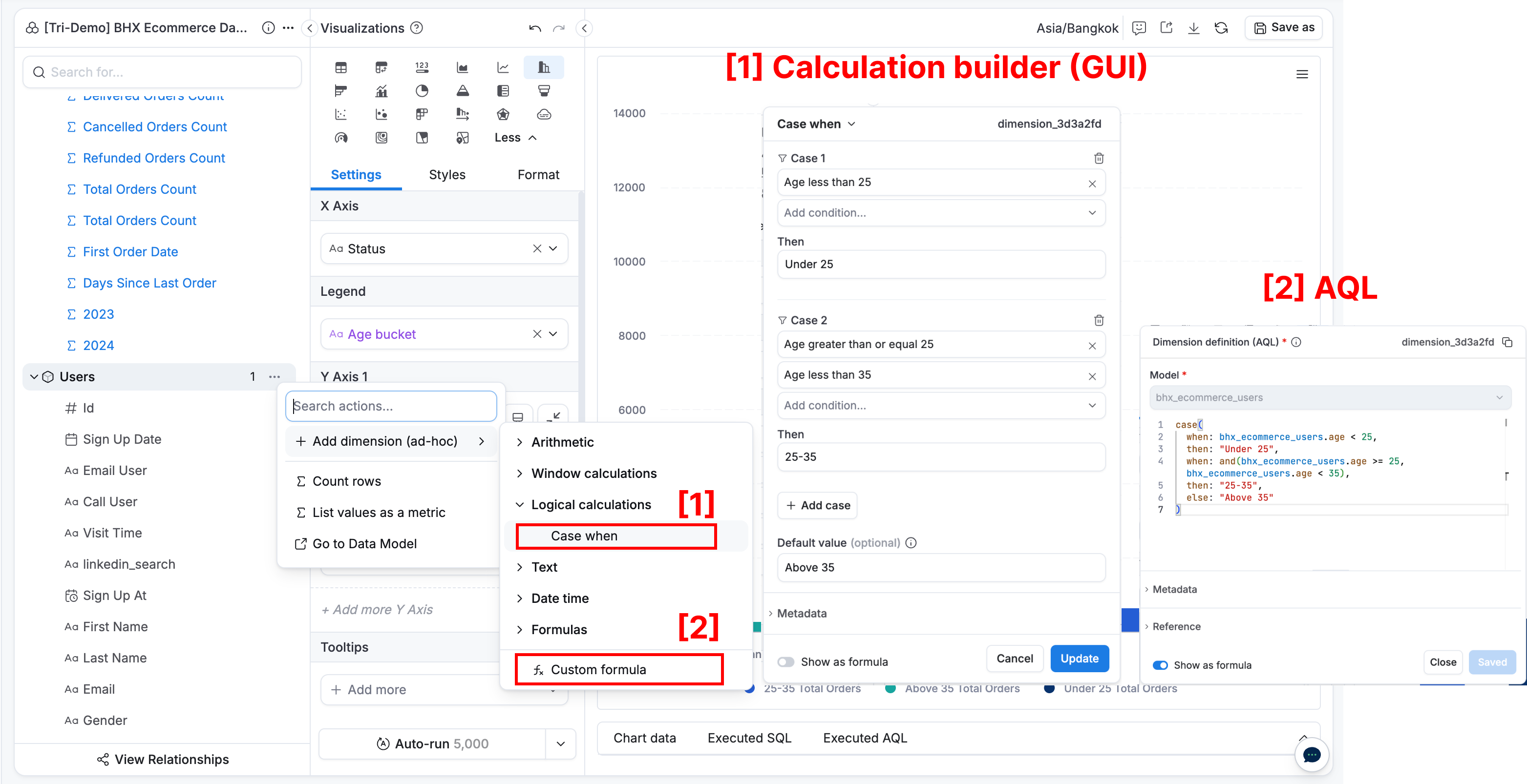
Pivot tables are a good example here — the group by small items piece is nice, but I’d like to manually combine fields for specific charts. E.g., if a sales rep owns two regions, I’d like the raw data to continue to keep those regions distinct, but I’d also like to be able to quickly build manual groups.

If this exists, let me know where (and maybe make it easier to find)

Hi @Jake_Powell,

Let me confirm my understanding:

  • Suppose you have a column chart:
    • X-axis: Status
    • Legend: Age
    • Y-axis: Total orders

  • You want to group these ages into defined age buckets, so:
    • X-axis: Status
    • Legend: Age buckets
    • Y-axis: Total orders

Is this what you’re looking for?

If so, you just simply need to create a custom dimension with a Case-when using

  • Calculation builder (GUI) or
  • AQL

// AQL
age_bucket = 
case(
  when: bhx_ecommerce_users.age < 25,
  then: "Under 25",
  when: and(bhx_ecommerce_users.age >= 25, bhx_ecommerce_users.age < 35),
  then: "25-35",
  else: "Above 35"
)

Let me know if this is your case or you need to clarify further.

1 Like

Hi Tri, thank you for the fast and thorough response.

This does address my case — I’ll use case-when or the GUI going forward, thank you for the tutorial.

Jake

1 Like