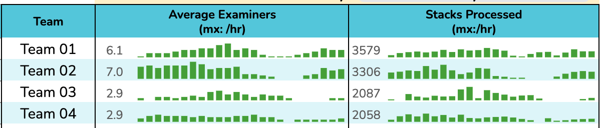
I’m trying to replicate a visualization I made in Google Sheets using the sparkling formula. It’s similar to the metrics sheet in Holistics, but not using the date slice approaches. Here’s a snippet:
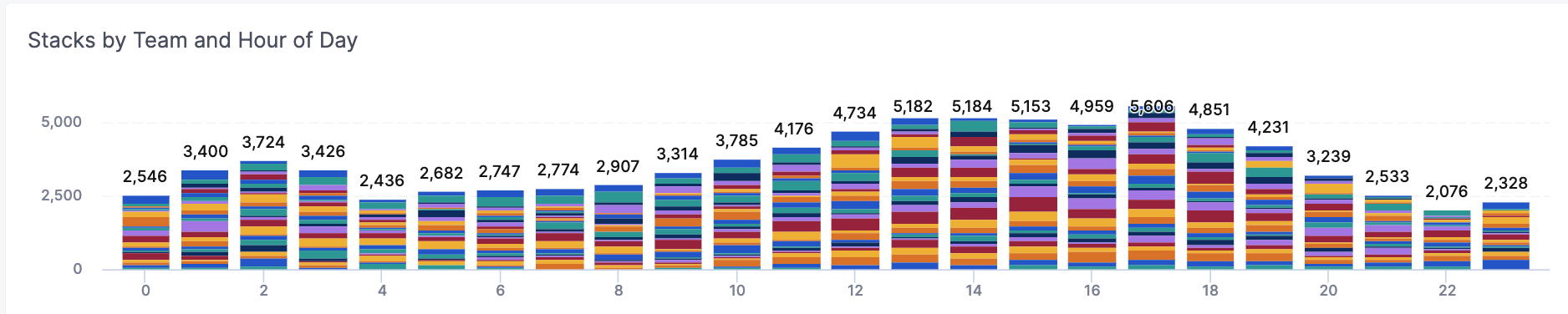
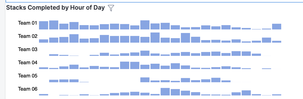
There are actually 30 teams in the groups, the columns represent a measure in a 24hr days (each counts the average examiners active in hour 0, 1, 2, 3-23. The global org is trying to understand “when work get’s done”. There is a hierarchy of team mangers on top of teams.
Thank you so much. This is a very interesting use case. As far as I know, this can be done using sparklines in tables or using trellis/small multiples visualizations. Unfortunately, these features are not yet available in Holistics.
As a workaround, I would suggest you look into our Custom Charts functionalities. With Custom Charts, you can create custom chart templates using Vega-lite and create visualizations that accommodate your needs.
More information about Custom Charts can be found here:
Note: Custom Charts feature is available to all customers in Standard Plan and above. If you want to know more information on how to get access to this feature, contact us at [email protected] or fill out this form.