Hello -
I’m working on a Line Chart with about 12 lines. The tooltip shows up to 12 values as I move my mouse around to different points. I can see how this would be useful in some instances! However, I would like to be able to hover over each point and display 4-5 data fields, as in your map tooltip example. The Map tooltip seems to use both the x and y coordinates of the mouse, but the Line Chart only uses the mouse’s x coordinate. Any chance this could be an option? Or maybe someone has made a custom chart type that does this?
Thanks!
Becca
Edit: like the toolips in the Scatter Chart! I would like to be able to toggle to that tooltip style for the Line Chart.
My understanding is that… your Line Chart has 12 lines, thus the tooltip always shows up to 12 values. You want to show only 4-5 values of your choice, instead of all 12 values. Is that correct?
Are those 12 lines from 12 different data fields, or from 12 legend values?
12 different legend values –
Store A, Store B, Store C
5 different metrics to display in the tooltip –
Metrics: 1,2,3,4,5
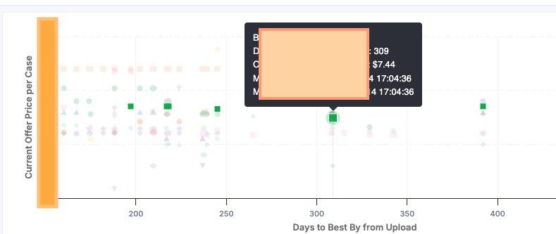
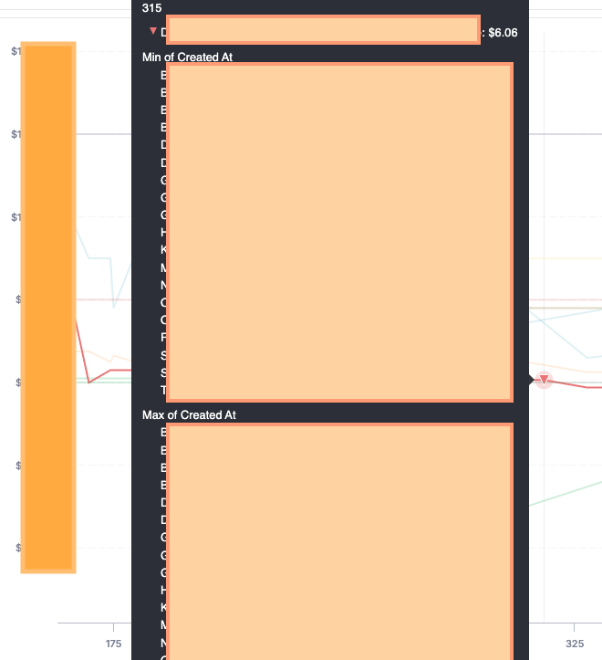
I want to see Metrics 1-5 for only Store A when I hover over one of Store A’s data points on a line. Currently, when I hover over the line I see Metrics 1-5 for ALL the Stores that share that same x-coordinate when I hover over a data point on the line. The tooltip is comically big in this case!
That makes 12 lines on the chart. When hovering to see information of a data point, the tooltip displays up to 60 values (12 lines x 5 metrics). That’s indeed comically big
Configuring what to shows in the tooltip is a valid use case. I’ve put your request in our backlog for further improvements!
Yes! That’s all correct. I’m including screenshots of how the tooltip looks for the Scatter Chart and the Line Chart. I like how the Scatter Chart tooltip works – displaying just the info for one point.
I would be really great to be able to toggle between the single-point tooltip and the x-value tooltip. But if we can only have one I’d rather have the single point tooltip.
This also applies to stacked bar charts. The tooltip shows all the values for all the segments. Sometimes I just want to see the metrics associated with a single segment of a stacked bar.
Thank you so much for the screenshots! They gave us a much clearer understanding of the problem.
Yes, line charts and stacked bar charts (along with area, column, and combination charts) are within the same chart family, so they share the same tooltip mechanism.
We have duly noted your use cases. We’ll keep you updated as soon as we have a more concrete plan for implementing a configuration feature for the tooltip.
Hello — piling on here. Tool tips are pretty chaotic with the entire x-axis data labels. It’d be nice to default to one data point and/or be able to toggle. Right now, when I’m presenting to leadership, hovering over data points covers the entire chart with the tool-tip and doesn’t help me share the specific information I’m trying to show. The chart shows the entire x-axis data — I’m looking to hone in on a point.
Hi @Jake_Powell,
Showing multiple values at the same x-axis point helps users compare across lines. In your case, though, the goal is to focus on a single data point, which is also absolutely a valid use case.
This is already on our backlog, but we don’t have a concrete timeline yet in the near future. I’ll share your feedback again with the team to aware of it and review prioritization for future improvement.