Hi community, we’re very excited to announce an upcoming update: a revamp of the app navigation, centered around one universal sidebar.
Dashboards, data, and tools now live in one place, with more room for your data.
What’s changing:
- One sidebar everywhere. It’s where you browse content, switch tabs, and find the key actions. It stays in the same place and behaves the same way as you move around the app.
- Two clear modes. For builders, Reporting and Development now read as two distinct modes. The sidebar stays in place and swaps its content to match the mode you’re in, so you can explore and build without losing your place.
- Resources & settings are centralized in the bottom section of the sidebar, follows a clearer hierarchy.
For Admins & analysts
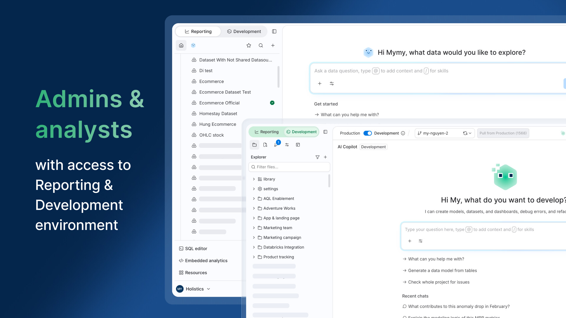
Reporting and Development mode sit at the top of the sidebar, so you can switch between exploring and building while still having a clear view of your current environment.
Explorers
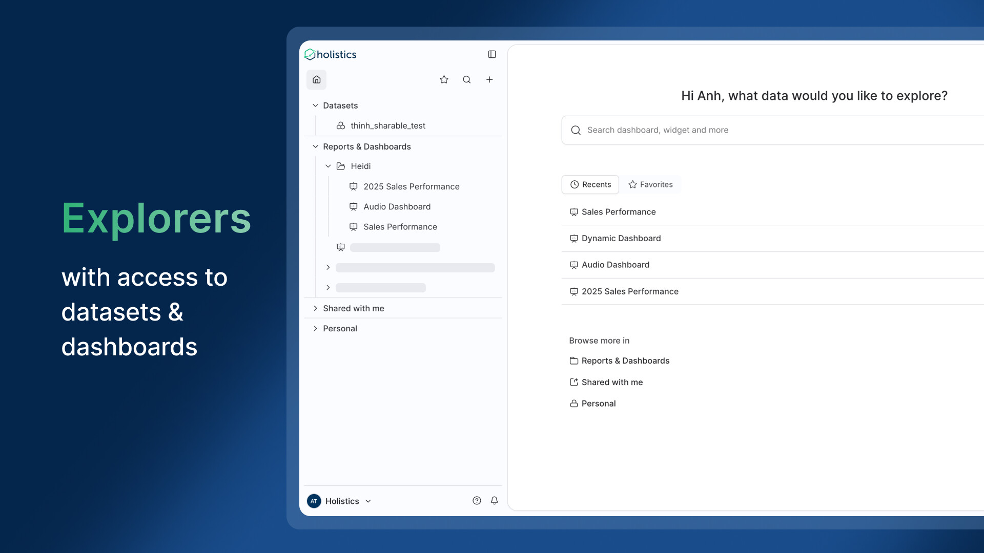
Your sidebar covers datasets and dashboards: Datasets, Reports & Dashboards, Shared with me, and Personal.
Viewers
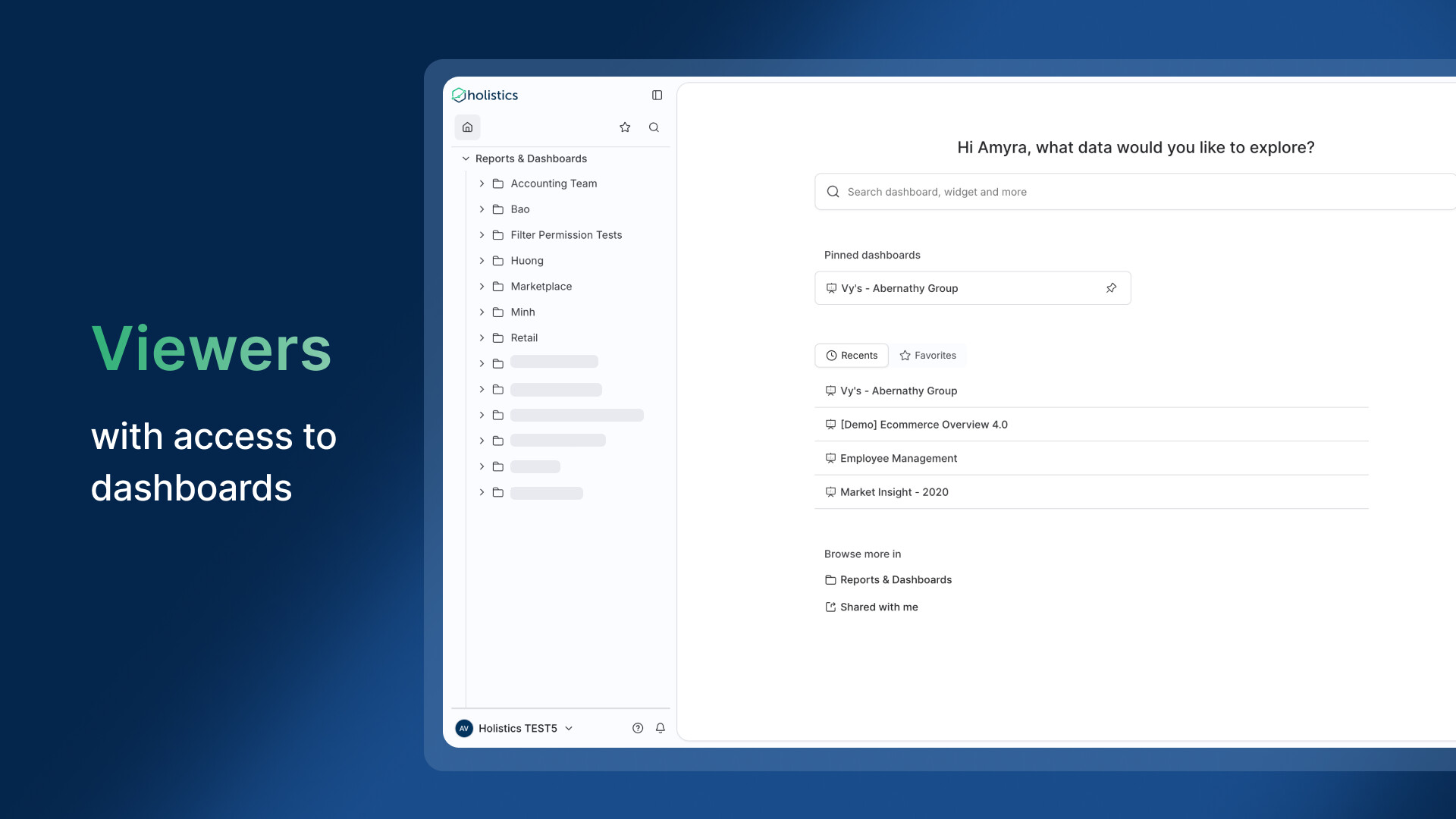
Your sidebar stays on the dashboards you have access to, with favorites and search in the top row.
This new update will be released on 16 September for workspaces on version 4.0. Earlier versions keep the current navigation for now.
It arrives with the new app dark mode, and together they give Holistics a more modern look and feel.
We’re still working through the details to improve the experience further, so any input or feedback is welcome!