Launched: Control Column Width in Table & Pivot Table
Notes: This feature is only available when editing Canvas Dashboard.
Previously, tables and pivot tables in Canvas Dashboard automatically expanded to fill the entire container width. Sometimes, this leads to excessive whitespace and removes the focus on important information.
What’s new?
You can now adjust the width of individual columns in your Table and Pivot Table. How it works:
By default, tables and pivot tables still expand to fill the full width of their container.
When editing dashboards, you can control column widths by directly dragging the column borders. The new widths will be saved, ensuring your tables and pivot tables maintain a consistent look across all views.
I also can’t seem to make this work. When I adjust the column widths while editing a canvas dashboard, it does not activate the “Commit changes” button. I would expect that button to turn blue like it does when I slightly move a widget. When I refresh the page, the columns go back to their original widths.
This feature will really help us once we have it working! Even better would be if we could optionally make the column headers wrap!
We have identified some bugs with the feature and have temporarily disabled it while we work on a fix. I’ll keep you updated on our progress and let you know as soon as it’s available.
@Theodore_NT It appears to be working for me! Thanks! Any plans to be able to set the text of Column Headers to wrap instead of being cut offer? That would allow me to set some of my columns narrower and see more info at once.
Thank you for your suggestion regarding the ability to wrap the text of column headers.
Could you please let us know how crucial this feature is for your work? I’ve noted your request and will make sure to keep you updated on any developments related to this
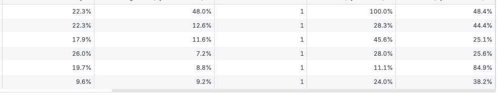
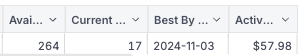
@Theodore being able to wrap column headers is not a deal breaker, but it would really help our reports be more user-friendly and look more professional. A frequent situation we have is a table with three different columns formatted like XX%. These do not take up very much horizontal space. But, to adequately describe and distinguish between these we have long names like: “% Discount from MSRP” which take up a lot of horizontal space. To display these full titles, we are having to set wide columns which then introduce user friction via a horizontal scroll. I’m attaching screenshots showing our two options today: (1) cut off the titles and have the columns/numbers display at a reasonable density or (2) show the titles and have lots of extra white space plus a horizontal scroll that has to be interacted with to see all the data.
This is a very detailed and insightful response! I’ll make sure the team sees your feedback, and we’ll keep you updated on our progress regarding any of the items as soon as we start addressing them.

 What’s new?