Hi @ctang, thank you for providing the examples.
You can build similar visual by using our Dynamic Content Blocks
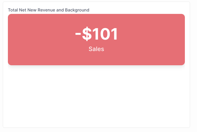
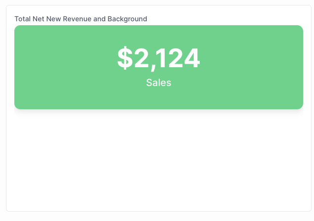
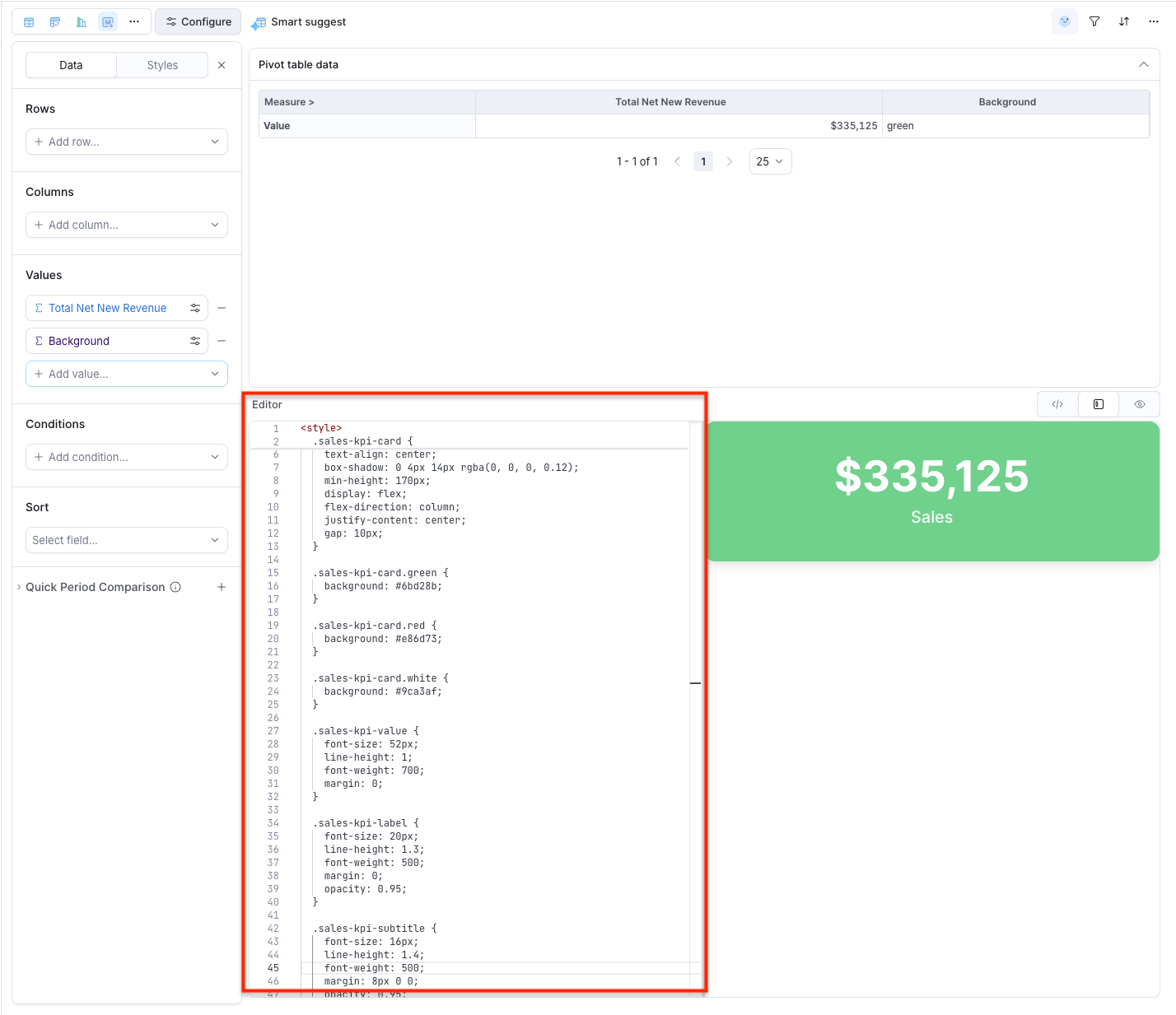
The result will look like this:
- Negative value:
- Positive value:
To build this visual, you can follow these steps:
- Select Markdown viz type
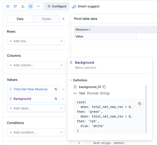
- Add the metric and create a new custom metric to calculate the card background using our AQL’s
case .. when ..syntax
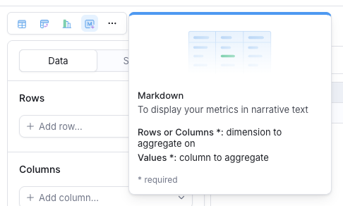
case(
  when: your_metric > 0, then: 'green',
  when: your_metric < 0, then: 'red',
  else: 'white'
)
(remember to name it Background)
- Add code to your editor
<style>
  .sales-kpi-card {
    border-radius: 12px;
    padding: 24px 20px;
    color: #ffffff;
    text-align: center;
    box-shadow: 0 4px 14px rgba(0, 0, 0, 0.12);
    min-height: 170px;
    display: flex;
    flex-direction: column;
    justify-content: center;
    gap: 10px;
  }

  .sales-kpi-card.green {
    background: #6bd28b;
  }

  .sales-kpi-card.red {
    background: #e86d73;
  }

  .sales-kpi-card.white {
    background: #9ca3af;
  }

  .sales-kpi-value {
    font-size: 52px;
    line-height: 1;
    font-weight: 700;
    margin: 0;
  }

  .sales-kpi-label {
    font-size: 20px;
    line-height: 1.3;
    font-weight: 500;
    margin: 0;
    opacity: 0.95;
  }

  .sales-kpi-subtitle {
    font-size: 16px;
    line-height: 1.4;
    font-weight: 500;
    margin: 8px 0 0;
    opacity: 0.95;
  }
</style>

<div class="sales-kpi-card {{rows[0].values.`Background`}}">
<div class="sales-kpi-value">{{ rows[0].values.`your_metric`.formatted }}</div>
<div class="sales-kpi-label">Sales</div>
</div>
(remember to replace your metric name to above code)
Could you give it a try and let me know if works for you?