Hi community! ![]()
We hope your week has been great. For this month, we’ve cooked up 10+ UX improvements to help improve your Holistics workflow & experience. We believe many small changes will lead to bigger improvements. Let’s go over them!
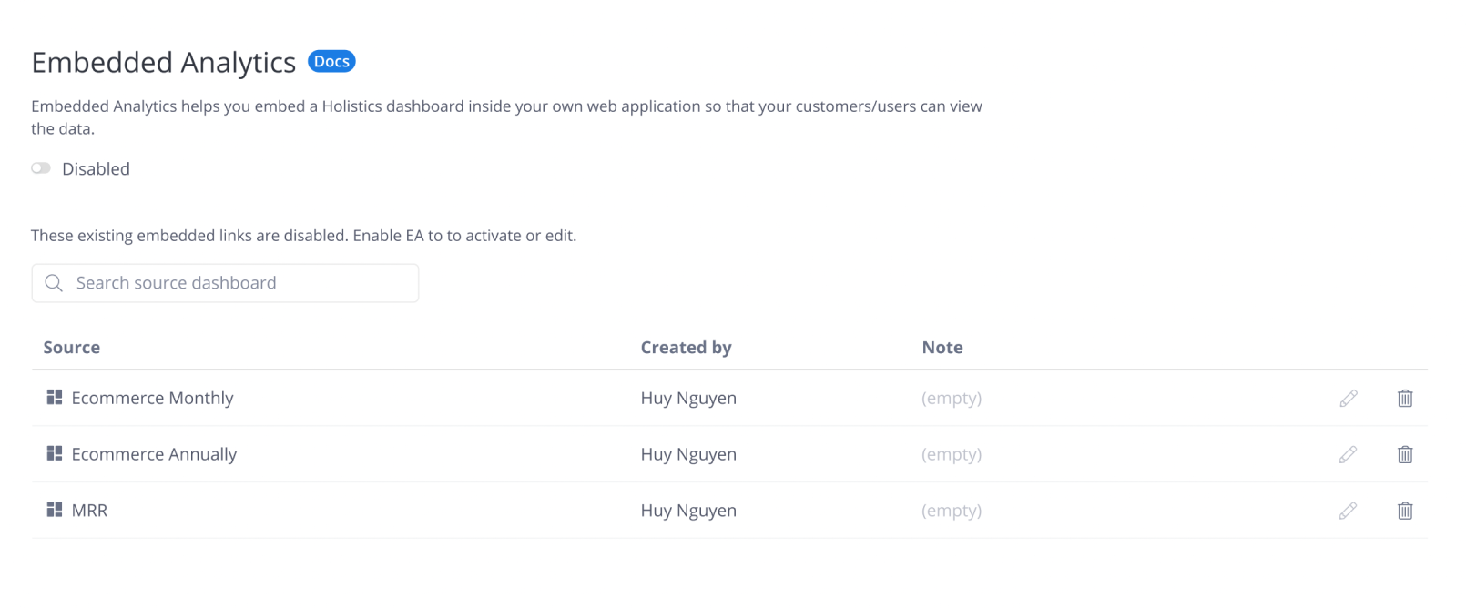
Embedded Analytics:
- In the Embedded Analytics modal, we fixed the issue where the Date picker popover is hidden on small screens.
- We now allow users to delete their embedded links even when Embedded Analytics is disabled, and updated the Embedded Analytics Management page’s content to be more useful.
Filter
- When the filter panel has too many filters, the Submit button is hidden way below. We fixed that by allowing scrolling in the panel.
- Improved cut-off options inside the filter operator’s dropdown.
- The Dimension and Measure fields when you’re creating field filters are now more distinguishable and easier to skim.

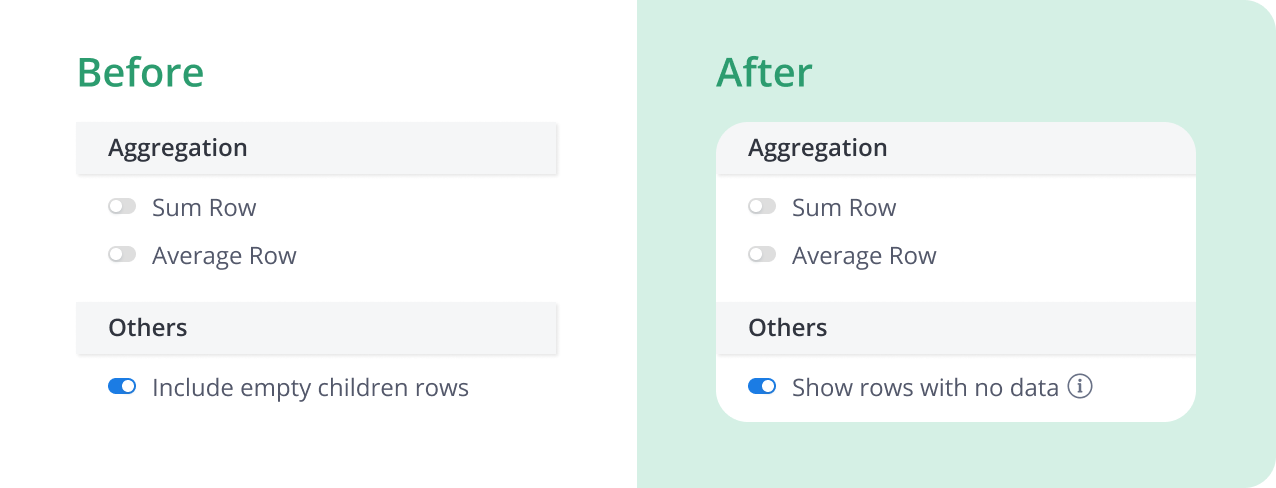
Viz settings
- Added
...to indicate when a long measure name is truncated - We fixed the combination chart’s broken dropdown option
- We revised the name of “Include empty children rows” to “Show rows with no data” and an info tooltip right next to it, for easier understanding.
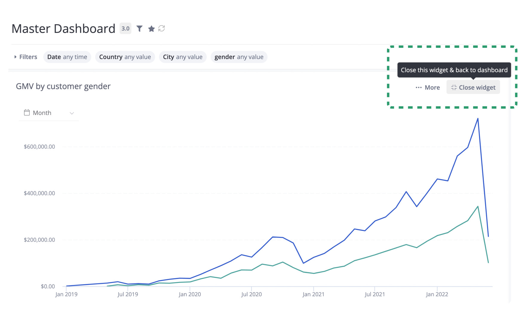
Dashboard & widget:
- Fixed the uninterrupted error messages spilling out of a widget inside a dashboard.
- Added a cue so it’s easier to tell when a folder is empty.
- We revised the collapse widget button and changed it to “Close widget” to be more precise.
General app UX:
- When adding users to a user group, the modal will display the user’s email so you wouldn’t accidentally add the wrong person

- Set a maximum width for the loooooong description in the Reporting & Data Modeling’s Browse to avoid breaking the table.

That’s it for this week. Please let us know if you have any feedback or run into any issues - we’re committed to making Holistics as seamless as possible for you ![]()