The Problem
Context:
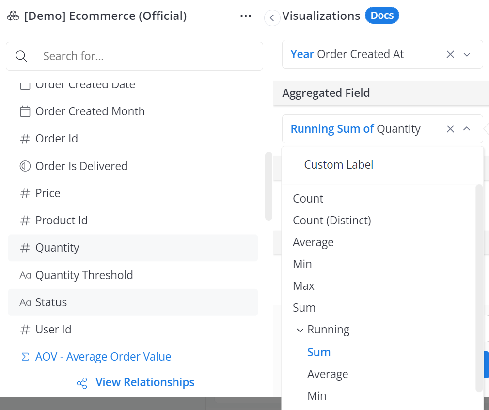
I have a line chart based on running sums of order “quantity” over the operational years of the business. I used the running sum aggregator available in the explore UI to create an aggregated sum of order “quantity” for the aggregated field input as seen below:
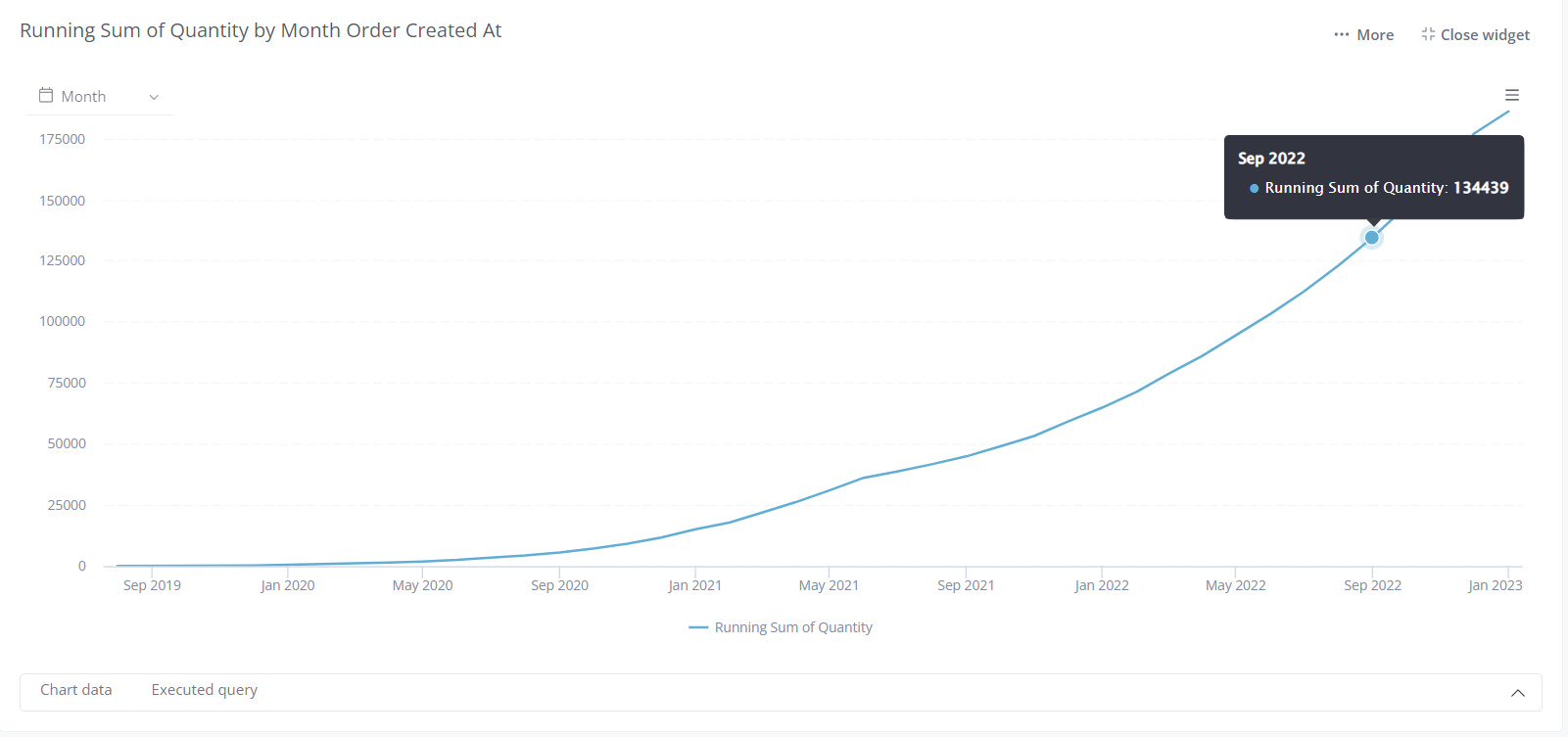
The result values from a period of about 1.5 years are low when compared to recent times. This results in a chart that shows the line being at almost zero (0) from those time periods up until a build up in the recent years. For later reference, note the tooltip with a running sum of Quantity value of Sep 2022 = 134,439
The space taken up on the chart by those periods with low values is redundant and I would like to trim the chart to areas closer to where the build up in values occurred.
Common Pitfall:
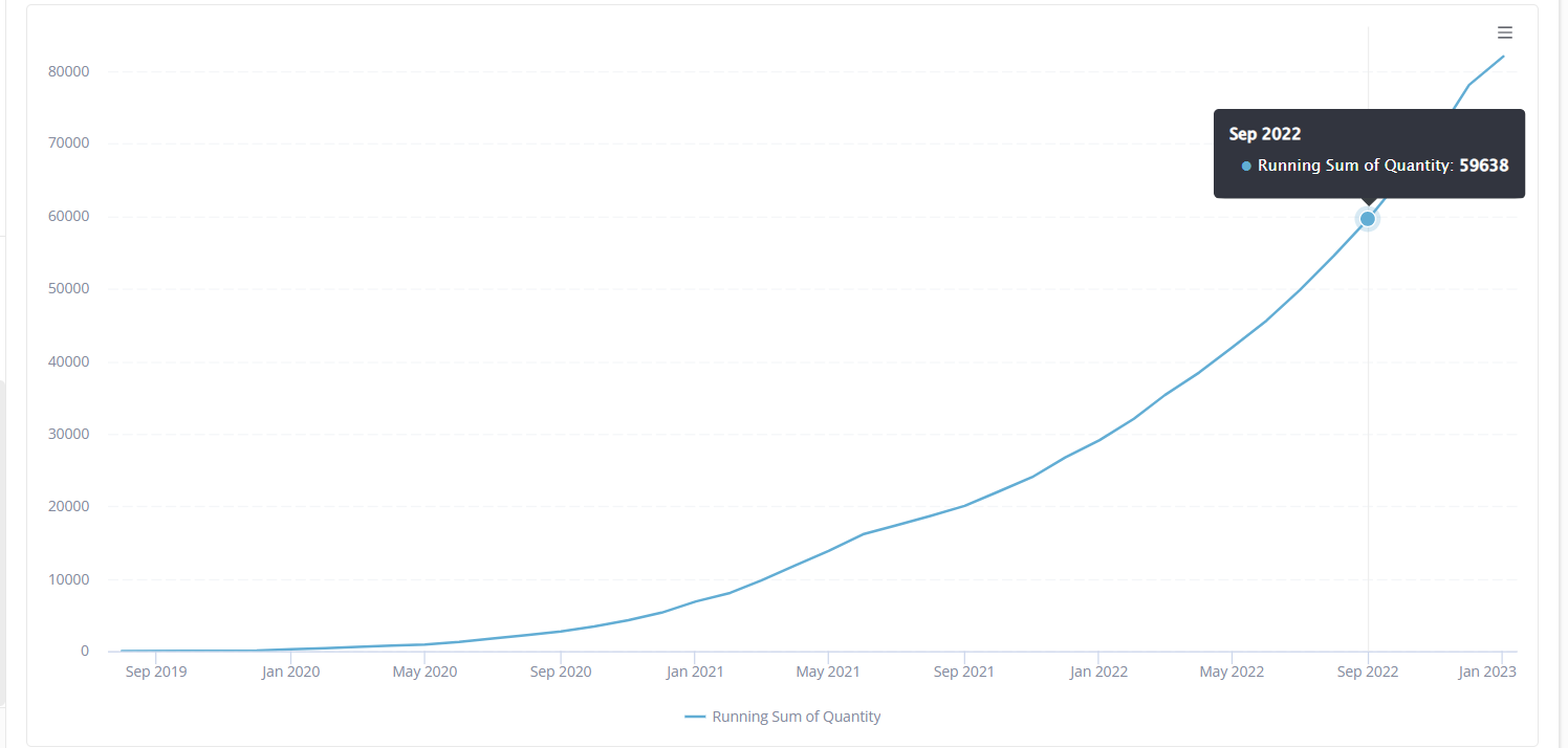
I try to apply filter condition of “quantity” greater than {{ #value}} to exclude low values as shown below.

However, the resulting chart produced wrong results as compared to what I would expect, as the running sums are now showing wrong values (Sep 2022 value is now = 59,638) and the chart still starts from Sep 2019 which means I have failed in my attempt to get rid off the “white space”.
Another pitfall could be a case where I decide to filter out date from Sep 2019 to maybe Feb 2021. This would also result in loosing row level values for those years and would yield wrong running sum values.
My limitation that may have resulted in this pitfall:
I created filters to filter out “low values”. This filter is not applied on the level of the running sum and would hence result in a case where the row level values would be filtered out before the running sum is executed. This is why I must have had wrong results.
The Solution
To avoid a chart with wrong results, I have to create a filter based on the running sum also. This means I have to apply the running sum aggregator to the selected field inside the filter UI. This would create a scenario where the filter is applied on the final aggregated results and not the original row level data.
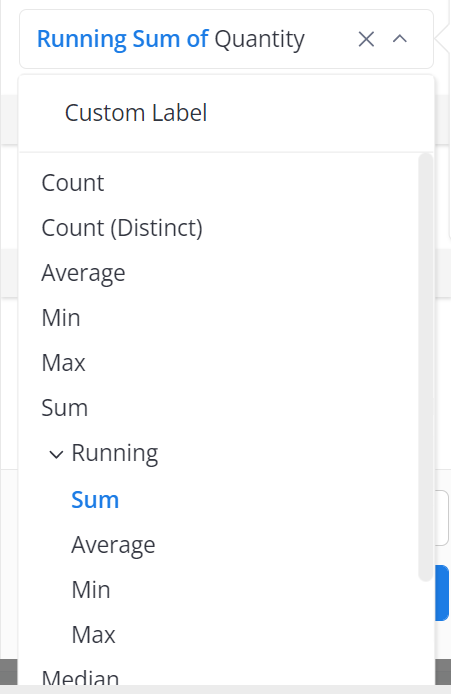
Step 1: After selecting the desired field for filter (i.e quantity), I click on the dropdown icon beside as shown below

Step 2: The above step should result in a drop down of available aggregators, then I proceed to click on the dropdown beside “running”. This should provide me a list of running aggregators available. I can then proceed to select “sum”. I would have succeeded in creating my filter condition on the level of the aggregation your chart is based on.
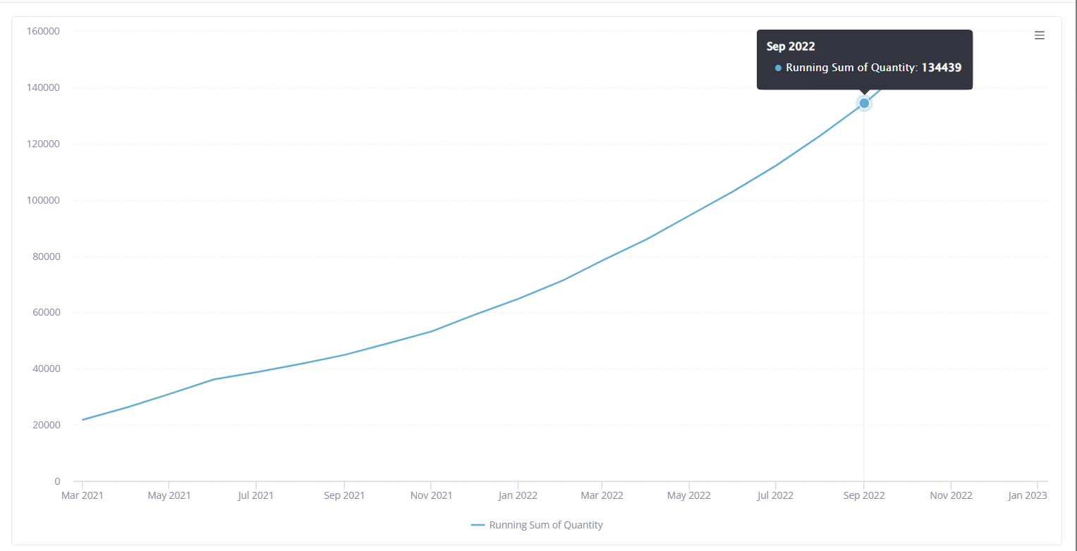
Now the resulting chart has the unwanted spaces trimmed off (chart now starts from Mar 2021), and now retains correct values for running sum of quantity. See Sep 2022 value still = 134,439