Monday, January 27, 2025
How’s your first month of 2025?
Returning to work after a long holiday can feel like opening an old, cluttered dashboard—widgets are outdated, the layout feels clunky, and you’re not quite sure where to begin.
It’s overwhelming, but familiar.
The same thing happens when you work with metrics in a system that’s not built for them. Numbers conflict, dashboards contradict, and decisions are delayed as teams argue over whose data is “right.”
At Holistics, we believe metrics should be a shared language—clear, consistent, and tied to the way your business thinks. And this language is missing.
Without it, everything falls apart. Metrics are defined differently by different teams, manipulated awkwardly in rigid tools, and often presented without the context necessary to interpret or act upon them.
This is the problem we’re solving. In 2024, we released over 80 new features and updates, with each one a step closer to a system where metrics are consistent, intuitive, reusable, and meaningful.
We’re not there yet, but we’re getting close. We know it’s hard to keep track of all our new features and updates, so we put some of our best highlights in this newsletter.
It’s a long read, but I hope it’s worth your time.
 Making Metrics Composable and Reusable
For years, analysts have relied on clunky tools and sprawling SQL scripts. Repetition and inconsistency ruled their workflows.
We knew this had to change. If metrics are to become a shared language, they must be easy to build, extend, and trust. Analysts needed simpler, smarter tools first.
To achieve this, in 2024, we released:
- Reusable BI Components
- Dynamic Data Sources
- Improved Development Experience
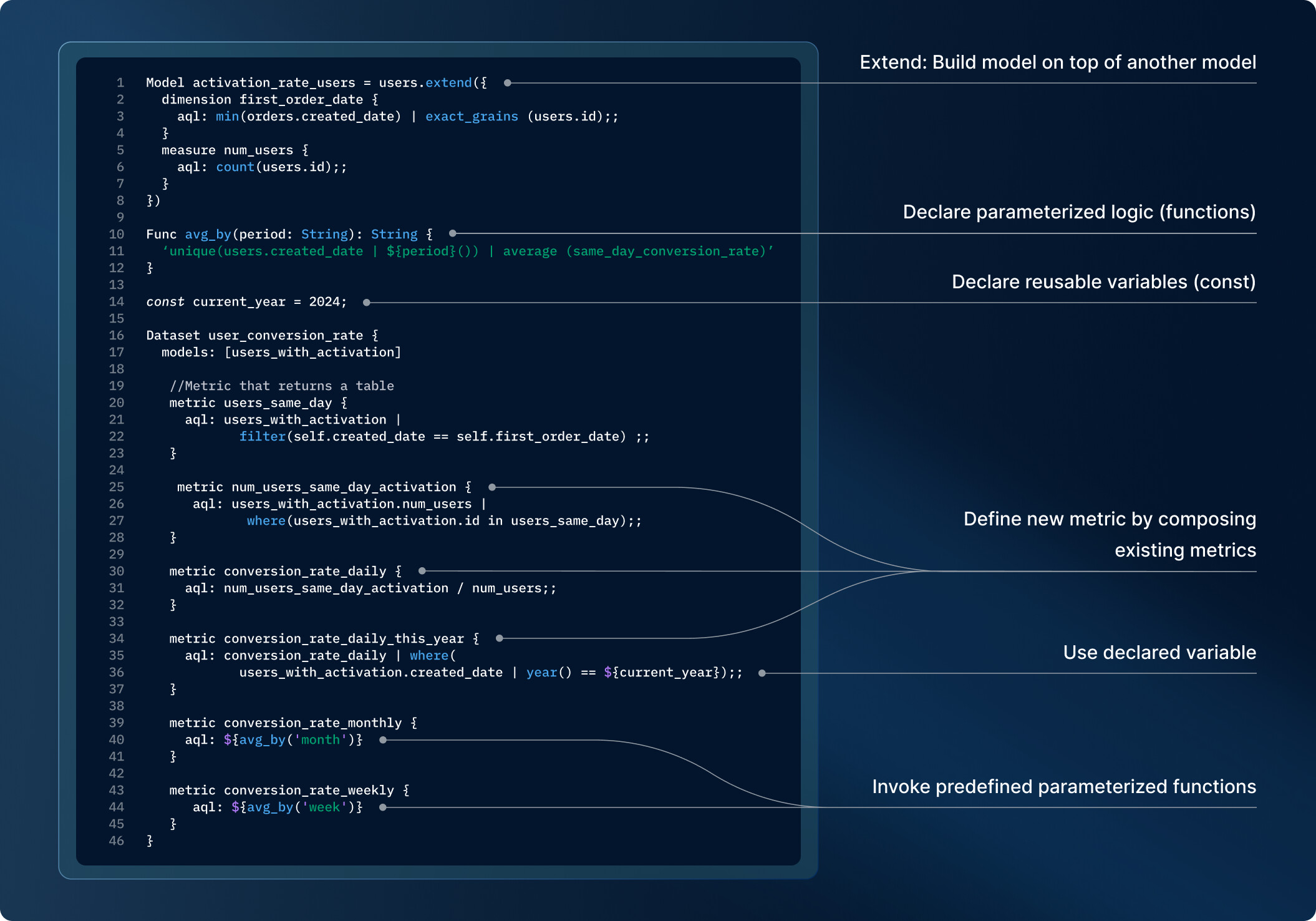
 Reusable BI Components
Analytics code often falls short of software engineering standards. We’ve all seen it – sprawling SQL queries, duplicated logic across reports, and metrics that somehow give different results depending on who ran the query. It’s a maintenance nightmare waiting to happen.
In 2024, we added reusability features to allow analysts to:
- Build reusable chart components.
- Define metrics once and use them everywhere.
- Simplify ad-hoc analysis with modular design.
This ensures metrics are consistent, reliable, and scalable across your organization.
 Dynamic Data Sources
Switching data environments was a manual slog. Dynamic Data Sources was added in late 2024 and is coming out of beta as we type. Analysts can:
- Use the same set of data setups for different clients, with each client pointing to a different database (or schema).
- Automatically toggle between Dev and Prod databases based on your Holistics environment
No more manual updates. Just one system that adapts to your needs.

 Improved Development Workflow
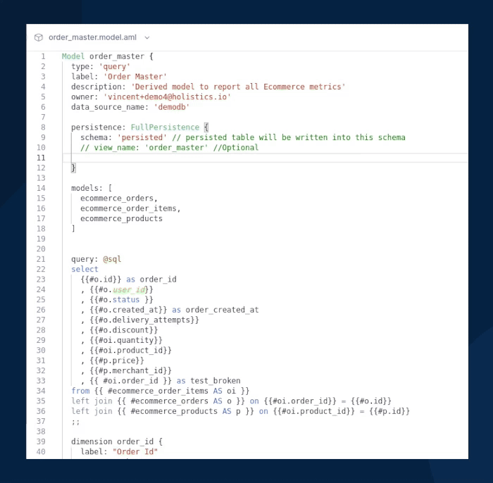
With Holistics, you have a centralized, code-based modeling layer with a metric-centric query language that makes composing metrics easier, eliminating the need for cumbersome SQL workarounds.
Yet, the analytics development experience can always be improved. In 2024, we continue to eliminate bottlenecks in your development and Git workflow. We introduced:
1) Smoother Git Workflow: Fewer steps, faster syncs, and less friction. https://cdn.holistics.io/product-newsletter/aug24/git-workflow.mp4
2) Version Restore: Mistakes happen—now they’re easy to fix.
3) Branching URLs: Share links that take teammates straight to the right branch and object.
4) New Conflict Resolution Flow: Resolve Git conflicts with less hassle.

 Making Metrics Easier To Manipulate
Without intuitive tools to drill into data or manipulate metrics, insights often remain surface-level, so we made metrics a bit easier to manipulate and explore.
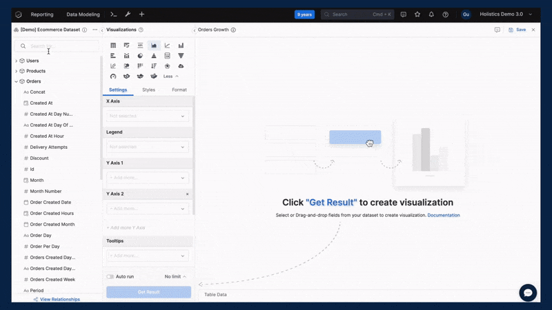
 Turning Common Analytics Functions Into 1-Click Operations
In 2023, we introduced AQL (Analytical Query Language), a powerful tool for advanced analytics. But we know not everyone wants to code. That’s why we built on AQL’s foundation to create a point-and-click interface for simpler analytics.
Now, with just a few clicks, business users can explore trends, identify patterns, and analyze distributions across metrics. Questions like “How are sales trending?” or “Are we hitting our targets?” are now as easy to answer as opening a report.
These analytic functions combine AQL’s power with simplicity. Here’s what you can do:
- Trend Lines: Identify and visualize trends over time.
- Reference Lines: Compare actuals against benchmarks or targets.
- Percent of Total: Understand each component’s contribution to the whole.

- Moving Calculations: Smooth out data fluctuations or calculate the cumulative sum.

5) Period-over-Period Comparisons: Compare metrics across different time periods.
 Excel-Like Table Interactions
We brought Excel’s flexibility to Holistics tables, so you can work with data the way you already know.
With a few clicks, you can rename, freeze columns, change aggregations on the fly, autosize columns, drag and drop to reorder, and more. It’s familiar, intuitive, and fast.
Condition Group
Our Condition Group feature makes complex filtering simple. You can create OR conditions, group filters, and even nest groups within groups. Build filters that match your logic, not just what the tool allows.
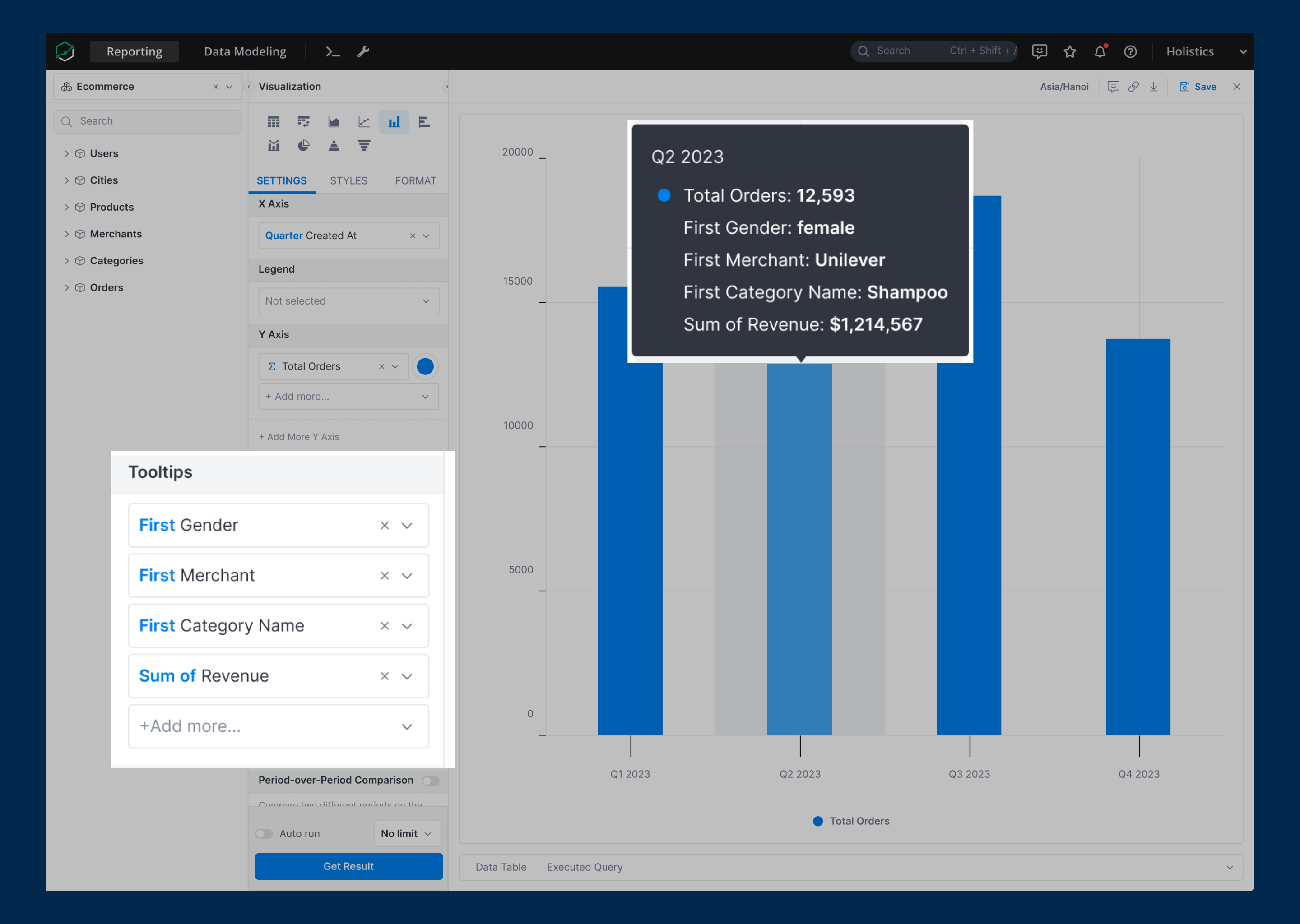
 Context-Rich Tooltips
Add measures, calculations, and AQL metrics directly to chart tooltips. Provide clarity without cluttering your visuals.
 Turning Metrics into Visual, and Business-Centric Tools
Metrics matter most when they’re presented in a way that fits your business context and drives actions. But traditional BI dashboards often fall short. They’re rigid, lack reusability, and reduce storytelling to static charts and numbers.
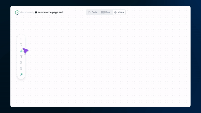
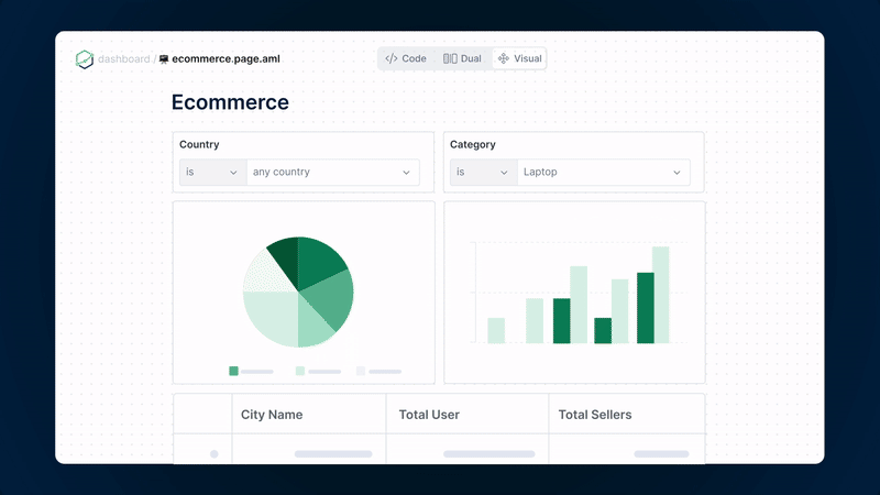
So we built Canvas Dashboard—a tool designed to turn metrics into sense-making stories. With it, you can present data, tell stories, and provide clarity that aligns with your business needs.
 Free-Form Dashboard Design
Canvas treats every element as a “block.”
Charts, filters, text, and more can be arranged freely. Add explanations, embed business models, or organize layouts to match how your business thinks.
 Dashboard Themes and Custom CSS Styling
Define reusable themes, set typography styles, and create consistent branding with custom CSS. Whether it’s light mode, dark mode, or a dashboard that looks like a magazine cover, the choice is yours.
 Taking Action: From Metrics to Decision
Static dashboards are no longer enough. Once you understand your metrics, the next step is to act on them. That’s why we introduced Actions, a feature that lets you define workflows directly in dashboards. Imagine:
- Noticing low stock in a report and emailing a vendor with one click.
- Spotting customer inactivity in a CRM dashboard and opening their profile instantly.
Actions turn your Holistics dashboard into a dynamic tool for decision-making, closing the gap between insight and action.

 Delivering Metrics Faster
Now you have your metrics. It’s easy to create, manipulate, and beautifully presented, but no one will know when every dashboard visit is a game of “spin the loading wheel”.
In 2024, we’re committed to getting rid of dashboard dawdling in Holistics. Everything is now a little faster, a little smoother, and a whole lot more enjoyable to work with.
Aggregate Awareness
With Holistics Aggregate Awareness, the query engine automatically picks the most optimal aggregated tables per each query for maximal query performance. It uses smaller pre-aggregated tables to deliver accurate results, allowing analysts to maintain pre-aggregates with less effort.

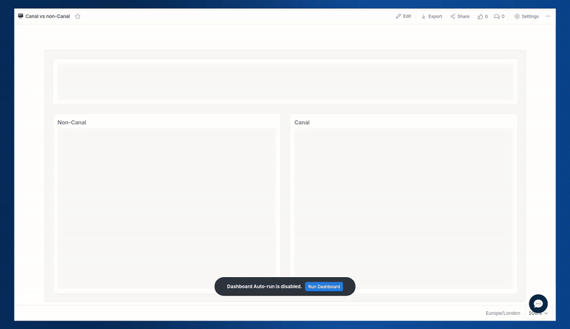
Canal - a fast query streaming engine
Our performance team introduced a new query execution engine, which delivers 5-30x faster performance for large dashboards of up to 500K records.
Customer Persistent DDL
You can declare the custom_ddl for a Persistence, and customize how the persistence table is created in your Data Warehouse. This allows you to apply Data Warehouse optimization features and techniques such as indexing, clustering, applying SORTKEY, etc. to improve the performance of your physically persisted tables.
Job Performance Analytics
With Job Performance Analytics, you can:
- Spot the slowest reports in your workspace.
- Identify dashboards that need performance boosts.
- Monitor if your Holistics Job Workers are overloaded.
- Monitor dashboard speed after optimizing SQL or your data warehouse.
 Quality of Life Improvements
It’s these little things and attention to detail that make the software invisible (seamless) to the users. In 2024, we polished the details to make every interaction more seamless.
Here are some highlights:
1) Filter Dashboards by URL: Pre-filter dashboards by adding parameters to the URL.
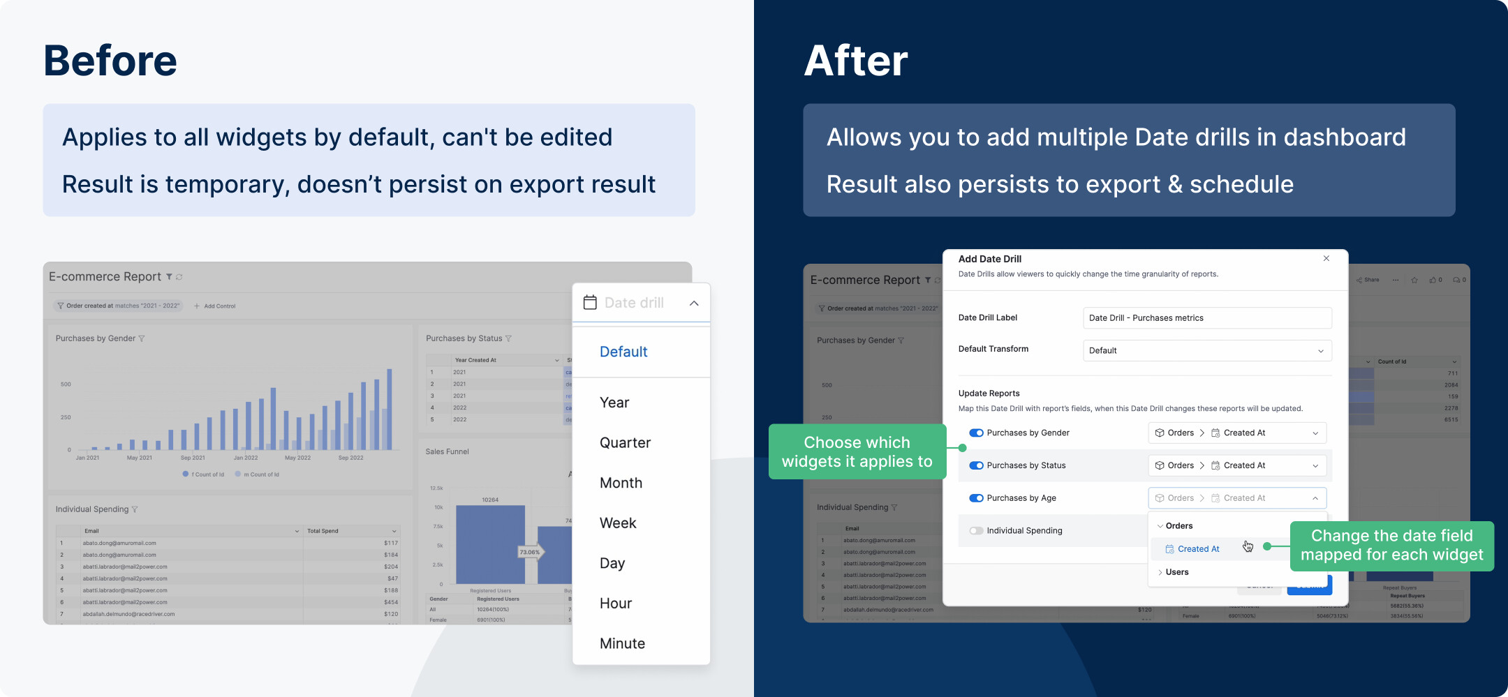
2) Date Drills: Add multiple date drill options, with results persisting in exports and schedules.
3) Public Dashboard Embedding: Embed dashboards anywhere—blogs, Notion, wikis—so your data lives where it’s needed.
What’s Next?
If you’ve made it this far, let me begin by saying thank you. Truly.
Holistics has been on this journey since 2015. We’re one of the very few BI tools that bootstrapped our way here, brick by brick, and we couldn’t have done it without you.
This has been our busiest year yet — more projects, more features, more ambition. We’re excited. Hopeful. Anxious, too, in the way anyone would be when they sense the future closing in fast.
This is the year of better end-user experience—where accessing, exploring, and manipulating data feels as natural as breathing. And we’re not stopping there.
While we continue to invest in the fundamentals, we’re also reaching higher with experiments that might just reimagine what’s possible with Holistics.
Here are a few examples of where we’re headed:
Sheety (Self-service BI in spreadsheets): An extension that allows business users to explore Holistics data within the Google Sheet interface while allowing data teams to maintain a single source of truth.
Askwitch: A chat copilot that answers your data questions in seconds. It can summarize, aggregate, plot, and even run what-if scenarios. Sometimes, you just need to ask.
We’ll share more about these experiments with you in a separate newsletter. But for now, that’s all. I hope to see you in the days to come, and I hope I continue to hear from you. ![]()
End Notes
If you’re curious about our upcoming direction, check out our Product Roadmap. If you’re interested in what we just released in the past few months, check out our Release Note.
Do you have any feedback for us? If you do, hit Reply and let me know. Or connect with me on LinkedIn and we can chat.
I’ll see you again real soon!