Handle Nulls in Running Calculations

Current State: If no values are returned for a series used for a running calculation, the running calculation is returned as null, with the running calculation continuing on the next instance of data.

Desired State: Return the previous value for the running calculation when null is returned in the series

We have found this a few times when working with pivot-driven reporting (pivot tables, column charts). When visualizing a running total of sales by customer by week, not every customer has sales for each week. When these gaps occur, the running total in the visualization disappears for that week (when working with window aggregate AQL measures); Moving calculations handle these correctly, but are limited to line-style visualizations.

When a total (cross-customer) running sales total is added, the running total for customers with no sales in a given week are removed from that week’s running total. This leads to unexpected dips in the overall running total. This issue occurs on both window aggregate AQL measures and Moving calculations

Example Table:

Customer A Sales Customer A Cumulative Sales Customer B Sales Customer B Cumulative Sales Aggregate Cumulative Sales
$1000 $1000 $500 $500 $1500
$700 $1200 $1500
$1200 $2200 $900 $2100 $4300
$2000 $4200 $500 $2600 $6800

Ideally, Customer A Cumulative Sales in the second row would continue with $1000 (the previous running value) and the Aggregate Cumulative Sales output would be $2500 for that row.

Hi @Bob_Adams, thanks for the question!

Can you share more details about how you’re setting up the example table, what’s the dims you are using, and what’s the AQL expressions you’re using for Cumulative Sales?

I’ve tried to set up a similar pivot table on my end:

  • Countries as columns.
  • Day number as rows.
  • Total orders as value.
  • Running total on total orders as another value. (running_total(total_orders, orders.created_date))

I found that it’s working as expected. Please look at the highlighted section below:

  • On Feb 18th, 2022, Vietnam (the country) has no new orders.
  • The Total column for Feb 18th, 2022 shows the number 8 for Total orders, which is the correct sum of total orders from other countries.
  • The Total column for Feb 18th, 2022 shows the correct number 141 for Running Total, which is the previous value (133) plus the new value (8).

In your example table, using a similar setup, I’d expect:

Customer A Sales Customer A Cumulative Sales Customer B Sales Customer B Cumulative Sales Aggregate Cumulative Sales
$1000 $1000 $500 $500 $1500
$700 $1200 $2200
$1200 $2200 $900 $2100 $4300
$2000 $4200 $500 $2600 $6800

Please let me know if there’s any other factors that play into this.

Hi @Bob_Adams

Just checking in, has the issue been resolved from your side? Please let us know if you need further assistance.

Best,
Phuong.

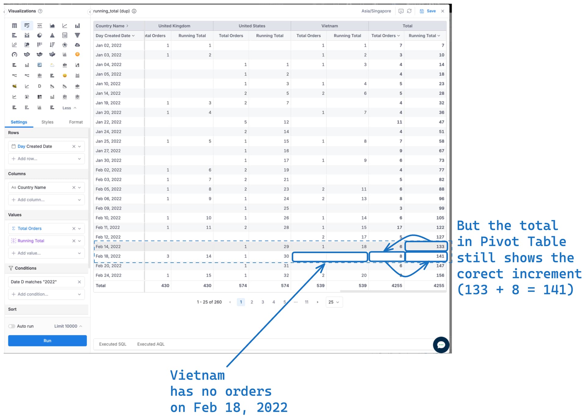
Hi @minhthanh3145 and @Phuong_N_Holistics , apologies for the delay on this! The issue that we’re seeing like Bob mentioned is for visualizations, especially when attempting to stack the values. For example, stacked bar chart.

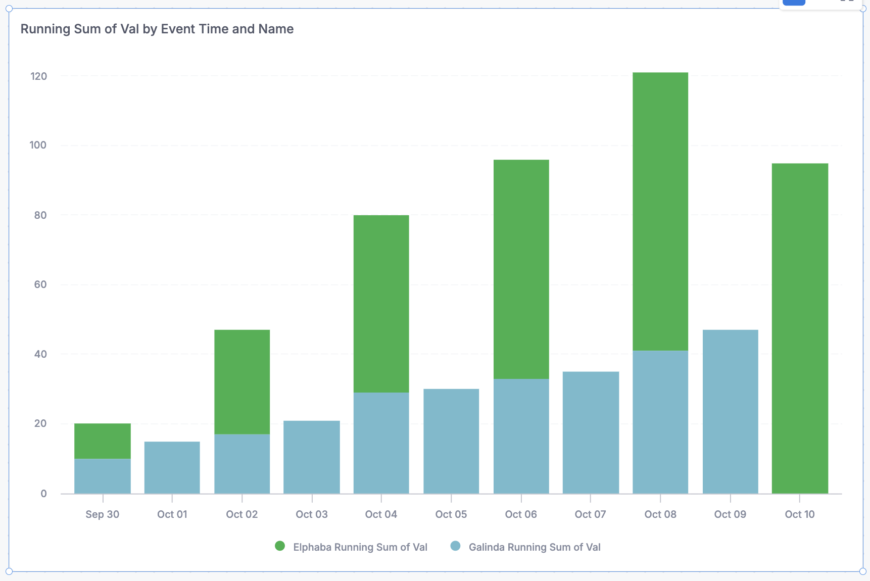
Here’s an example with fake data. Even though blue is individually increasing, and green is individual increasing, on the days that one has no data, it looks like the total is decreasing.

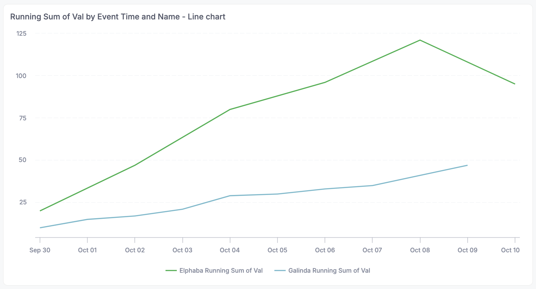
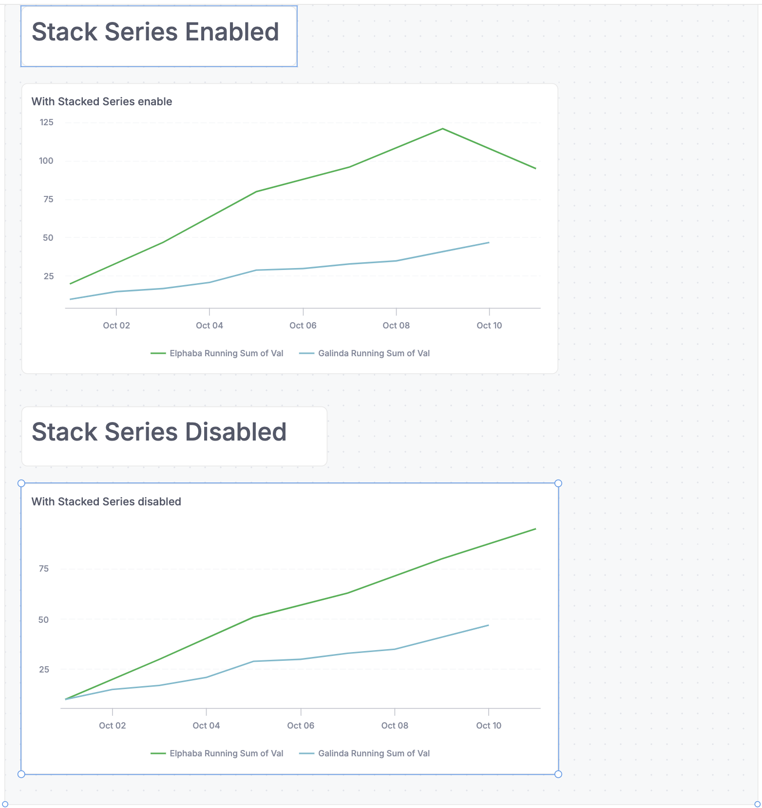
The line chart is a bit better with the stacked approach for most of the time, but looks even weirder at the end when blue has no data - it looks like green has a dip!

I put together a test model, dataset, and dashboard with fake data in case it helps, apologies for the long post (query syntax is BigQuery):

Model testing_running_totals {
  type: 'query'
  label: 'Testing Running Totals'
  description: ''
  data_source_name: 'spoileralert'
  dimension event_time {
    label: 'Event Time'
    type: 'datetime'
    hidden: false
    definition: @sql {{ #SOURCE.event_time }};;
  }
  dimension name {
    label: 'Name'
    type: 'text'
    hidden: false
    definition: @sql {{ #SOURCE.name }};;
  }
  dimension val {
    label: 'Val'
    type: 'number'
    hidden: false
    definition: @sql {{ #SOURCE.val }};;
  }

  query: @sql
    SELECT TIMESTAMP_SUB(CURRENT_TIMESTAMP(), INTERVAL 10 DAY) as event_time, 'Elphaba' as name, 10 as val 
    UNION ALL 
    SELECT TIMESTAMP_SUB(CURRENT_TIMESTAMP(), INTERVAL 8 DAY) as event_time, 'Elphaba' as name, 20 as val 
    UNION ALL 
    SELECT TIMESTAMP_SUB(CURRENT_TIMESTAMP(), INTERVAL 6 DAY) as event_time, 'Elphaba' as name, 21 as val 
    UNION ALL 
    SELECT TIMESTAMP_SUB(CURRENT_TIMESTAMP(), INTERVAL 4 DAY) as event_time, 'Elphaba' as name, 12 as val 
    UNION ALL 
    SELECT TIMESTAMP_SUB(CURRENT_TIMESTAMP(), INTERVAL 2 DAY) as event_time, 'Elphaba' as name, 17 as val 
    UNION ALL 
    SELECT TIMESTAMP_SUB(CURRENT_TIMESTAMP(), INTERVAL 0 DAY) as event_time, 'Elphaba' as name, 15 as val 
    UNION ALL 

    SELECT TIMESTAMP_SUB(CURRENT_TIMESTAMP(), INTERVAL 10 DAY) as event_time, 'Galinda' as name, 10 as val 
    UNION ALL 
    SELECT TIMESTAMP_SUB(CURRENT_TIMESTAMP(), INTERVAL 9 DAY) as event_time, 'Galinda' as name, 5 as val 
    UNION ALL 
    SELECT TIMESTAMP_SUB(CURRENT_TIMESTAMP(), INTERVAL 8 DAY) as event_time, 'Galinda' as name, 2 as val 
    UNION ALL 
    SELECT TIMESTAMP_SUB(CURRENT_TIMESTAMP(), INTERVAL 7 DAY) as event_time, 'Galinda' as name, 4 as val 
    UNION ALL 
    SELECT TIMESTAMP_SUB(CURRENT_TIMESTAMP(), INTERVAL 6 DAY) as event_time, 'Galinda' as name, 8 as val 
    UNION ALL 
    SELECT TIMESTAMP_SUB(CURRENT_TIMESTAMP(), INTERVAL 5 DAY) as event_time, 'Galinda' as name, 1 as val 
    UNION ALL 
    SELECT TIMESTAMP_SUB(CURRENT_TIMESTAMP(), INTERVAL 4 DAY) as event_time, 'Galinda' as name, 3 as val 
    UNION ALL 
    SELECT TIMESTAMP_SUB(CURRENT_TIMESTAMP(), INTERVAL 3 DAY) as event_time, 'Galinda' as name, 2 as val 
    UNION ALL 
    SELECT TIMESTAMP_SUB(CURRENT_TIMESTAMP(), INTERVAL 2 DAY) as event_time, 'Galinda' as name, 6 as val 
    UNION ALL 
    SELECT TIMESTAMP_SUB(CURRENT_TIMESTAMP(), INTERVAL 1 DAY) as event_time, 'Galinda' as name, 6 as val 
  ;;
  models: [
  ]
}

Dataset test_running_totals_dataset {
  label: 'Test Running Totals Dataset'
  description: ''
  data_source_name: 'spoileralert'
  models: [
    testing_running_totals
  ]
  relationships: [
  ]
}

Dashboard test_dashboard {
  title: 'test_dashboard'
  description: ''''''

  view: CanvasLayout {
    label: 'View 1'
    width: 980
    height: 940
    grid_size: 20
    block v1 {
      position: pos(20, 20, 920, 380)
      layer: 1
    }
    block v2 {
      position: pos(20, 420, 940, 500)
      layer: 1
    }
  }

  theme: H.themes.classic
  block v1: VizBlock {
    label: 'Running Sum of Val by Event Time and Name - Bar Chart'
    viz: ColumnChart {
      dataset: test_running_totals_dataset
      x_axis: VizFieldFull {
        ref: ref('testing_running_totals', 'event_time')
        transformation: 'datetrunc day'
        format {
          type: 'date'
          pattern: 'LLL dd'
        }
      }
      legend: VizFieldFull {
        ref: ref('testing_running_totals', 'name')
        format {
          type: 'text'
        }
      }
      y_axis {
        settings {
          stack_series_by: 'value'
        }
        series {
          field: VizFieldFull {
            ref: ref('testing_running_totals', 'val')
            aggregation: 'running sum'
            format {
              type: 'number'
              pattern: 'inherited'
            }
          }
          settings {
            point {
              value: 'Elphaba'
              color: '#2AB24AFF'
            }
            point {
              value: 'Galinda'
              color: '#70BBCDFF'
            }
          }
        }
      }
      settings {
        row_limit: 5000
      }
    }
  }
  block v2: VizBlock {
    label: 'Running Sum of Val by Event Time and Name - Line chart'
    viz: LineChart {
      dataset: test_running_totals_dataset
      x_axis: VizFieldFull {
        ref: ref('testing_running_totals', 'event_time')
        transformation: 'datetrunc day'
        format {
          type: 'date'
          pattern: 'LLL dd'
        }
      }
      legend: VizFieldFull {
        ref: ref('testing_running_totals', 'name')
        format {
          type: 'text'
        }
      }
      y_axis {
        settings {
          stack_series_by: 'value'
        }
        series {
          field: VizFieldFull {
            ref: ref('testing_running_totals', 'val')
            aggregation: 'running sum'
            format {
              type: 'number'
              pattern: 'inherited'
            }
          }
          settings {
            point {
              value: 'Elphaba'
              color: '#2AB24AFF'
            }
            point {
              value: 'Galinda'
              color: '#70BBCDFF'
            }
          }
        }
      }
      settings {
        row_limit: 5000
      }
    }
  }
}
1 Like

Hi @anya.conti and @Bob_Adams ,

I figured where the issue lies. Your running sum is returning correct data, but you have an turned on the Stack Series option in the visualization setting, so it is displaying in a misleading manner.

Please go to your chart and turn this setting off

The result should look something like this:

Hi @minhthanh3145

We understand that stacking is causing issue, that’s the feature request, sorry for the confusion! We want the ability to used stacked values even there is no value for all categories being pivoted on, for all rows, and continue to see the proper totals look like they’re continuing to increase.

This example I put together is simplified, but if you’re pivoting on 10 different categories instead of 2, this gets EXTREMELY wide to show without stacking. And there are times when we want to visualize the total for all categories.

Best,
Anya

1 Like

Ah I see, apologies for misunderstanding, and thank you for the clarification :pray:. We have taken note of this feature request for future improvement.

Just a note, our team is working on a viz option called “Breakdown by Legend” which can help you achieve this outcome and turn off the legend effect for each measure in the chart.

Once this is available, you can visualize the cumulative sum of quantity for each category (3 lines), and a cumulative sum of total quantity by turning off the “Breakdown by legend” (the red line).

We’ll let you know when there’s new updates on this!

Oh that sounds cool, thank you! Would it apply to bar charts as well? That’s admittedly our main use-case. We’re using the line chart as a work-around since it’s mostly better at showing the totals, though not always.

Hi! Yes, the “Breakdown by legend” toggle will be available in all chart types within the line chart family (including area, line, column, bar and combination charts).

Hi @anya.conti

Toggle “Break down by legend” is now available!

Please give it a try and see if it’s useful to you :pray:

Hi Phuong, thanks for letting us know, this feature is very cool and will definitely be useful, but I don’t think this achieves quite what we’re looking for in this particular ask, especially in bar charts. We would really love to see the stacked running totals! I’m also running into a few bugs with the feature, I shared via email so I could more easily share our internal data.

1 Like

We just had an internal user ask how to have the legend apply to one field but not another. So while “Breakdown by legend toggle” doesn’t accomplish the initial goal of this feature request, shout-out for the new feature regardless! :tada:

1 Like