 Link to dashboard
What it is
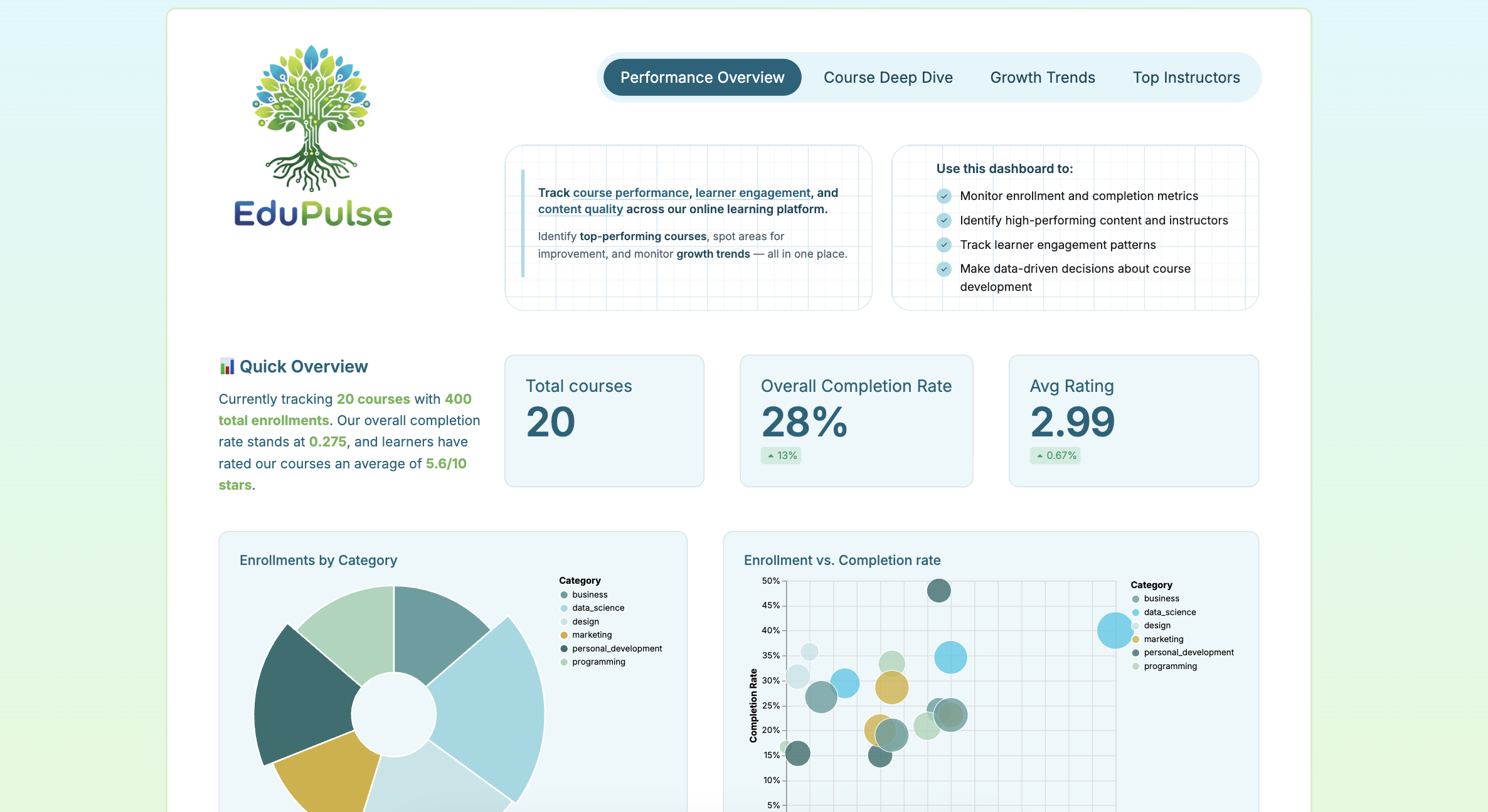
An online learning analytics dashboard that helps you track course performance, learner engagement, and instructor effectiveness — all wrapped in a gradient-loving, vine-decorated, data-driven package 

Description
This dashboard helps education platform teams understand learner behavior without digging through raw data. Track where students drop off, which courses drive engagement, and how completion rates trend over time — all in one view, filterable by course category.
Built as-code in Holistics to demonstrate AQL metrics, custom visualizations, and dynamic content capabilities. 

Key features
 Interactive category filters that cross-filter the entire dashboard, letting you isolate performance by subject area (Programming, Business, Design, etc.)
 Instructor performance comparison across enrollments, completion rates, and learner ratings
 Custom AQL metrics including completion rate with time-period comparisons, average days to complete, and conditional aggregations
 Holistics custom charts (radial category distribution, multi-dimensional bubble chart) with configurable color pickers
- Dynamic content blocks for rich HTML/CSS components beyond standard chart types
 Reusable components demonstrating the as-code approach to visualization templates
May your insights be actionable and your gradients be smooth 