Hello Holistics Community ![]()
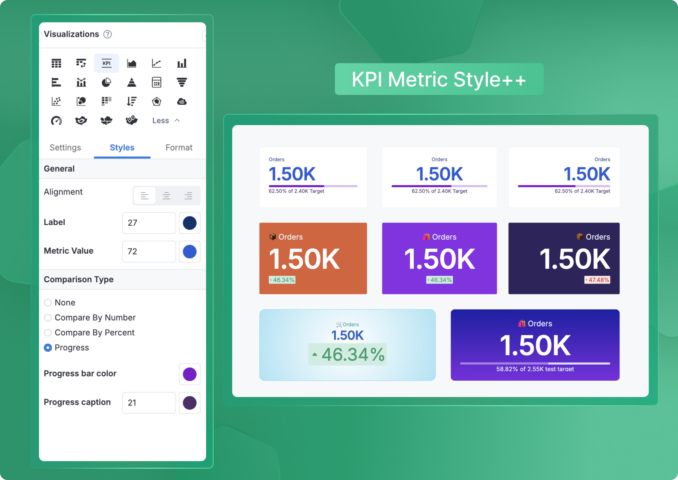
KPI metrics in Canvas Dashboards come with flexible styling options that let you create professional, polished dashboards that match your brand and communicate insights effectively.
What you can customize
You have full control over how your KPI metrics look and feel:
 Font size – Make your metrics stand out or keep them subtle
- Font color – Match your brand colors or highlight important values
- Text alignment – Left, center, or right align to suit your dashboard layout
- Comparison type styling – Different visual options for:
- Number comparisons
- Percent comparisons
- Progress bar displays
Each comparison type can be styled independently, giving you complete control over how your KPIs communicate performance at a glance.
To customize your KPI metrics, simply edit the KPI metric block and navigate to the Styles tab in the Viz Settings panel—all styling options are available there.
![]() Tip: Combine these with our Themes feature for truly stunning and unique KPIs.
Tip: Combine these with our Themes feature for truly stunning and unique KPIs.
Note: These styling options are currently available for version 4.0 only.
Wrapping Up
With these styling options, you can create dashboards that not only deliver insights but also look exactly the way you want them to. Experiment with different combinations to find what works best for your audience!
If you have questions or want to share your dashboard designs, drop them in the comments below. Happy dashboard building! ![]()