Hello @kaid , the problem is solved by change datum.@{fields.data.name} to datum['@{fields.data.name}'], the same for datum.bin_log_x to datum['bin_log_x'] …
But now, I have a new issue.
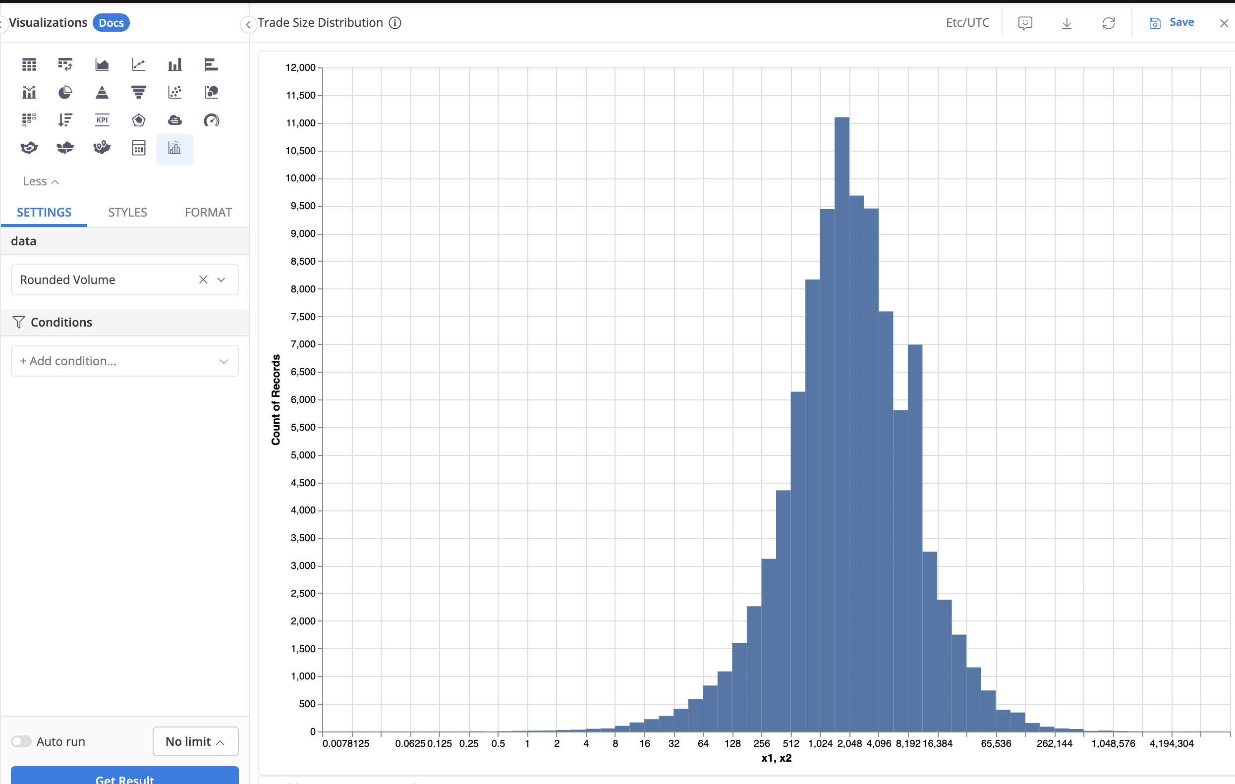
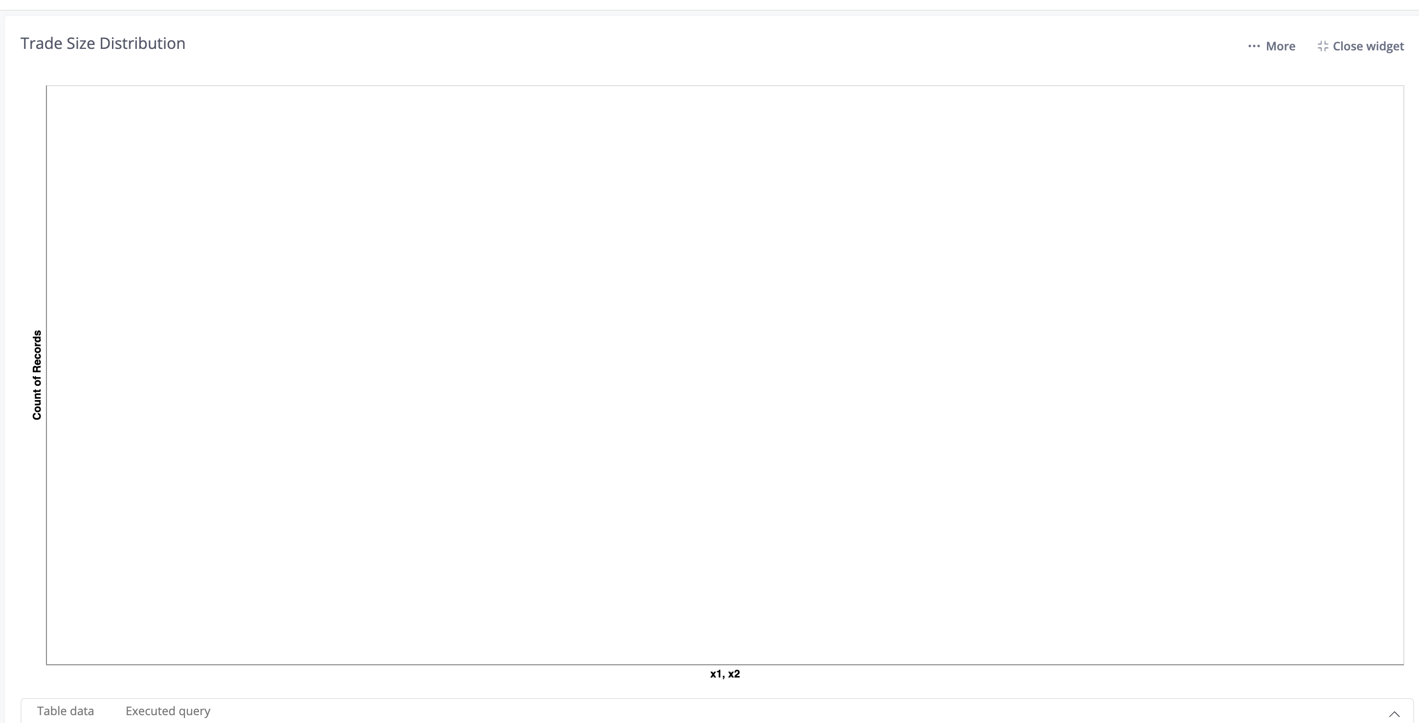
In editor mode, the chart renders fine:
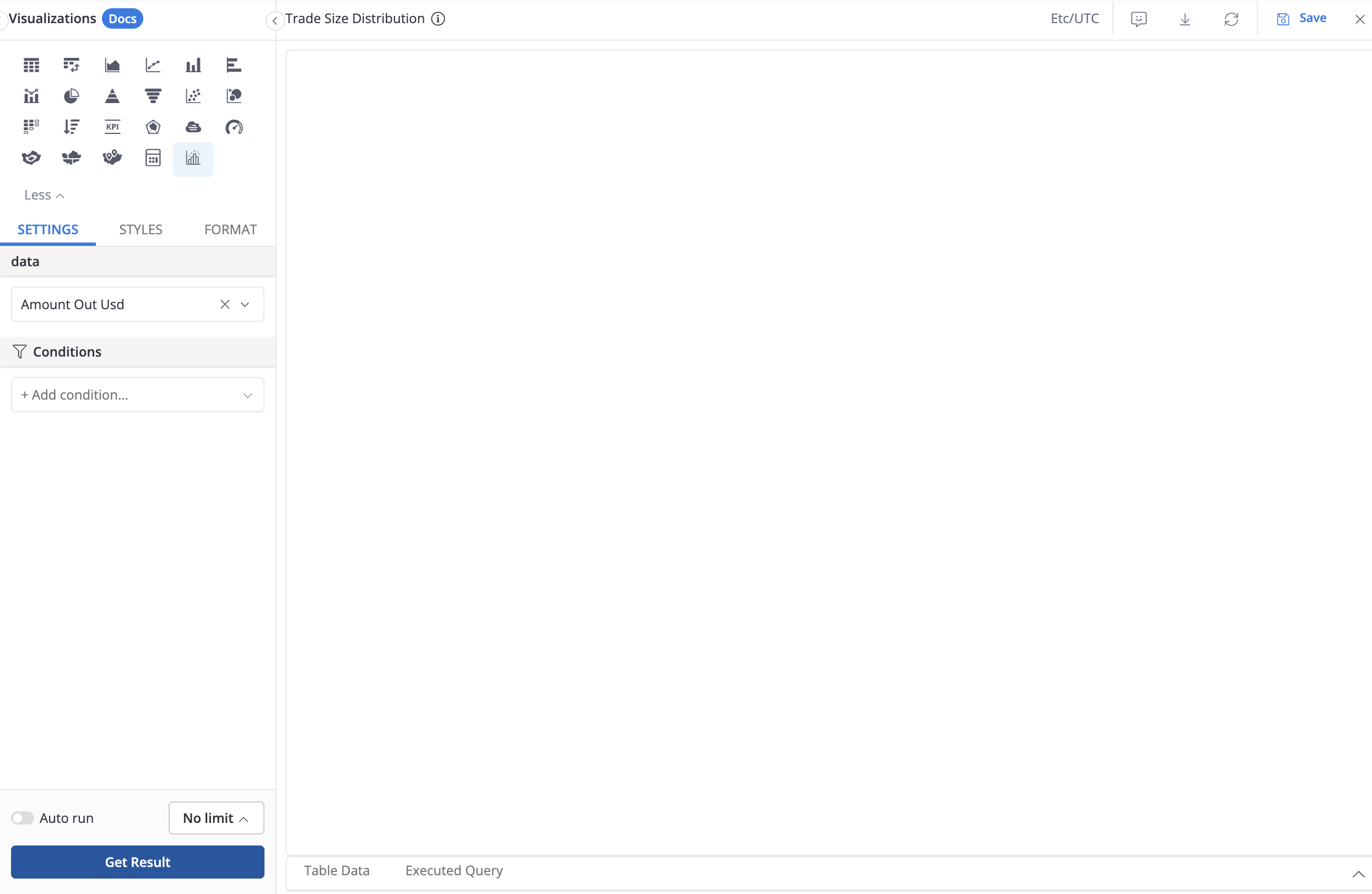
rounded volume is the amount out usd but rounded into format “.2f”. It is a custom dimension that I added into the model (e.g bigquery: @sql{ROUND(amount_out_usd, 2)} )
If I use the ordinary amount out usd, the chart renders okay in both editor mode and dashboard. I think maybe it’s the custom dimension problem
@kaid I found more information, it looks like the chart will only render if I limit the size.
The reason that my chart only renders in editor mode is that in that mode, the executed query is the automatic limit of 100000
Is there any way that I can build a histogram of full data size?
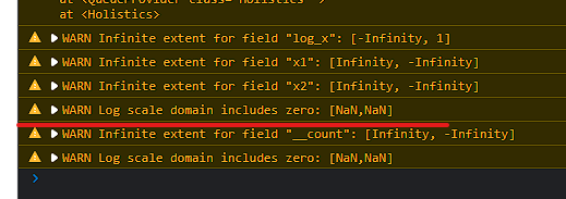
If this is the cause, you can either update your custom chart definition to properly handle 0 and null values, or add viz conditions to filter those values out