The UX for the conditions needs a lot of work, it’s getting harder to actually select the conditions and to know when conditions have been selected. Sometimes we find users trying to select using Enter as they can’t easily select with point and click.
Thanks for your feedback @Alex_H really appreciate it!
To help us properly understand your filter/condition issue, could you share with us some screenshots or video of it?
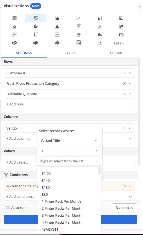
Hi Di - here you can see that there’s no way to see how to confirm a selection in the conditions as the UI has pushed it down.
Also, users tend to find that once a selection has been made (after which it is selected) the secondary step of “applying” the selection in the UX is a little unintuitive and ofter they run queries without the selection.
I agree, we have the same issues. I often struggle to apply the conditions because the Apply button disappears under the long list. Also, I experience a similar problem when using filters on the dashboard, the Apply button there is covered by the list as well.
I understand @Alex_H and @Monika_Kubek
I’m also struggle with the hidden Apply button ![]() I’ll forward your feedback to our Product Design team, hope that we can improve this behavior soon.
I’ll forward your feedback to our Product Design team, hope that we can improve this behavior soon.
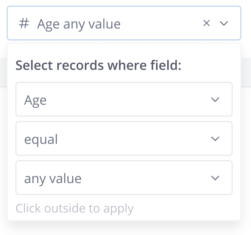
For a workaround, whenever you see the Apply button disappear, please try to click outside first, then click to open the condition panel again ![]()
Hi all, good news!
After receiving your feedback, we recently removed the redundant Apply button.
From now on, you can click outside to apply the changes. We’re also considering supporting a shortcut in the future for easier use.
We’d love to hear your feedback so please let us know what you think. Thank you for being patient with us!
1 Like