I have some time series data I’m trying to plot. At each point in time, I have numeric value and a text “status” field. I would like the users of the report to be able to hover over a point and see the value of the “status”.
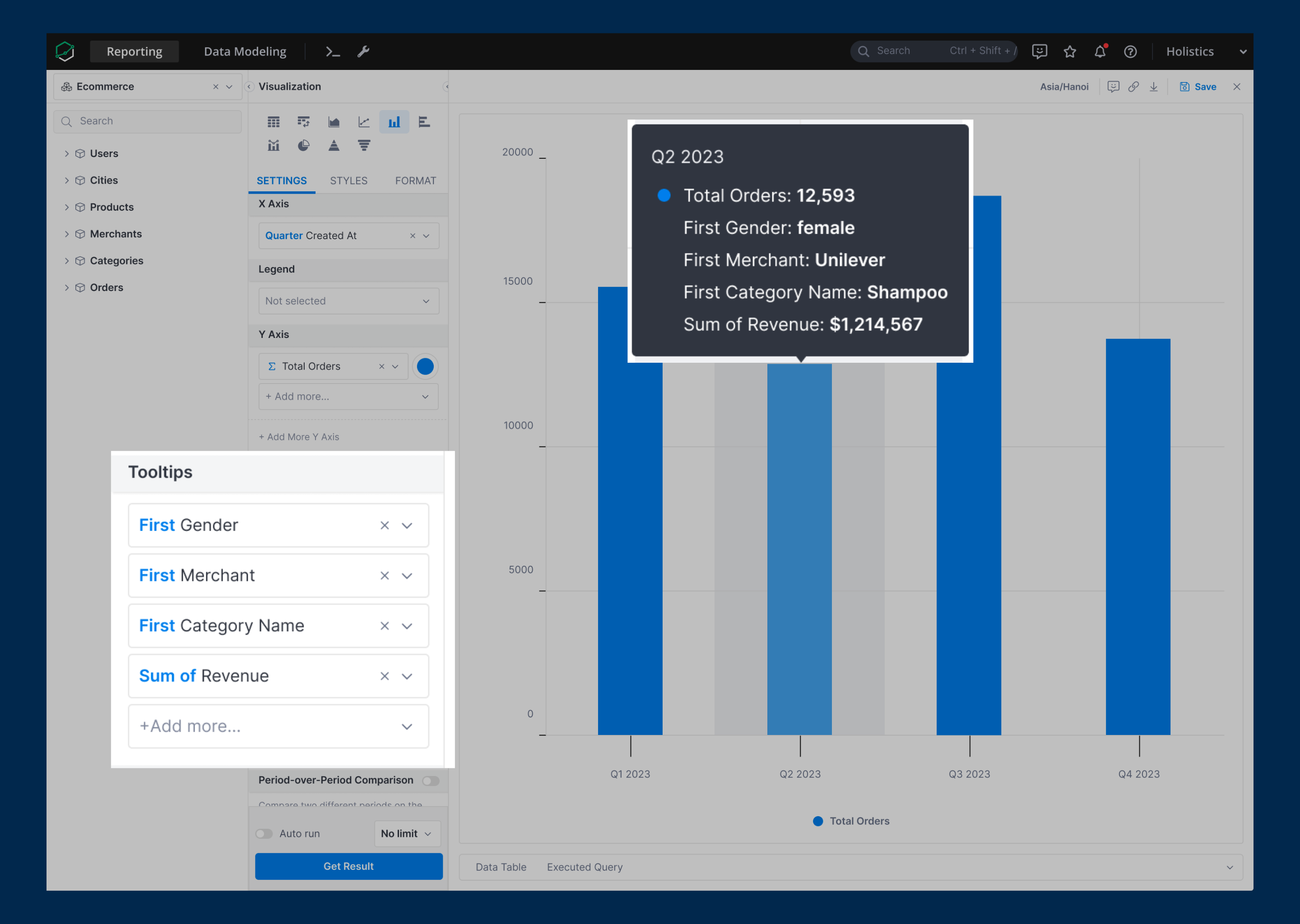
We’re about to roll out a new feature called Customizable tooltip. This cool addition lets you jazz up your chart tooltips with extra info, bringing much more clarity to your audience.
With this feature, we believe you could add the “Status” field to the tooltip. Would you mind checking if it can address your issue? ![]()
3 Likes
We are glad to share that our Customizable Tooltips feature was released yesterday.
For more information, you could visit our public doc here: Customizing Chart’s Tooltips
Please note that this feature is currently available for the following charts:
- Line, Column, Bar, and Area Chart
- Filled Map, Point Map
- Scatter, Bubble, Pie, Funnel, and Pyramid Chart (coming soon)
If you have any questions or need further assistance, feel free to let us know ![]()
2 Likes