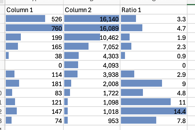
I use the data bars option in Excel all the time. I find it really helpful to show the relative values of a bunch of different metrics next to each other. I’d love to be able to do this in Holistics too.
Even better would be to have the values right aligned and then the bars popping out to the right of the values for clarity. That would be an improvement over the Excel version!
Currently, we don’t support showing relative formatting values (like data bars) in tables. I’ve logged this as a feature request and will raise it with the team.
While this isn’t supported yet, could you share more about your use case? How are you using data bars today, and is the lack of this feature blocking you from delivering key insights on your dashboard?
This will help us better understand how this table type fits into your analysis.