Annotations can be very useful to help your business users understand why certain changes happened in the data — whether it’s a feature release, a marketing campaign, or a system issue.
In this post, I’ll show you a quick tip on how to add annotations to your charts in Holistics, using a reusable approach that works across multiple charts.
Approach
- Create an Annotations Data Model
Build a model withevent_dateandannotationcolumns. - Join It to Your Dataset
Use a date-based relationship between your main date field and the annotations. - Display on Chart
- Add
count(annotation)as a measure on the secondary Y-axis - Show data points (or bars) only on dates with annotations
- Add
max(annotation)to the tooltip for context
You can use either line or column chart formats depending on the visual style you prefer.
![]() Full guide with detailed config here: Adding Annotations to Charts (Holistics Docs)
Full guide with detailed config here: Adding Annotations to Charts (Holistics Docs)
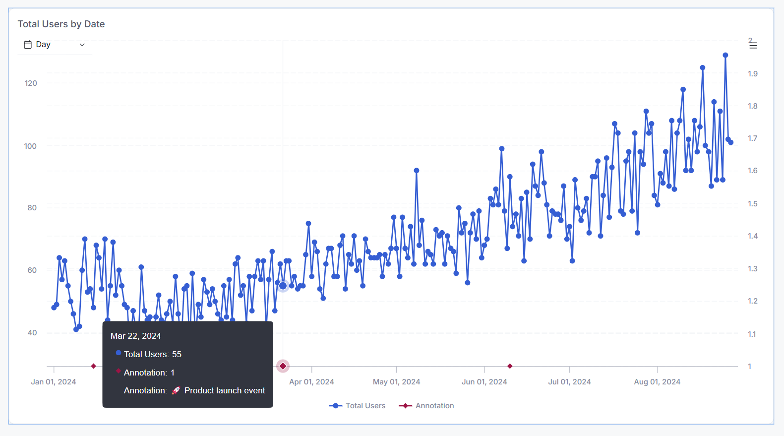
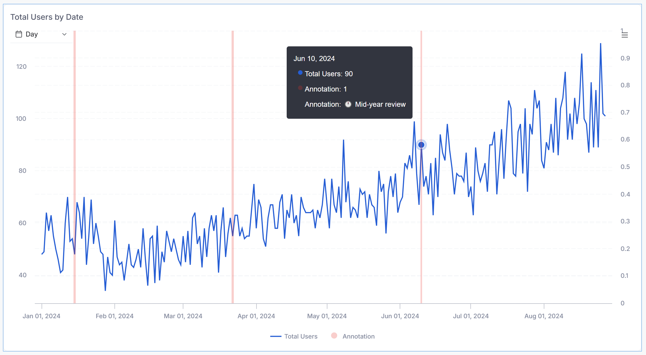
 Result
Your charts now include markers like these: